Web Blooper of the Month
Links Distract from Task
A commercial website is designed to support certain customer tasks, e.g., purchasing products, obtaining services, getting information, making transactions. Most commercial websites of course have additional purposes, such as informing and educating consumers, building brand loyalty, providing legal notices, and so on. But the primary purpose of the site is to help customers complete their tasks. Therefore, when a customer starts down a path towards completing a task, the site should not distract him/her from that. Unfortunately, many commercial sites do throw up distractions that guide customers away from completing their tasks.
Southwest Airlines
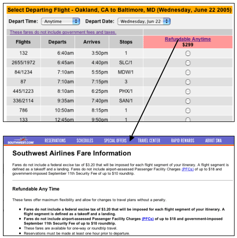
Southwest Airlines' website provides an example. When a customer initiates a flight search and the site lists the flights it found, Southwest displays a prominent link "Refundable Anytime" at the top of the choices (see below). A customer might be lured into clicking on this link. If so, the list of flights disappears and is replaced by a page titled "Southwest Airlines Fare Information", which provides information about many things, including Southwest's refund policy.

How does the customer return to the list of flights? No explicit path back is provided -- customers must click the BACK button to get back to the path towards booking a flight. But many customers, especially novice Web users, might not know to do that. Many such users, seeing the navigation bar at the top of the page, will hit the "Reservations" link, believing that would take them back to making their flight reservation. After all, the word in the navigation bar matches the task they have in mind: making a reservation. But of course that link won't take them back to the list of flights. It puts them at the beginning of the reservation process.
UBS Financial Services
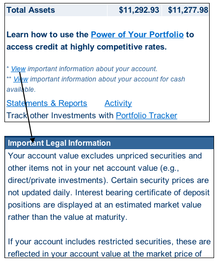
UBS Financial Services, on its Summary page for an online banking customer's account, has a similar distraction. The customer is looking at this page to get an overview of his/her account. Most customers drill down from here to more specific information about their account, such as recent transactions, balances, etc. Right in front the customer's face are two links that provide "important information about your account". Those links sound promising, but in fact go to legal notices and explanations; nothing specific to "your account" at all.

Returning from these legal notices to the customer's primary task is easier than at Southwest Airlines because adequate navigation is provided (not shown). But it is still possible for customers to get lost.
United Airlines
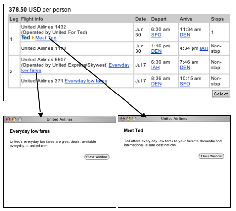
United Airlines has it almost, but not quite, right. Their flight search-results, like Southwest's, include distracting links to information intended to educate customers about their "everyday low fares" and their "Ted" subsidiary airline. Because these links display their information in small pop-up windows, which don't replace the task page, they are almost OK. But not quite, because the prominence and wording of these links could fool customers into believing they are primary task links, rather than optional links unrelated to the task.

Therefore many customers will click these links, become annoyed at United for wasting their time, and quickly close the pop-up windows.
Avoiding the Blooper
Don't distract customers from their tasks. Help people do what they came to your site to do.
Once customers have started down a task path, you are harming your own site's purpose if you distract them from completing the task. Attractive links that lead away from the task decrease the task completion rate. Enticing links that pop up irrelevant information may not divert customers from completing the task, but they slow them down, annoy them, and waste their time.
Create a "process funnel" that guides users toward their goal and keeps them on the path toward completing it. See design-pattern H1 in the book The Design of Sites by Van Duyne, Landay, and Hong for details.