Web Blooper of the Month
Burdening Users' Memory
Many websites provide services for registered members. In order to access the services, members must log in. Some websites place heavy burdens on their users by forcing them to use user-IDs, passwords, PIN numbers, etc. that are difficult to remember.
Usability Professionals Association: Assigned, Non-Changeable Passwords
Of all organizations, one would think that the Usability Professionals Association (UPA) would know better than to overtax peoples' memories. However, they do: they assign arbitrary account names and passwords to members, and don't provide a way to change them.
Members of UPA receive a letter inviting them to use UPA's online services, and assigning them a user-ID and password. The user-ID is a four-digit number while the password is the member's family name. For example, a member named Fred Flintstone might be assigned the following:
- User-ID: 4512
- Password (case sensitive): Flintstone
The UPA website provides no way to change one's user-ID or password to something easier to remember. UPA members who want to use UPA's online services (i.e., those who aren't put off by the memory burden) are forced to either memorize yet another user-ID and password, or use an external memory aid such as keeping the letter or a sticky note near their computer. Relying on external memory aids raises the risk of someone else getting the user-ID and password, and also makes it difficult to access the online account from elsewhere.
A further problem with UPA's scheme is that it uses a number for the user-ID and text for the password, which is uncommon. UPA members can easily forget which is which and try to type their password in as a user-ID, and vice-versa. I've made this mistake myself.
Client Website: Unreasonable Password Restrictions
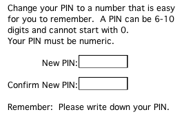
A more subtle form of the blooper occurred at the website of one of my client companies. To log into the site, customers had to type their Personal Identification Number (PIN), which is essentially a password. The site allowed customers to change their PIN, which is an improvement over the UPA site (see above). The instructions warn users to devise a PIN "that is easy ... to remember", but then impose restrictions that make it nearly impossible to do so (see below).

The last line of the instructions -- juxtaposing the word "remember" with "please write down your PIN" -- would be funny if it weren't so annoying.
Intuit
An even more subtle example of the blooper occurs at the website of Intuit Software. To purchase Intuit software through the site, you must register as a customer. The good news is that the site allows you to choose your own account-name and password. It even allows you to register a "password hint" so the site can remind you if you forget your password. The trouble occurs when the site asks customers to "select a security question" that it will ask if you forget your password and want your hint. You can't specify a security question -- you must choose one of the five listed in a menu (see below). But what if you can't answer any of those questions? For example, I have no idea what the answers are to four of those questions. The only one I could hope to answer is the one about my "childhood best friend", but our family moved a lot while I was growing up, so I had many "best friends".

I didn't bother to write down the answer I gave, so I just hope that if Intuit.com ever asks me who my childhood best friend was, I'll remember which "best friend" I gave it.
Avoiding the Blooper
Here are some guidelines on how to design security measures that don't overburden users' memory:
- Let site users devise their own user-IDs and passwords when they register. To avoid clashes where multiple users try to specify the same user-ID, ask for an email address as a user-ID; those will be unique.
- Don't impose arbitrary and unnecessary restrictions on the password. Let users create passwords that they can actually remember.
- Give registered site users a way to change their password.
- Include a way for users who have forgotten their password to get or set it. Sending a hint, the password, or a set-new-password link to the account's on-file email address is a good way to do it.
- If you use challenge-questions, include common ones -- e.g., mother's maiden name, birth city -- or let users specify their own challenge question.