Classes Offered
We offer the following talks and lectures.
Designing with the Mind in Mind: The Psychological Basis for UI Design Rules
UI design rules are not simple recipes to be applied mindlessly. Applying them effectively requires determining their applicability (and precedence) in specific situations. It also requires balancing the trade-offs that inevitably arise in situations when design rules appear to contradict each other. By understanding the underlying psychology for the design rules, designers and evaluators enhance their ability to interpret and apply them. Explaining that psychology is the focus of this course. It is based on the author's book, Designing with the Mind in Mind: Simple Guide to Understanding User Interface Design Guidelines, 3rd edition, published in 2020. 1-6 hrs. (adjustable) [View Video] [Hear Podcast] [Read Interview]
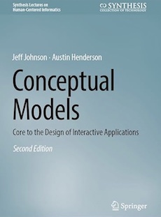
Conceptual Models: core to the design of interactive applications
The most important step in designing a user interface for a desktop or web-based application is to design a coherent, task-focused conceptual model. Unfortunately, this step is often skipped in software development. The result is incoherent, arbitrary, overly-complex applications that expose irrelevant concepts to users. Longer versions of the class include a hands-on exercise in performing Object/Actions analysis for a simple application. The class is based on the author's latest book, Conceptual Models: core to the design of interactive applications, published in April 2024. 1-3 hrs (adjustable) [View Video]
User Research: Understanding Users and their Tasks
This course covers why it is important to understand users and their tasks, and how to conduct research aimed at doing so. It covers methods of gathering and analyzing data, and ways of representing users and their tasks. It includes hands-on class exercises in applying the methods. Half day.
GUI Bloopers: Recognizing and Avoiding Common GUI Design Errors
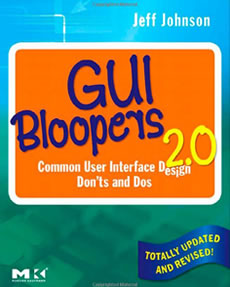
This tutorial is based on the book GUI Bloopers 2.0: Common User Interface Design Don'ts and Dos. The book explains how to avoid common GUI design errors, illustrated with examples from commercial software and websites. The tutorial covers the more concrete bloopers from the book: GUI Control, Navigation, Textual, Graphic Design & Layout, and Interaction. Longer versions of the tutorial include class exercises in which participants review GUI of products and websites brought to class by instructor and by participants. It is intended for software designers and developers, mainly those who lack several years of experience designing and evaluating GUIs. After completing this class, participants will:
- Have seen the most common GUI design errors and ways to avoid them.
- Be able to recognize those errors in software products and web-software.
- Be better designers and customers of interactive software and online services.
This tutorial is offered in full day (6.5 hrs, excluding breaks and lunch), half-day, and two-hour versions.
GUI Bloopers: Avoiding Common Design Mistakes
This talk is a short version of the GUI Bloopers tutorial. It describes a few bloopers in each category, and explains how to avoid them. The talk is illustrated with many examples of bloopers in commercially-available software products and websites. 1 - 1.5 hrs (adjustable)
Designing for Older Adults: Usability Considerations for Real Users
Web and mobile devices are increasingly the primary means of accessing information, transacting business, and communicating. This is true for people of all abilities and all ages. But sensory, cognitive, and behavioral profiles of people aged 50+ can make user interfaces particularly challenging. Although they represent a significant percentage of users, design often fail to take their needs into account. We present research, design guidelines, and good/bad examples of design, as well as resources for later use. User-centered, inclusive, and persona design techniques are spotlighted. This talk was presented at Stanford University in January 2014. 1-1.5 hrs.[View Video]
Designing Websites for Older Adults
If a significant percentage of a website’s target audience includes older adults, certain aspects of the site’s design become even more important. Based on experience designing, reviewing, and testing websites for older adults, this talk describes age-related factors that affect ability to use the Web, and present web design guidelines that reflect the capabilities, usage patterns, and preferences of older web users. This talk was presented at the American Society of Aging's "Aging in America" conference in Chicago in March 2013. 1-1.5 hrs.
Textual Bloopers and How to Avoid Them
This talk focuses on one type of blooper: textual. It covers common textual bloopers that occur in computer-based products and services. The bloopers are followed up with advice on how to avoid them. The importance of using writers rather than engineers to write and review all text displayed by software is stressed, as is the importance of developing and adhering strictly to a project lexicon. 1 - 1.5 hrs (adjustable).
Web Bloopers: Common Web Design Mistakes and How to Avoid Them
This tutorial is based on the book Web Bloopers: 60 Common Web Design Mistakes and How to Avoid Them. The book explains how to avoid common Web design errors, illustrated with examples from actual websites. The tutorial, like the book, organizes bloopers into categories: Content, Task-Support, Navigation, Form, Search, Text & Writing, Link Presentation, and Graphic and Layout. It includes class exercises in which participants review actual websites looking for bloopers and discuss how to improve them. The tutorial is intended for Web designers and developers, mainly those who lack several years of experience designing and evaluating websites and Web applications. Others who might benefit from this tutorial are web Q/A engineers, usability testers, and web development managers. After completing this full-day tutorial, participants will:
- Have seen the most common Web design errors and ways to avoid them.
- Be able to recognize those errors in websites and Web applications.
- Be better designers and customers of websites and online service.
This tutorial is offered in full day (6.5 hrs, excluding breaks and lunch) and half-day versions.
Web Bloopers: Avoiding Common Design Mistakes
This talk is a short version of the Web Bloopers tutorial. It describes a few bloopers in each category, and explains how to avoid them. The talk is illustrated with many examples of bloopers in commercially-available websites. Humorous but hard-hitting. 1-2 hrs (adjustable) [View independent review of this class.]
Introduction to GUI Design and Usability
This tutorial surveys the knowledge that experienced user-interface designers draw upon in designing and evaluating software user interfaces. It provides a brief overview of the history of user-interface design as a recognized field of expertise, discusses the motivation for highly-usable products, and presents the important principles that guide successful UI design. Examples illustrating the benefits of following the principles -- and the pitfalls of not following them -- are provided from the instructor's experience. 2 or 4 hr. versions.
Designing Responsive Software Despite Performance Limitations
Many of today's interactive software products and services are not responsive enough. Responsiveness is one of the most important factors in determining customer satisfaction with software and online services, but it is continually slighted by developers. This tutorial is based on chapter 7 of GUI Bloopers. It distinguishes responsiveness from performance and points out that performance need not limit responsiveness. It explains that the user-computer interface is a real-time interface, with time-constraints that software must satisfy in order to be perceived as responsive. The tutorial also presents techniques for improving responsiveness despite limited or fluctuating processing resources. Many examples are provided of responsive and unresponsive systems. 1-1.5 hrs.
User-Interface Evaluation 1: Usability Testing
This tutorial describes the many different ways to test software user interfaces on real users, and why one might use form of testing vs. another. It is well-illustrated with screen-images and videotape clips. 1-1.5 hr. (Note: This tutorial is often combined with the following one.)
User-Interface Evaluation 2: Discount Usability Evaluation
Explains how to conduct heuristic evaluation of interactive software, to supplement usability testing. 45 minutes-1 hr. (Note: This tutorial is often combined with the preceding one.)
Design Patterns for Complex Information-Intensive Applications
Frustrated with UI design guidelines that only cover simple situations? Designers and developers of enterprise-level, complex, information-rich applications often face difficult trade-offs and highly-constrained situations in none of the solutions given in UI guidelines books seem acceptable. This class provides design solutions for several common complex situations:
- Small display, lots of data: best practices for large tables, graphical and direct manipulation alternatives to tables, charting complex data.
- Long property lists: what to do when objects have hundreds of properties or settings.
- Displaying and navigating in large hierarchies: dealing with huge outlines and tree views.
- Sensitivity Analysis for input-rich models: when users need to tweak input to see how it affects results.
Developing Highly Useful and Usable Software -- Consistently!
Explains how to assess your company's User Experience (UX) maturity level and steps you can take to advance to your desired UX maturity level. Also describes how to measure your organization's risk-exposure for new products. 1 hr.
The Business Value of Usability
Explains in business terms why it is important for software development organizations to strive for highly-usable products. Describes how investing in usability can:
- increase customer satisifaction
- reduce cost of sales and support
- increase return on investment (ROI)
- decrease time to profitability, and
- reduce business risk
Describes how to decide when and how much to invest in usability. 1-1.5 hrs.


