Web Blooper of the Month
Poor Search-Results Navigation
My book Web Bloopers discusses two common Search bloopers: "Search Terms Not Shown" and "Number of Hits Not Revealed". A related blooper -- search results that are difficult to navigate -- was left out of the book. I wasn't sure it was common enough. I have now seen it often enough that I think it is worthwhile to warn Web developers to avoid it.
InfoWorld.com
For example, at InfoWorld.com, a technology magazine site, searching for "Bill Gates" yields 413 hits, displayed in 42 pages of ten hits each. But the results page doesn't show that. It merely lists the first ten hits and indicates that there is another page of hits (see below).

If you go to the next page of hits, you see that there is yet another page. From any page of hits, you can only go to the next page or the previous page (see below). Only at the last page can you see how many hits there are.

ValcoElectronics.com
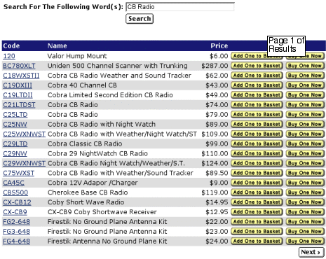
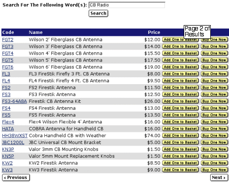
ValcoElectronics.com, an online store, is another site that commits this blooper. Searching for "CB Radio" yields 98 hits displayed 20 hits/page. The only way to find that out is by stepping laboriously through all the pages one by one (see below). Aargh!


Avoiding the Blooper
Search results should not only remind users what the search-terms were and indicate the number of hits, they should also make it easy for users to navigate among all the hits. If a large number of hits is displayed in a series of pages, it should be clear how many results-pages there are, and it should be possible to get to any results-page in a few clicks, preferably one.
GoodGuys.com
Search results at GoodGuys.com, the website of a consumer appliance store, show how to avoid the blooper: right at the top of the results they indicate how many results pages there are, and provide links to all of them (see below).
