Web Blooper of the Month
Internal & External Links Look Alike
A common problem in websites is that users can't tell whether links point to an anchor-point elsewhere on the same page or to a separate page. Users may click on a link expecting it to take them to a different page, but instead are taken to a heading further down (or up) in the same page. Or they may expect a link to take them further down the same page, when in fact it goes to a different page. Either way, they may not realize that where they arrive is not where they expected to go, so they quickly become disoriented as they try to move around the site.
Web-browsers do not mark within-page and between-page links differently, so it is not surprising that many websites have this problem. Browsers do usually show the destinations of links in a message-line at the bottom of the browser window when the mouse-pointer is over the links. However, few users pay attention to that, mainly because the information displayed there is too cryptic for them to understand.
Page Contents or Links Elsewhere?
Confusion between within-page and between-page links most often arises in web-pages that start with a table-of-contents at the top of the page. If the contents list is all that is visible without scrolling, users might easily (but wrongly) assume that they are looking at a site table-of-contents with links to separate pages.
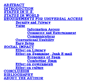
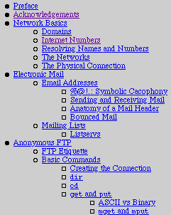
For example, below are tables-of-contents for two different articles posted on the Web. The one on the left is at ACM's website. The links in its table of contents are all for anchor-points further down on the same web-page. The article on the right is at Indiana University's site. The links in its table of contents are all for separate web-pages. Users cannot tell just by looking at the links whether they are internal or external. Neither table-of-contents has a label explaining what it is.
General Motor's website also formerly exhibited this problem: the link-lists at the top of many pages could be mis-interpreted as links to other pages (see below). When the link destinations are already in view, as on this page, users are particularly likely to assume that the links go elsewhere, because why would a page need links to somewhere that is already displayed?

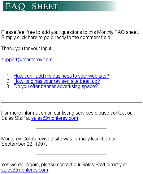
A particularly confusing case of this blooper can be found on the FAQ page at Monterey.com. At the top of the page is a list of questions answered on the page. Each question links to its answer. However, the answers lack any headings indicating what question they are answering, making this FAQ very disorienting to use. (Never mind that the questions aren't really FAQ's; see last month's featured Blooper: FAQ Doesn't Contain FAQs).
Mixing Internal and External Links
Sometimes both internal and exteral links are included in a single navigation bar, with no way to tell which does what. The Home page of TechnologyReview.com is an example: it has both types of links in its main navigation bar (see below, upper left of page). Most of the links display different pages of the site, but the "Focus of the Week" link jumps to the article in the center of the page.

A product detail page at Acer.com exhibits the same problem. Although they are all in the same navigation bar, "Features" and "Bundle Software" link down the page, while "Specification" goes to a different page.

Avoiding the Blooper
The fact that browsers don't distinguish between within-page and between-page links is only a weak excuse, not a valid justification, for creating a website in which users can't tell whether links are within- or between-page. It is possible, through careful positioning and labeling, to make it clear to users that the destination of a particular link is inside or outside of the current page. It is just that many web-developers aren't aware of the need for users to know this and so don't do anything to make it clear.
Mark TOCs Clearly as Page Contents
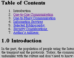
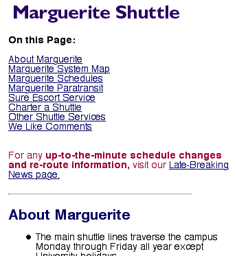
If a web page starts with a list of links that is a table of contents for the page, one straightforward way to avoid the blooper is to simply label the list as page contents. The Internet Engineering Task Force's website uses the heading "Table of Contents" (below, left), while Stanford Universities website uses the heading "On This Page" (below, left). I prefer "On This Page" because it cannot be misinterpreted to mean site contents.
Mark Internal Links with Graphic Symbol
Another way to distinguish internal links from external ones is to mark internal links with a graphical symbol that suggests that they go "down the page". Philips.com (see below) does this quite effectlvely using small down-arrowheads, in my opinion.
