Web Blooper of the Month
Not Linking Directly
Imagine you're looking on the Web for something specific -- a product, service, or piece of information. After browsing and searching for a while, you spot a link that promises to be exactly what you're looking for. You triumphantly say "Yes!" and click on the link... only to find yourself looking at the home page of some website that might have what you're seeking, assuming you care to look for it there. This is the blooper of not linking directly. It has several variations.
Monterey.com
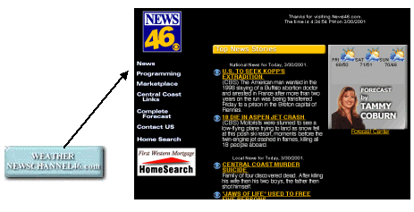
The primary form of the blooper is exemplified by Monterey.com. The site's home page includes a button promising weather information (see below). Visitors probably expect it to display weather forecasts for the Monterey peninsula. Instead, it displays the home page of News46.com, a news site that includes weather reports. Users would have to go to that site's Weather section and look for Monterey weather. Or not. On the Web, users don't "have to" do anything. For example, when I found myself unexpectedly at News46, I immediately hit BACK.

IGC.org
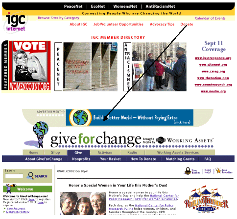
Dumping visitors at another site's home page can hurt your organization, as is made clear by the website of the Institute for Global Communication (IGC). IGC.org's home page includes a "Donate" link to encourage visitors to help support the organization (see below). Such links usually go to a page with instructions for donating, an address, maybe a donation form, and the tax status of the organization. At IGC.org, the "Donate" link goes to the home page of GiveForChange.org, a donation clearinghouse for non-profit organizations. Once there, it isn't clear how to donate to IGC. One has to find IGC in GiveForChange's listings of organizations. Or not.

BarnesAndNoble.com
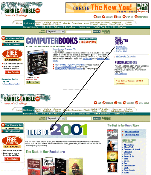
A third form of the blooper is specific-looking links that dump users at a generic page. It occurred at BarnesAndNoble.com. In December 2001, their Computer Books page listed popular computer books and provided links to "More Computer Books". One such link was "Best of 2001" (see below). Most people would expect that link to go to BarnesAndNoble's list of the best computer books of 2001. It actually went to a list of the best books of 2001, in all subject areas. Users had to scan that list for computer books.

Avoiding the Blooper
The guidelines for avoiding this blooper are:
- Links should fulfill their promise. A link that names or shows a specific product should go to that product's page. It should not go to the home page of a site that sells that product, or to the front page of a category containing that product, or to a site map listing that product.
- Stay on track to goal. If users have navigated down into the content hierarchy or along a sequence of steps, links to proceed should preserve the level of specificity already achieved. It is poor design to unexpectedly pop a user out of the track they were on into a more generic area of the site, forcing them to find the track again.
Except for the aforementioned example of the blooper, BarnesAndNoble's site follows these guidelines fairly well. For example, in the same page and list of links as the one exhibiting the blooper is a "New Releases" link. It goes to a page of newly released computer books, as expected. Likewise, the "Coming Soon" link does not forget the level of specificity the user had reached.
CharityFocus.org
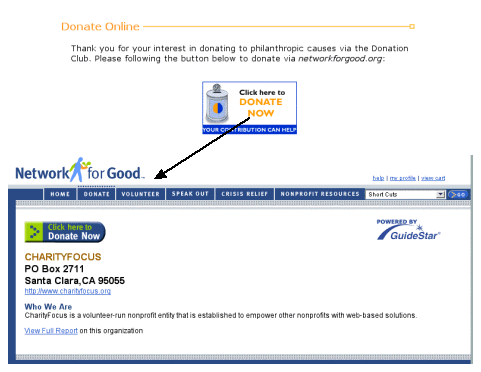
Like the Institute for Global Communication (above), CharityFocus is a non-profit organization that receives donations through a donation clearinghouse rather than accepting them directly. Therefore, like IGC, clicking "Donate Now" on CharityFocus' donations page (see below) goes to another website, in their case NetworkForGood.org. Unlike IGC, CharityFocus donors are taken directly to CharityFocus' own page at NetworkForGood.org, rather than to the donation clearinghouse's home page.
