Web Blooper of the Month
Current Page Not Indicated
Have you ever tried to get around in an unfamiliar town or neighborhood, but found yourself stymied by a lack of street signs? When it's difficult to tell where you are, it's easy to get lost. Even if you don't actually get lost, you feel lost. That's how Web-users feel when they visit websites that don't show clearly what page you are on.
The current page can be indicated in by either marking its item in the navigation bar or by putting a page title prominently on the page. Well-designed sites do one or both of these. Many websites either don't do either, or try to do one or both but don't make the markers or titles prominent enough. Let's look at some examples.
ValcoElectronics.com
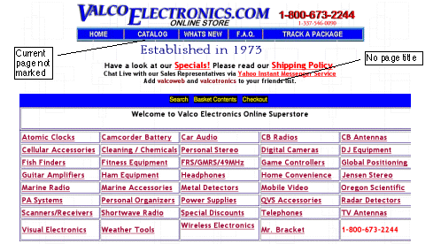
Until a recent site upgrade, ValcoElectronics.com didn't mark the current page on the navigation bar or provide page titles (see below). The page shown was the Catalog page, but there was no way to know that from what was on the page. For example, this page could easily be a Home page.

RealEstate.com
Sometimes Web pages lack identification due to poor enforcement of site-wide policies. For example, most pages at RealEstate.com are identified, but the site's "Find an Agent" page formerly had a banner ad in the page title's position (see below). If temporarily distracted from your computer after arriving here, you might not remember if you were at "Find an Agent", "Find an Appraiser", or "Find a Broker".

Avoiding the Blooper
As I said in introducing this blooper, the current page can be indicated in one of two ways:
- Nav bar. Marking the current page's item in the site's navigation bar.
- Page title. Placing a page title prominently, near the top of the page content.
A few pages at RealEstate.com lack titles, as in the example above, but most have them. The site doesn't mark its navigation bar to indicate the current page, but its page titles are prominent enough that few users would be confused about where they are (see below).

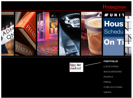
Pentagram.com is a site that indicates the current page on the navigation bar only (see below). Even without separate page titles, the marked navigation bar clearly indicates the current page.

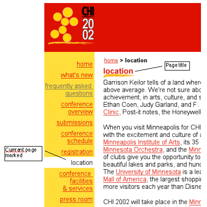
Obviously, if indicating the current page by marking the navigation bar is helpful and showing page titles prominently is helpful, doing both at once would be absolutely clear. As an example, examine a page from the 2002 ACM Conference on Computer-Human Interaction, ACM.org/CHI2002 (see below). This site actually has two page titles on each page: one in the navigation trail ("home > location") at the top of the page content area, and one just below that.
