Web Blooper of the Month
Active Link to Current Page
An extremely common navigation blooper is for a web page to include an active link to itself. Clicking on such a link merely reloads the page. At best, this wastes people's time as the page reloads. At worst, if they didn't realize the link just redisplays the page they were on, it can be disorienting. Also, any data entered into forms on the page will be lost.
This blooper has two variations, depending on whether the active self-links are in the navigation bar or elsewhere on the page.
On Nav Bar
ComputerWorld.com
The most common form of this blooper is for all the links in a site's ever-present navigation bar to be active on all pages. An example can be seen at ComputerWorld.com, an online computer magazine.

Galor.com
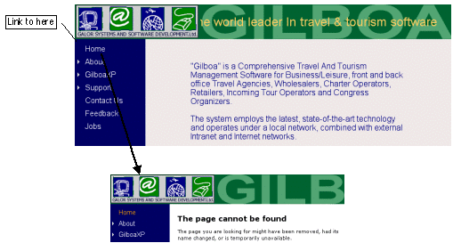
Galor, a software company based in Israel, gets "extra credit" for the blooper. Their Home page has a link to itself, but the link is broken! Thus, clicking Home while on the Home page displays a message that the page cannot be found, even though we were just there (see below).

Not on Nav Bar
Self-links that are not in the navigation bar tend to be more trouble than those that are in the navigation bar. Site-users often can't easily tell whether such links come back to this page or not. When a user clicks on such a link, s/he may not initially realize that the same page has been redisplayed, especially if s/he had been scrolled down the page.
Monterey.com
At Monterey.com, a tourism site, the entire image serving as the title of the "Area Maps" page is a link to... the Area Maps page (see below). At best this is useless; at worst it can cause site visitors to become disoriented.

Amazon.com
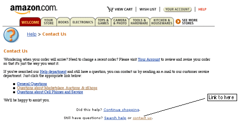
Amazon.com, an online store, provides an excellent example of how "non-nav-bar" self-links can disorient users. In the Help section of the site is a Contact Us page for emailing questions to the company. At the bottom of the page is this instruction: "Still have questions? Search help or contact us." (see below) The "contact us" link goes to the Help>Contact Us page, which is this page. Perhaps Amazon.com intended this as an intelligence test for their customers: the more intelligent the customer, the fewer times they'll go around this loop before they realize they aren't going to get their questions answered and abandon Amazon for another store. I won't say how many times I went around.

Avoiding the Blooper
Jakob Nielsen, in his book Home Page Usability, gives the following design rule: "Don't include an active link to the homepage on the homepage". This rule can be generalized to any page:
Don't include an active link to the current page.Some Web developers "justify" active navigation-bar links to the current page by arguing that Web users occasionally need a way to refresh the page. Sorry: that's a poor excuse. Most browsers have a "Reload" button, allowing users to refresh the page in the rare cases when they must. The real reason the navigation-bar form of this blooper is so common is what I said earlier: it's easier to use the exact same navigation-bar code on every page than it is to alter the code for each page. But hey: it's not that much more work, after copying the navigation-bar code, to edit out the link to the current page.
UIWizards.com
The correct approach is simply to leave all the items on the navigation bar on all pages, but remove the link-code from the item the current page. This makes the navigation bar consistent from page to page, while eliminating the active-self-link blooper. I use this approach in my own website, UIWizards.com, in both the navigation bar and the text-only links at the bottom of every page (see below).
