Web Blooper of the Month
Calling Site Visitors "User" to Their Face
When websites refer to site visitors as "users", that's a strong clue that they were designed from the point of view of the people who developed the website, rather than that of the people who are intended to use it.
"Users" is what we -- software and Web developers -- call people who use our systems. It's a fine term to use when we are talking with other developers. It's part of our professional jargon -- our way of communicating succinctly with peers. But "users" is not how people refer to themselves. Well, maybe heroin and cocaine users refer to themselves as "users", but nobody else calls themselves that.
Websites that call users "user" to their face are committing a blooper. The amazing and sad fact is that this blooper is extremely common.
Consider the online booksellers BarnesAndNoble.com and BookPool.com. Both use the word "user" to refer to the people who visit their sites.
BarnesAndNoble.com
BarnesAndNoble's Computer Books page uses the ambiguous phrase "Home Users" -- does this mean people who use homes, people who use computers at home, or people who use BarnesAndNoble.com at home (below)?

BookPool.com
Almost as bad, BookPool.com calls its visitors "Past Users" or "New Users" on its Account page depending on whether they've registered (below).

Amazon.com
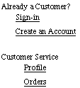
In contrast, their competitor, Amazon.com, uses the more appropriate and less geeky term "customer" (below).


FinancialEngines.com
A more blatant form of the blooper is exhibited by the investment advice website FinancialEngines.com: it not only calls site-visitors "user", it makes them refer to themselves as "user". The Home page commits the normal form of the blooper by asking "First time users" to "start here" (below left). The Advice page asks visitors to classify themselves to help guide the site's investment advice, with "An individual user" as one of the available options (below right).

Maps.Yahoo.com
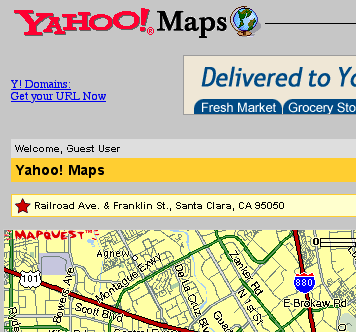
Our last example of calling site visitors "user" comes from Yahoo Maps. Visitors who haven't signed in are greeted "Welcome, Guest User" (see below). Why not simply "Welcome, Guest"?

Avoiding the Blooper
Calling users "user" to their face is an easy mistake to make. "User" is developers' jargon for people who use the website. If a development team doesn't explicitly think about this and choose a more appropriate word, "users" is the word that will appear in the site.
However, as easy as it is to make this blooper, it's just as easy to avoid or correct it. All it takes is awareness and a few moment's thought. Yahoo's "Welcome, Guest User" seems a clear case of ending up with the developers' default term because no one thought about it. Amazon.com's use of the sensible word "customer" instead of "user" cannot have cost them any significant money or development time. The table below lists other websites that avoid calling their visitors "user":
|
AA.com |
 |
|
HauteAtHome.com |
 |
|
WalMart.com |
|
Because this blooper is so easily avoided and corrected, there is no valid excuse for calling users "user" in a website.