Web Blooper of the Month
Stealth PDF Links
People hate to wait, especially when the wait is unexpected. One way to make visitors to a website wait unexpectedly is to fail to mark links that bring up PDF documents rather than regular (HTML) web pages. Site-visitors who click on such links are, without warning, forced to wait 10-30 seconds while their browser's PDF plug-in (e.g., Adobe Acrobat Reader) starts up. Furthermore, there is usually no way to stop the process until the document is displayed, so the user must wait for the document to display even if s/he doesn't care to see it.
Several Web-designer colleagues who encountered this blooper have pointed me to sites that commit it. I've also often encountered it myself.
Teknion
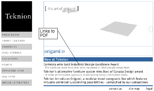
The blooper can be found on the Home page of Teknion, a Canadian manufacturer of workplace furniture (see below). It's bad enough that the links under "New at Teknion" are not clearly marked as links, but the first one (only) is a link that displays a PDF file.
Keystone Health Plan Central
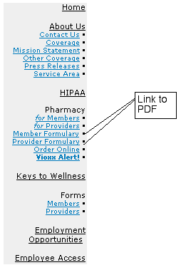
Another site that has unmarked PDF links on its Home page is the Keystone Health Plan Central website (see below). Both "Formulary" links display PDF documents without warning. Links on a site's main navigation bar that display PDF links are especially misleading: no one would expect that.
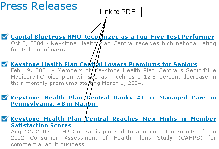
KHPC.com also commits the blooper on its Press Releases page. Nothing on the page informs visitors that the Press Releases are PDF documents. Perhaps the designers expect site-visitors to look at their browser's status line, where the destination of links is previewed. However, few Web users ever look there unless somehow warned to do so.
"Media by Sony" Website
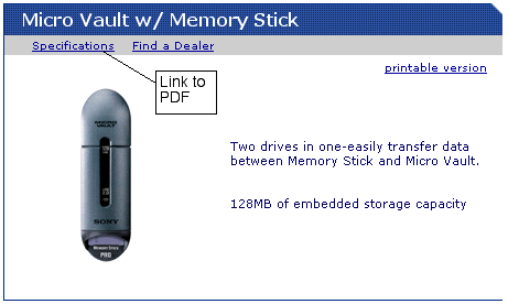
Our final example, from Sony's "Media by Sony" division, illustrates a fairly common form of the blooper. Product specifications are often PDF files, but many sites, MediaBySony.com included, do not mark them as such. Site-visitors who don't know that product specs are often PDFs will click and have to endure the 10-30 second wait while their PDF reader starts up.
Avoiding the Blooper
Links that display PDF documents are easy to mark, so there really is no excuse not to mark them. The marking should be highly salient, both to visitors who can see graphics and to those who cannot. PDF symbols such as that displayed on the About Us page of Refinery.com (below) are helpful in making PDF links stand out, but they aren't by themselves sufficient, because sight-impaired Web users and those whose browsers don't display graphic images won't see them. Therefore, it is important to include ALT text for the PDF symbol or external text identifying the link as a PDF link.

Further guidance on how best to mark PDF links can be read in Jon Ashley's excellent article: "Visual Cues Can Make PDFs More Usable for Your Site Visitors."
No amount of marking makes it OK to have links on a navigation bar that display PDF documents. Navigation bar links should never open PDF documents. They should always take the user to some other page on the site, where PDF links -- or any type of link -- may be provided.
(Thanks to Jon Ashley, Avi Soudack, and Bill Litfin for the examples used in this article.)