Web Blooper of the Month
Home Page Identity Crisis
Home pages should allow website visitors to determine the site's purpose in a quick scan of the page. People want to quickly determine whether the site has something of interest to them. Home pages that don't let users easily do this commit not only a content blooper, but also a navigation blooper.
PriceWaterhouseCoopers (PWCGlobal.com) and PWC.com
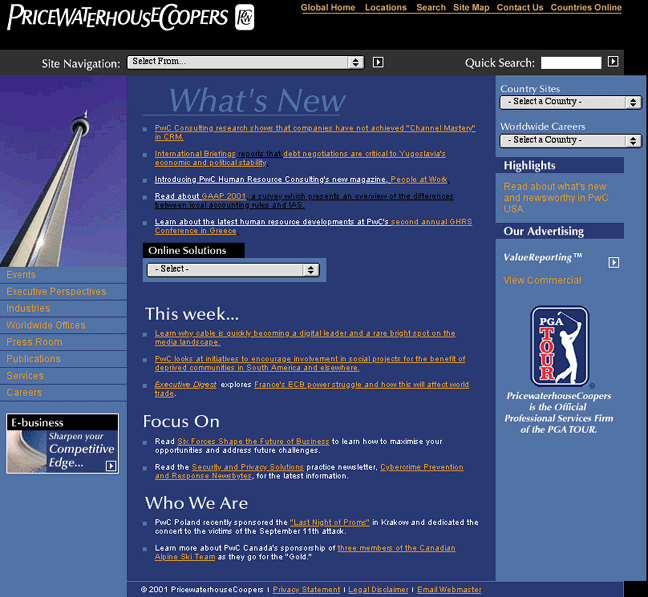
Look at the home page of PriceWaterhouseCoopers' website (below), and try to figure out what the company does. The home page offers few clues, so if you don't already know, looking at their home page probably won't help.

The navigation links and menus around the margins of the page could be for any business. The list of headlines in the middle suggest that it might be a business news service. The main thing suggesting a company identity is the "Who We Are" section at the bottom middle of the page. What it suggests is that PriceWaterhouseCoopers is a foundation sponsoring international events.
In fact, PriceWaterHouseCoopers is a large accounting, auditing, and management consulting company. Where does it say that on their home page? On the bottom right, buried under a golf logo in hard-to-read white text, are the words "...Official Professional Services Firm of the PGA Tour." Not very helpful. First, "professional services" is an insider industry term that, to outsiders, means anything from lawyers to prostitutes. Second, even if you know what "professional services" means in this context, this tiny clue on the home page gives you no reason to believe that PriceWaterhouseCoopers provides services for anyone besides sports organizations.
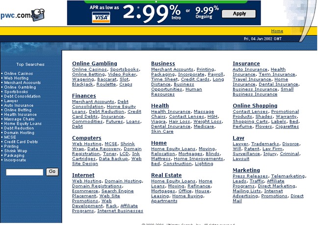
PriceWaterHouseCoopers' vague home page is made worse by another problem not entirely their fault: the web address most people would try in attempting to reach their site, "PWC.com", is owned by a different company and takes you to that other company's website. PriceWaterhouseCoopers' site is at the much harder-to-guess address "PWCGlobal.com" (although "PriceWaterhouseCoopers.com" also works). Worse, the home page at PWC.com is even more poorly identified than is PriceWaterhouseCoopers' home page. One can't even tell what the full name of that company is, much less its business. It looks like it could be an e-commerce company (see below), but that's not clear.

The combination of these two poorly-identified websites puts PriceWaterhouseCoopers in a very bad situation. Someone who looks for them under www.PWC.com can't immediately tell that they are in the wrong place. And if someone seeking an accounting or auditing firm happens to find www.PWCGlobal.com, they might not realize that they are in the right place.
Acer.com
Next, see the home page of Acer Corporation. What business are they in? They make and sell computer equipment, but you couldn't tell that from their home page. To figure out what this website (and the company) is about, you have to go a few pages into the site.

On their home page, they ask, "Which word best describes Acer?" I'll guess that many visitors leave it on "Don't know".
Barneys.com
Barneys is an upscale department store in New York. Their website is very upscale, employing Flash animations in an unusual design in which the entire site is one page, a section of which scrolls left and right to show the requested information. (For now we will ignore the problem that the well-heeled customers of Barneys probably aren't technophiles who have the latest Flash plug-in.)

For all its sophistication, Barney's home page is not particularly forthcoming about what Barneys is. "Taste, Luxury, Humor!" is all that is explicitly said about what the site offers. The categories on the navigation strip suggest a department store, but only implicitly.
Of course, this mysterious home page may be intentional. Barneys' management may not care that newcomers can't tell what the site and the store are about: if you don't already know, maybe they don't want you here.
Earthwatch.org
As an example of a website that explains its identity and purpose very well, check out the home page of Earthwatch (below). I don't have to explain what Earthwatch is; you can tell from its home page.
