UI Wizards
Product usability consulting
Web Blooper of the Month
Dueling Search Controls
At some websites, visitors encounter more than one set of Search controls to choose from. "Which ones should I use?" "Are these different or the same?" "Do they search through the same data?" These are questions that arise in the minds of site visitors when faced with competing Search controls. As explained in Steve Krug's web-design book Don't Make Me Think, it's a poor design that causes users to stop thinking about their work and start thinking about how to operate the website.
CNN.com
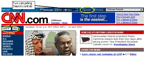
Until a recent site update, CNN.com, the website of the television news company, provided a good example of competing Search controls and how they can confuse people (see below). Visitors to that site could easily mistake the Search button at the top of the page -- the one labeled with a magnifying glass -- for the site's Search function. In fact, that Search box was a sponsored function that brought up Netscape's search engine for searching the entire Web. CNN's Search box, in contrast, was "buried" just under the big red CNN logo. It was further "disguised" by the word "SEARCH" in it, making it look like a button rather than a text field. When I showed people this site and asked them to find a news story using the Search function, they almost always tried the top Search button first.

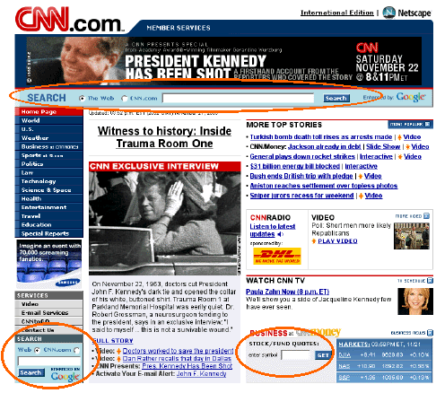
CNN's new, improved website eliminates the misleading Netscape Search box (see below) and clearly distinguishes its Stock/Fund Quote lookup function (lower right) from its general Search function. Unfortunately, while eliminating one form of the blooper, it others. Most of its pages now have two copies of the same general Search function (top and lower left), forcing users to decide if they are different and to choose between them. Secondly, the Search function defaults to searching the entire Web, invoking Google, which isn't what most visitors would want from this site's own Search function.

Los Angeles Times website
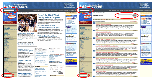
Another news organization, the Los Angeles Times newspaper, has two competing Search boxes on the home page of its website, LATimes.com (see below, left). Here, however, the problem is that it is unclear how they differ. The one at the upper left of the page is labeled "Search", while the one at the lower left is labeled "Archives", "Enter Keyword", and "Detailed Search". But the upper Search box can find articles in the site's news archives, which are presumably the same "archives" the lower Search box refers to. What then is the point of the lower Search box?

To compound the duplication, when the site displays Search results, it includes a Search box to make it easy to search again (see above, right). Thus, after a Search, the fixed portions of the page -- with their two competing Search boxes -- now compete with a third Search box. It seems likely that the Search results portion of the page was designed without the knowledge that it would appear embedded in a page that already has a Search box.
CPSR.org
Until a recent redesign, the website of Computer Professionals for Social Responsibility, CPSR.org, exhibited an interesting variation of the "Competing Search Controls" blooper. The Home page had two Search boxes, one labeled "Quick Site Search", the other labeled "Complete Search" (see below). The two Search functions used different search engines and were labeled as different, but the differences between them weren't clear enough to allow site visitors to decide rationally which one use. For example, is the Quick Search incomplete? Is the Complete Search significantly slower?

It turns out that the Quick Search is not much faster than the Complete Search, and sometimes is more complete, returning more hits for the same search terms.
The old site's designers may have provided two Search functions because they understand the implementation differences and considered the speed vs. completeness tradeoff to be significant. Or maybe they just couldn't decide which one was better, and so included both. The bottom line is that the differences between CPSR.org's two Search functions do not seem important enough, or even reliable enough, to warrant burdening users with deciding which one to use. This blooper was eliminated in when the site was redesigned.
Avoiding the Blooper
Web designers may have reasons for providing multiple competing Search functions on a single Web page. However, providing multiple Search functions has costs that must be weighed against the benefits. The costs boil down to this: the Search functions compete for attention.
If the competing Search functions are different, as on the CNN and CPSR home pages, one cost is that people might use the wrong one. They might notice the wrong one first and use it, overlooking the right one. Even if they see both, they might not know how they differ (or even that they differ) and choose the wrong one for their intended Search.
If the Search functions are the same, as on LATimes.com, users must decide which one to use. Unnecessary decisions cost time and distract people from their own tasks.
For Search functions, as for user interfaces in general, less is more. In fact, for Search boxes on a page, the best number is one. More than one causes confusion, delay, and error. If you are considering putting two or three copies of the same Search box on a page because you aren't sure where visitors will look, don't. Really. Place just one Search box prominently, in one of the standard places: top left under the logo, top right, lower left under the navigation column. And make sure users recognize it as a Search box.
If you plan to include a function for searching the entire Web (as at CNN.com), heed this advice from Nielsen and Tahir (2001):
Don't offer a feature to "Search the Web" ... Users will use their favorite search engine to do that, and this option makes search more complex and error-prone.
If you want to provide different Search functions for searching different data sources, such as general site content vs. news articles vs. stock prices, design them to look completely different. First consider making everything other than the general site Search box a link to a separate page. If that isn't acceptable, design each Search box to look as specific to its own search-domain as possible. None of the special-purpose Search boxes should look like a general site-Search box (see below, left). For example, a function for looking up stock quotes could be sized to fit only company stock-symbols, and its button could be labeled "Get Quote" instead of "Search" (see below, right).
Finally, if you are providing two Search functions in order to give users a choice between Search implementations having different characteristics, first question whether that is the real reason. If the real reason is that the developers can't decide which implementation they prefer, choose one arbitrarily and consider the other one "exploratory development". If the intent to offer users a choice is sincere, ask whether users really care. Even if they do, don't offer the choice on your home page. The home page should have one general Search box, period. Options should be confined to the Advanced Search page. Even there, the choice should be presented as an option affecting a single Search box, rather than as multiple competing Search boxes.