Web Blooper of the Month
Big Buttons With Tiny Click-Targets
ElCamino.cc.ca.us
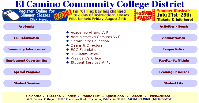
The website for El Camino Community College (Torrance, California) displays a fairly common Blooper: big buttons with tiny click targets.

Based on the appearance of the large gray navigation buttons; on the sides of the page (e.g., Academics, ECC Information, Administration), most people would assume they could click anywhere in each button to go to the indicated section of the website. However, they can't. They have to click exactly on the text labels in order to go to the indicated page. Otherwise, the browser ignores their clicks. This is not something that users of the site will get used to, for two reasons:
- Most people won't visit this website very often, and so aren't likely to remember from one visit to the next,
- The behavior of these buttons contradict not only their own appearance, but also most other buttons people encounter on the Web.
I've seen this blooper in web-applications developed by my clients, but I considered it rare until I started seeing it recently on some pretty prominent websites.
www.Continental.com

For example, Continental Airlines' website (www.Continental.com) has tabs at the top of its home page for navigating to the site's functional areas. As in many websites, the tab-width adjusts according to the width of the visitor's browser window. However, only the labels of the tabs respond to mouse-over and mouse-clicks.
Until recently, this blooper could also be seen at www.AltaVista.com (a search site) and www.Powells.com (a website for a Seattle-area bookstore). See the page-images below. However, both AltaVista and Powells recently eliminated this blooper when they updated their websites.
AltaVista.com (late 2000)

Powells.com (late 2000)

How to avoid the blooper
This blooper can be avoided by either:
- Make the button images into whole-image links by enclosing the IMG tag in a link tag, or
- Design the image-map(s) for the buttons so that entire buttons are mapped as links. If the buttons widen when the site-visitor widens the browser, the width of the mapped link must be a calculation.
Neither solution is difficult, as is clear from the fact that so many Web sites get it right.