Web Blooper of the Month
Centering Everything
One sign of a neophyte Web designer or developer is a tendency to center text, controls, and other elements on the page. It may be because HTML and Website layout tools make centering easy, and some Web designers haven't yet learned that centering is usually a bad idea.
Prose text written in a left-to-right language such as English
is harder to read when centered than when left-aligned. The reason has to do with the way our
eyes are trained to scan back and
forth over lines of text. When lines don't start in the same horizontal
position, reading is disrupted. See what I mean?
VitaminShoppe.com
Despite the difficulty of reading centered text, many websites display large blocks of centered prose. See, for example, a legal disclaimer at VitaminShoppe.com.

NHASP.org
Bulleted text suffers from centering more than prose text does. Bullets are supposed to mark list-items. Centering bulleted items "buries" the bullets, effectively neutralizing them. It requires slow, laborious zigzag eye movements.
Nonetheless, it is easy to find centered bullets on the Web. The New Hampshire Association of School Principles website has an example: not only is their mission statement centered, the bulleted list of links is too.

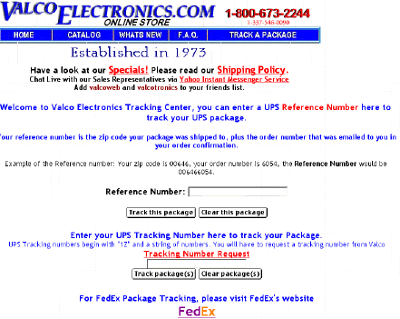
ValcoElectronics.com
Our Grande Finale example of centering comes from the package-tracking page of ValcoElectronics.com. This page centers everything: prose text, controls, and links.

Avoiding the Blooper
The basic rule on centering is: Don't. If you need more detail, here are additional rules:
- Don't center prose. Prose text should never be center-aligned. It should be left-aligned or justified. Single-line headings and poetry are the only text that should be centered, and even those should be done only sparingly: many headings are left-aligned, and poetry is often not centered.
- Left-align bullets. Bulleted lists should be aligned so the bullets are aligned; otherwise the bullets' effectiveness is greatly reduced. Itemized lists in general should not be centered.
- Don't accept bad defaults. Don't center content just because it is the default in your Web development tools. The World Wide Web Consortium, which defines HTML, had good reasons for making left-alignment the official default for content in table cells. If your Web development tool has center-alignment as its default, it is wrong; you should change the default or use a different tool.