Web Blooper of the Month
Unhelpful Content Descriptions
Websites often display a choice of products or services, each one with a name, a brief description, and (for products) perhaps a picture. The information about the items should, first, allow people to determine if any are what they want. Second, in case multiple items seem relevant, the information should help choose between them.
At many websites, item names and descriptions do not help site-visitors with either of these two decisions. Often, it seems as if they were written at different times, by different people, with no coordination, no consideration of how the items might best be contrasted, and no thought to how item-descriptions will be interpreted in the context of the array in which they appear. I am not the first Web analyst to say this; Web consultant Jakob Nielsen has often often mentioned this problem in his critiques of websites (see UseIt.com).
A good example of an unhelpful item-description comes from a client company's customer-support website I reviewed several years ago. Let's call the company "Grafix". One page of the site listed software "patches" that could be downloaded and installed to correct known bugs in the company's software. Part of the Patch page was set aside for the patches that the company was currently recommending to its customers. That section was labeled:
Recommended Patches
These patches have been tested and will keep your Grafix workstation running smoothly.
I pointed out in my review of the website that this might suggest to some customers that the other patches on the page had not been tested. The person who wrote the section-label had considered it only in isolation, not what it implied about the rest of the page in which it appeared.
Connectix.com (was separate company; now subsumed by Microsoft)
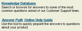
A more recent example comes from the customer-support website of Connectix, a software company. Like many customer-support sites, Connectix.com tries to help customers to get answers to their questions. The problem is, the site provides two different resources for this, but doesn't explain or contrast them very well (see below). One resource is labeled: "Knowledge Database: Search or browse for answers to some of the most common questions asked of our Customer Support team." The other is labeled: "Answer Path Online Help Guide: Use this tool to quickly pinpoint the answers to questions about your product." From these descriptions, it is hard to tell which one to use in a given situation.
Pitsco-LEGOdacta.com
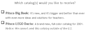
The website of Pitsco-LEGO Dacta, a maker of construction toys, provides an example of poorly-contrasted objects rather than information services. The company has two catalogs that customers can order. Unfortunately, the names and descriptions of two product catalogs appear to have been written without regard for each other (see below). Both the catalog names and the descriptions are just noise-words carrying no information in this context: "new ... bigger... better", "brand-new, full-color". There is nothing here to help site-visitors choose between the two catalogs. I'll bet many people simply pick both and decide when they get them which one is relevant to them.
Netscape.com
For an example of a very poorly-written set of product descriptions, let's look at a software download page from Netscape.com. The descriptions on the page aren't just unhelpful for distinguishing the items, they are actually misleading (see below).
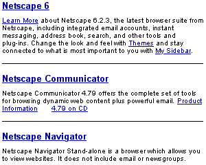
Assume that you want Netscape Communicator -- the whole works: Web browser, email reader, instant messager, calendar, and other tools. Which item would you click? The header "Netscape Communicator" naturally grabs your attention; it exactly matches what you want. However, a closer look reveals that this item is for Communicator 4.79, which at this point is almost two major releases old. What you actually want is the first item. Why is it labeled "Netscape 6" instead of "Netscape Communicator 6"? Because that's what the person who added it to the page called it.
Now assume you don't want the whole Communicator package. You just want the latest browser, in this case Netscape Navigator 6. Which item would you click? The third one, perhaps? Sorry, that's an old link for downloading Netscape Navigator 4.76. To get the latest browser, you must choose the first item and perform a custom, rather than a "normal", installation.
Avoiding the Blooper
As I said above, when a website or web-based application displays a set of items, information about items needs to help users answer two questions:
- Do any of these items match what I want?
- Which of these matching items best suits my purpose?
To do that, the item names and descriptions should not consist of marketing noise-words, such as "New!", "Bigger!", "Awesome!", "Fully-functioned!" They should consist of honest descriptions of what the item does and does not do, perhaps with reference to other items that have something a given item lacks.
Also, item descriptions cannot each be written in isolation, each by its own product manager. You can't list ten products all claiming "Does everything you need!" You also don't want items to inadvertently detract from other items, as they did in the case where some items were labeled "these patches have been tested". Item descriptions must be written together, with consideration for how they will be interpreted in context and how they contrast with each other. When new items are added, old items, if they are retained, should be revisited and possibly revised to ensure that they contrast properly. Alternatively, old items can be deleted or removed to an "archive" category.