Web Blooper of the Month
False Choices
In my Web Bloopers book, Blooper 10 is "Pointless Choice": forcing Web users to make choices needlessly. I listed four common varieties of that blooper:
- No significant difference: The options are not different enough to make a difference.
- Users don't know: The options are meaningless to the site's users.
- Obvious answer: There is an obvious choice, but the site ignores it.
- Site could figure it out: There is no need to ask this; it could be figured out automatically.
I am now adding a fifth variety of "Pointless Choice" bloopers:
- False Choices: The choices don't really exist anyway.
This blooper is becoming more common on the Web. The reason for the increase is that companies are cutting costs by buying generic third-party back-end systems instead of developing their own business-specific back-end services. Generic databases of airports or cities, for example, don't reflect any specific company's actual product or service offerings, and so may cause the company's website to offer non-existent choices to customers.
American Airlines
A good example of the "False Choices" blooper can be seen at American Airlines' website.
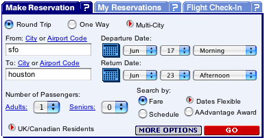
Customers who search for flights to "Houston" are required to choose from a list of possible "Houston airports". Some of the "Houston" airports are in Canada, and one isn't even an airport (see below). We will ignore that the other listing for Canada, "Houston All Airports", makes no sense because the only other listing for Houston, British Columbia is a bus station, not an airport. There is a worse problem.
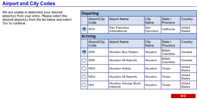
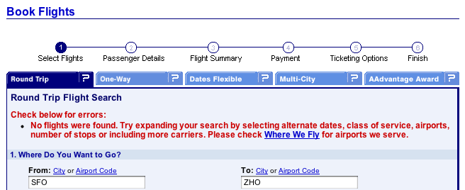
The more serious problem is that selecting either of the two Houston-listings in Canada reveals that American Airlines does not provide service there -- no flights, no buses -- nothing (see below).
So why does the website confront customers with choices that aren't really offered? Probably because American Airlines' website is based on a generic third-party database that has not been customized to reflect their service catalog. Blooper!
Travelocity.com
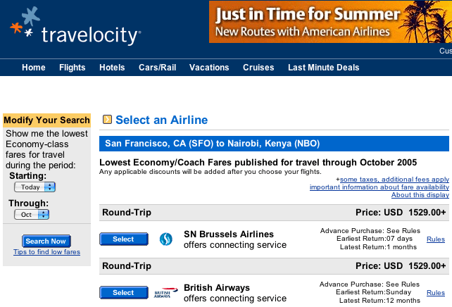
An even more frustrating example of the "False Choices" blooper can be found at Travelocity.com, an online travel agency. Searching the site for economy flights from San Francisco to Nairobi (Kenya) yields a list of low-cost flights (see below).
Clicking the "Select" button for a listing displays calendars indicating the dates on which the low fare is offered. Customers are asked to select a departure date (see below). This is a good design: it is easy to understand and use. If only it were accurate.
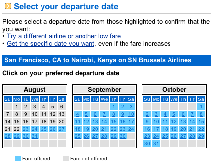
For most of the discount flights listed, many of the "available" dates aren't really available: selecting them displays a message saying that the airline "does not provide service between San Francisco, CA and Nairobi, Kenya on the selected date" (see below).
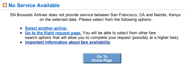
For example, for the first airline listed (SN Brussels Airlines), none of the dozens of dates shown in the calendar were available. The only way to discover that was to click on a date, wait for the "no service" page to display, click back, wait for the calendar page to redisplay, click another date, etc.
In order to discover that a choice isn't available, Web users often must go several steps down a path to their goal. Thus, the False Choices blooper, in addition to being a variety of Pointless Choice, is closely related to another blooper: Dead End Paths.
Avoiding the Blooper
If a human employee of your company offered a customer choices that were not really available, the customer would consider the employee either mis-informed and therefore incompetent, or deliberately lying and therefore untrustworthy. The customer would then transfer that impression to your company. Neither impression is one most companies wish to project.
Before your website lists "available" products or services, it should make sure they are really available. This is not to say that items or dates that are out-of-stock or booked up should not be listed. Of course you want to list them so customers can see your full catalog. However, unavailable products or dates should be marked to indicate that they aren't available, so customers won't go to the effort to order them and only discover several steps later that they wasted their time. At the very least, your site should not explicitly mark unavailable items as if they were available (as Travelocity's site does).
Amazon.com does a very good job of indicating the availability of products. Visiting the page for any product (e.g., my book Web Bloopers) tells customers almost more than they need to know about the current availability of the product.