Web Blooper of the Month
Wrapped Links: How Many?
When a textual link on the Web consists of more than one word, it may be wrapped to two or more lines. Whether it is wrapped depends on the width of the browser window, the width of the link's containing area of the page, the text font size, and other factors.
Wrapped links create ambiguity and confusion -- how many separate links are there? -- and are difficult to scan quickly. In general, they should be avoided, but can work if the ambiguity is minimized by proper graphic design.
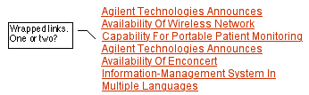
Agilent.com
A good illustration of the ambiguity of multi-line links is provided by Agilent.com (see below). By scrutinizing this "clump" of text carefully, site-visitors might be able to figure out that it contains two links, each beginning with the company name: "Agilent". However, that puts far too much of a burden on site-users. It should be designed so it is clear at a glance where links begin and end.
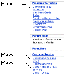
United.com
A different example of confusing multi-line links come from the website of United Airlines. On the frequent flier customer page is a list of links, some of which are wrapped see below). Because the line-spacing is the same between items as within them, customers might not be sure how many links there are unless they notice the capitalization.
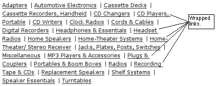
Radioshack.com
When links are in horizontal rows rather than vertical lists, links at the ends of lines may wrap to the next line, causing a slightly different sort of ambiguity. Radioshack.com provides an example (see below): five of the links in this list of product categories are split across lines. Careful visual analysis is required here to determine what the links are.
Avoiding the Blooper
The most straightforward way to avoid the blooper is simply not to let links wrap. Vertical lists of links can be placed in containing areas that are wide enough that no link wraps.
Of course, a design rule that textual links should not wrap conflicts with another important Web design rule: that text should be as fluid as possible to accommodate different sized browser windows and different font choices by users. Fixing a page's layout so firmly that no multi-word links ever wrap would result in inflexible layout and font size, which are themselves bloopers . There is no general solution to this conflict. Designers must simply attempt to minimize the incidence of all the conflicting bloopers through sensible page layout and reasonable default font sizes.
In specific cases, solutions are available. For example, the wrapping of links at RadioShack.com (see above) could be avoided through the use of non-breaking spaces between words in multi-word links. However, non-breaking spaces don't help when there is only one link per line, as in the Agilent example.
When multi-line links are unavoidable, the ambiguity they cause can be reduced or even eliminated through spacing and bulleting. A screen-excerpt from Albany.co.uk shows that if line-spacing between links is greater than that within links, ambiguity about the number of links can be eliminated (see below).

Bulleting links is even better than spacing for reducing ambiguity, as is shown by an excerpt from bookseller BarnesAndNoble.com (see below). However, bulleted items may not fit the graphic style of a particular website.