This is a new browser window. When finished viewing, just close this window.
Usability Test:
SmartKart Personal Shopping Service
Author: Jeff Johnson,
UI Wizards, Inc.
Creation Date: 1 June 2000
|
This document shows a usability test report for a situation in which we were hired to observe and interpret a test that was designed and conducted by another usability consultant. This report therefore does not describe how the test was designed and conducted; that was described in the other consultant's report. Instead, this report focuses on interpreting the test results.
The yellow boxes are annotations (not included in actual usability test reports) that explain the report's various sections. For your convenience, listed below are the annotated sections of this report.
Annotated Sections of this Report:
|
|
Here, for the benefit of busy executives who don't have time to read the entire report, we describe the purpose of the test and summarize the results. [Return to Top]
|
Purpose
To assess the usability of its online shopping service and to determine how the user interface of the service can be improved, SmartKart conducted a usability test of the service. Two versions of the service were tested: a) a desktop client application, and b) and a website.
Executive Summary of Findings
The Client version of the SmartKart shopping service has promise, but will require significant improvements in its design before it will be usable and useful enough to succeed in the market. The Web version of the service is much closer to being ready for release, however it could use some polishing of a few "rough edges". Improvements in the quantity and quality of product information returned by searches will be important to the success of both versions.
|
This section presents the results of a question test participants were asked before they were shown the software. Noteworthy quotes from participants are included. [Return to Top]
|
Before being shown any of the software designs, test participants were asked to describe how, in a very general sense, they would expect an independent online shopping service to work.
Most test participants expected the service to operate much like a web-search engine. They said that they would expect to be able to type in what they are looking for without having to wade through a lot of predetermined categories or departments. They said that they want to be able to specify aspects of the product besides its type, e.g., brand, price range, as well as features specific to the product type. Some participants said that they would want to be able to limit the search to products and merchants that were local to them so they could go look at the product.
Regarding search results, most participants wanted the service to list the following information about items it found: brand, price, features, availability, and delivery time. Many of the participants expected to see pictures of products (for tangible products). Several participants also said they'd like the service to provide some indication of product quality, e.g., ratings by the service, access to product reviews (e.g., Consumer Reports), and customer reviews. A frequent concern was that the search results would provide enough information that they could avoid having to look at each item one-by-one; some participants mentioned wanting the ability to examine multiple products simultaneously to compare them.
Several test participants raised the issue of trust, saying that they would have to trust the service in order to use it much. Trust issues took three forms: a) could consumers trust the service not to overlook obvious product offerings, especially well-known discount merchants, b) were the merchants listed by the service reputable and fair to customers, c) would the merchants listed by the service use customer information fairly?
Comments of Test Participants
- P1: I would expect to type in what I want. I'd expect it to run around and find things. I'd expect it to show me quality, price, brand name, and delivery time.
- P2: I would start by looking at the make, for example, Nokia. The price has to be reasonable. I usually go to each company's website. It would be nice if I could get products from different companies up on the screen at once so I could compare.
- P3: I would think there would be some sort of search engine. I would want it to bring all relevant products, and show price, delivery, and other stuff. I would want to investigate each product on their own.
- P4: I would want it to be easy to get to see the product. It should provide pertinent info about the product: price, availability, shipping.
- P5: It differs depending on how expensive the item. Security is a concern. I would want to be able to specify the particulars I was interested in: price, capacity (for a washing machine), etc.
- P6: I would hope it had a selection of types of couches... or styles... and like a price range and couches in that range. I would look up items possibly by brand name. I would want it to list: price, quality, where it is.
- P7: There are sites that search by category, but they don't let you refine the search. You have to re-search several times on all different categories. It's hard to narrow the search enough to avoid information overload. [The organization of the search results] would depend on what we're searching for. I'd like details on the products, so I don't have to look at all of them.
- P8: I've used some that don't find the good items (e.g., search for a book finds several, but misses the best price at Amazon.com). So it's important that a shopping service should get all the obvious places. But you need verification by the shopping service that the vendors are OK and honest and secure, because if you're looking for low prices, you many wind up with vendors you haven't used before.
- P9: I would look for whatever I wanted, e.g., a digital camera. I would like to look at a bunch of them, and get pictures, prices, features, ratings. I would look at cameras by going to the manufacturer. If I was looking for something obscure, I'd go to a search engine. I would want ratings to be independent and to cover the important brands.
- P10: Very often I know what they cost at in-store retail. On the Internet, you want to find a more reasonable price. I'm starting with a product in mind, right? I'd want to know what I could expect in price, what accessories are available, local availability, and access to reports on safety, durability, etc.
- P11: I would like something that was easier than going to all those sites. I would like to put in my price range, and whether I'm a beginner or an advanced consumer of the product. I'd like to know where I can get it locally. I'd like a picture, price, and where I could find it. I'd like to see comments from other users... consumer reviews.
- P12: I'd want details about the product. I'd like to be able to view products based on options (as in cars), price, availability.
- P13: You'd say what you want to buy, and what you want to spend. You'd say things you didn't want, like certain brands. In the results, you'd want a picture of each item.
- P14: It would be easiest to type in the items you're looking for first. Then a price range and brand name. Then they would give you a list of items with a range of prices. Then you could click on the one you were interested in.
- P15: I guess it would give me a "spreadsheet" of items, with plusses and minuses, price, and availability. It should act like a search engine.
- P16: I'd type in "new car". Then find out who sold it. Then go to compare prices. I'd like to see the bottom price, options, alternative prices. I'd want shipping info.
|
This section presents the results for the Web version of the shopping service. It describes problems seen in various parts of the Web application, and provides relevant quotes from test participants. [Return to Top]
|
The Web version of SmartKart proved to be pretty easy to use, especially compared to the Client version. All 16 test participants figured it out without much trouble. Most explicitly stated that they found it easier to use than the Client version. Of course, this is to be expected given that it has significantly less functionality than the Client version.
The Web version was not, however, free of problems. Below is a summary of the problems I observed during the tests, categorized according to the relevant part of the user interface. The problems are followed by memorable and useful test-participant comments, and then by my recommendations for improving the design.
Problems on Search Page
Keyword Search vs. Category Search
- Many participants tended to ignore the categories completely and go straight to keyword search, in many cases typing keywords that were pre-defined categories .
- Most participants did not initially notice that the current category is shown in the Quick Search area. Most had to have this pointed out to them. After it was pointed out, many commented that it "doesn't stand out enough".
- As a result of not noticing the category-indicator, many participants executed searches in which the keyword (e.g., "cd player") contradicted the current category setting (e.g., Books & Records & Video > Books > Biographies).
- Some participants first typed keywords, then tried to set the category. But setting a category clears the keyword field, so using a category with a keyword requires setting the category first.
- Some participants thought the GO SHOP button was only for Quick Search (i.e., keyword search) because it's in that area of the screen. So they weren't sure how to start a category-based search.
Category Hierarchy
- Many participants tried to expand categories by clicking on the arrows that are on the right of each expandable category.
- Many participants expected clicking on a "terminal" sub-category (non-expandable) to initiate a search on that sub-category. They'd click (or double-click), wait, and then say something like "Nothing happened. I expected it to show me all the digital cameras". This problem is related to problem 5 above. [Note: This expectation by users is understandable, given that in most shopping websites, clicking on a category immediately takes the browser to the page for that category, which lists sub-categories (if any) and products (if any).]
- Some participants didn't initially notice that categories expanded into sub-categories. This may be partly due to the fact that the entire screen refreshes (because the browser is really going to a new page), and the blank-and-refresh sequence is somewhat disorienting.
- Even after noticing the sub-categories, some participants didn't initially realize, after they clicked on and expanded a top-level category, that the sub-categories were also clickable/expandable.
- The fact that category links change color after being clicked confused a few participants: they mistook the "been there" link color as meaning "this category is highlighted", and therefore sometimes thought several categories were highlighted.
- Some participants felt that important top-level categories were missing, e.g., Clothes, Lawn & Garden.
- There is no obvious way, once a participant selected/expanded a category, to get back to no categories selected (i.e., the "all categories" state). The only way to do this is to click the browser's BACK button repeatedly until that state appears. However, this has the adverse side-effect of also clearing the other datafields.
Other Search Page Problems (some not encountered by users, but noticed by Jeff)
- A few participants assumed that the keyword field operates like many search engines, e.g., they used quotes, logical conjunctives such as "and", etc. Of course, the results were not what they expected.
- One participant clicked "Search Tips" mistakenly, either because she was looking for any button containing the word "Search" (which that button has and the "Go Shop" button doesn't), or because she misread "Search Tips" as a verb phrase and wasn't sure what "Tips" were.
- One participant commented that the "SmartKart Power" logo looks like a power button, but wasn't sure what it would do and so didn't click it.
- The keywords field is labeled "Enter Keywords". "Enter" is unnecessary; they know this is a field for typing into.
- There are several graphical imperfections in the Search page, e.g., random pixel crud here and there (especially in and around buttons), text labels butting right up against the left edge of their enclosing colored box instead of having a small margin before the text starts, slight mis-alignments of items. These make the page look tacky and amateurish. The entire page design should be cleaned up, preferably by a real graphic artist.
Problems on Results Page
Results Table
- Most participants didn't know what "QD rating" meant. Only one said "QD rating... SmartKart rating". The rest indicated that they weren't sure what kind of a rating it was (and their confusing was compounded by the fact that in the prototype, all rating-values were zero). Some expected clicking on or mousing over the "QD Rating" link to explain what it meant.
- Most participants didn't initially realize that clicking on a column header resorts the column. This was compounded by the fact that many clicked on "QD Rating" (see above) and saw no apparent effect because all rows had the same (zero) value.
- Most participants felt that the results returned by the various searches included items that were unrelated to the query, e.g., typing "cd player" and getting CDs and CD cases.
- Several participants didn't notice initially that items in the search results table were links. After being told, however, it made sense to them.
- Some participants didn't understand that when a lot of items were found, the results table showed only the first 50 items, and that the number-links under the table allowed them to switch between sets of 50 found items. Part of the problem here may be that few search engines use this format anymore (most provide only "< Previous N" and "Next N >" links, so this list of numbers may be unfamiliar. In addition, this control is unlabeled: nothing explains what it does.
- A few participants weren't sure whether to click on the item-link or the merchant-link. On day 1 of testing, the merchant link went to the merchant's home page, and the one participant who clicked it got lost. On day 2 of testing, this link had been changed to go to the item, and the one participant who clicked it on day 2 got where s/he wanted.
Other Results Page Problems (some not encountered by users, but noticed by Jeff)
- Some participants didn't notice that the search parameters were displayed at the top of the Results page. This wasn't a problem when the search had gone correctly, but it was a problem when the user had specified contradictory search parameters (e.g.: keyword: "cd player"; category: Books & Records & Video > Books > Biographies) and so got zero results, or when the user typed odd parameters into the keywords (e.g., "mandella" instead of "mandela").
Useful Participant Comments on Web-Version
- P1. "Here I can just put what I want. The other seemed more complicated."
- P1. [After searching for mandela bio, and clicking on result-items that went to merchant high-level pages instead of specific item-pages] "I put in his name. Who do I have to go through all this?"
- P2. "The SmartKart should run across the screen."
- P2. "I'd prefer to have everything on one screen."
- P3. "I think Quick Search is the easiest way to go. I usually use it [at other search sites]."
- P4. "I like the fact that the screen's not too busy."
- P4. "I don't feel like the search yielded accurate search results."
- P6. "This is nice that is has a brand, too."
- P8. [After trying web-version for 1 minute and not getting useful results] "At this point if I was at home, my attention-span would be over."
- P10. "Real simple. Simple is good."
- P11. "Simple... It's nice that you can enter a keyword right away."
- P11. "I don't like to start by limiting [search]. I want to see what they come up with and if they come up with too many, then I'll restrict the search."
- P12. "The web-version is closer to what I'm used to. I like the interface better."
- P13. Would like to be able to specify brand [which on day 2 of test was not available]. Would also like to be able to specify brands not to show.
- P15. [The web-version] "seems really easy."
- P15. "Birkenstock.com has a setup like this." [Note: Birkenstock.com has a horizontal series of drop-down menus for selecting categories and sub-categories. The content of menus on the right (sub-categories) changes depending on the setting of menus on the left (categories).]
- P16. "It looks clean."
|
This section presents our recommendations for improving the usability of the Web shopping service. [Return to Top]
|
- Clicking a category should not clear keyword textfield, allowing users to type the keyword first, then set the category.
- Make the arrows on the right of the category items clickable.
- Make the arrow for selected categories look different than the arrows for non-selected categories. E.g., arrows should be hollow triangles that fill-in black when the item is selected (see Figure 1, below).
- The link-colors of category items should not change once they've been selected. These links aren't really web-page links from users' point of view, so it doesn't help for users to know "been there, done that". The changing link colors only confuse some users, who think it means the item is selected. So set the link colors on these links to remain unchanged.
- Make the current category setting, which will affect the search, stand out more. E.g., put the text in the same color as the category links. Or make it first appear red, then revert to black after 1 second. Or use layout and spacing to make it stand out. (see Figure 1, below).
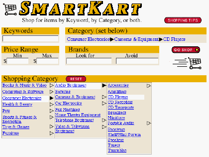
Figure 1. Recommended new design of Search page.
- Relabel "Search Tips" to "Shopping Tips" or "Tips for Shopping". The goal is to remove the noun/verb ambiguity.
- Add a button to the category setting that resets the hierarchy to "all categories" (i.e., no category selected).
- On Results page table, relabel "QD Rating" to make it more self-explanatory. If this is SmartKart's company rating of the product, then call it "SmartKart Rating" or "Product Rating". If it's something else, explain that.
- Either change the search results page-indicator to be more like the "Next N" indicators on most current-day web-search engines, or label it to explain what it is.
- The results information at the top of the page is "buried" in a prose sentence. Change the display to be more terse, so that the important info stands out more, e.g.:
Shopping for:?Consumer Electronics > Audio > CD Players
Found:?253 items
|
Here, we present the results for the Desktop Client version of the shopping service. As with the Web version, we describe problems seen in various parts of the application, and provide relevant quotes from test participants. [Return to Top]
|
The Client version of SmartKart was, in general, not easy for the test-participants to figure out. Most had a difficulty accomplishing the tasks they were asked to do. Below is a summary of the problems I observed during the tests, categorized according to the relevant part of the user interface. The problems are followed by memorable and useful test-participant comments, and my recommendations for improving the design.
Problems of General Understanding
- Several test participants thought that the client version was self-contained, i.e. contained all its data. Therefore, they wondered how it would be updated. E.g., P10 asked "How is SmartKart updated after I download it? Where does it get its data?" P11 said: "This is a program that's on your computer that's got info in it. It would have to get updated product info." P13 said: Is the desktop version connected to the Internet?"
Problems of Navigation
- The tester explained to each test-participant (repeatedly, in a variety of wordings) that this version of SmartKart was a desktop software application rather than a website. Most participants seemed to understand that distinction because they've used desktop applications such as Word. Nonetheless, many of those same participants appeared at various points in the test to confuse the SmartKart desktop application with a webpage. For example, when viewing a product website in the browser, they often thought that they could get back to SmartKart by hitting the browser's BACK button or a link on the merchant's website. Since they can't get "back" to SmartKart that way, many had considerable trouble finding SmartKart again. (On the other hand, a few participants saw either the SmartKart item on the Windows task-bar or the SmartKart (head) button on the SmartKart toolbar, and clicked there to get back.) In addition, many participants referred to the Client version as a "site", it's panels as "pages", and the Search page as the "home page".
- In SmartKart, when trying to return from the Search panel to the Results page, many participants looked first for a Back button (which had been removed from the post-beta version at my suggestion, but was present on Day 1 of testing because we had to use the Beta version due to bugs in the post-beta version).
- Some participants saw the SmartKart toolbar (or had it pointed out to them), and tried to click on the SmartKart Power logo to get back to SmartKart.
- Some participants instinctively clicked the SmartKart item on the Windows taskbar to get back to SmartKart, and thus didn't much need the doghead button on the SmartKart toolbar.
- Several participants got lost in merchant websites after going there to view products. Sometimes this was due to the fact that the link in SmartKart went to a vendor home-page, an index page, or a multi-item catalogue page rather than to a product page. Some participants didn't understand the distinction between SmartKart and the merchant websites.
- One complicating factor for navigation: often when participants clicked on a link to display a product page or other info on the web, the browser window appeared immediately, showing whatever was last being viewed there, and then took several seconds to display the new information. Users often failed to notice that the browser was still loading, and assumed that the info first displayed was what SmartKart thought they had asked for. Thus, they thought SmartKart was giving them the wrong info. In a few cases, participants actually clicked on links in the "previous" page before it changed, causing the browser to abort the page-load-in-progress and go to the indicated page. In such cases, the user quickly got very lost.
- Some participants didn't understand the difference between going to the Compare panel by executing a search, and navigating there using the Compare link. For example, after refining search parameters, some went get back to the Compare panel by clicking the Compare link.
Problems in Searching
Overall, the Search panel was quite confusing for most test-participants. They didn't understand how the various parts interacted, such as how the Category setting affected the Quick Search area, or which button used which settings.
Keyword Search vs. Category Search
- As with the Web-version, most test-participants tended to ignore the categories initially, preferring to initiate searches by typing in keywords and clicking the Search button. Some even said explicitly that they prefer to search that way. E.g., P11 said: "I like how it starts right out with keywords. I don't like to dilly dally around in their site."
- Some participants tried to type keywords into the Category field. The field tries to auto-complete to the nearest category name on every keystroke, which surprised some people.
- When preparing to initiate searches, some participants said that they weren't sure whether to click Search, Add, or Go Shop. Some did their first search by typing a keyword and clicking Search, and then wanted to use the Search button thereafter.
Specifying Categories
- No participants understood the menu above the category list, especially what "Special Planners" are. Between day1 and day 2 of testing, the previous shopping lists were removed from this menu, but that did not eliminate the confusion.
- As in the Web-version, many participants expected clicking on a "terminal" sub-category (non-expandable) to initiate a search on that sub-category. They'd click (or double-click) and wait for something to happen. [Note: This expectation by users is understandable, given that in most shopping websites, clicking on a category immediately takes the browser to the page for that category, which lists sub-categories (if any) and products (if any).]
- Participants had more trouble operating the Category menu than they did operating the Categories in the web-version. For example, some users had difficulty figuring out how to return the Category setting to the top level: they didn't realize they could click on items in the ancestry-list in the upper pane. One participant commented about the Category list: "It doesn't strike me as very intuitive."
- Some participants said that they weren't sure which categories certain items would be in, e.g., cameras.
- As with the web-version, some participants felt that important top-level categories were missing, e.g., Clothes, Lawn & Garden.
Shopping List and Refining Searches
- Many participants thought that the Shopping List was a list of items they had bought or ordered, rather than a list of items they were looking for. For example, when asked what the Shopping List was, P4 said: "If I found what I was looking for, I could move it to the Shopping List." Some thought this initially but gradually figured out the truth, while others never abandoned their initial incorrect belief.
- Even participants who seemed to understand it claimed that they probably wouldn't use it much. For example, P7 understood it, but said "I'd probably just stick [my previous lists] on a post-it note and keep track of it that way."
- Several participants double-clicked on Categories, which automatically added them to the Shopping List. Few participants noticed this happening, and later weren't sure how the categories got onto their Shopping Lists.
- Old category settings that contradict new keywords aren't as much of a problem in the Client version as in the Web version. The reason is probably that when a user types a new keyword and clicks Search in the Client version, the old category setting is ignored when the new item is added to the Shopping List. Therefore, previous category settings don't affect later keyword searches.
- When trying to revise a search, most participants would find their way back to the Search panel (sometimes with difficulty), then initiate a new search without noticing what was already in the Shopping List. Since they didn't know what the Shopping List was, they tended to ignore it. This sometimes got them into trouble, e.g., if they tried a new search for something that was already on their shopping list, or if they wanted to modify a search. Even if their search was completely new, they didn't understand why the results page continued to show info from previous searches. [Note: Ideally, a UI design should let users ignore parts of the UI they don't yet understand and use only the parts of the UI they do understand.]
- When instructed to restrict a search by setting a price range, ALL test participants returned to the Search panel and filled in the Min and Max fields that are on the panel. Most then clicked "Search" or "Go Shop", and were mystified or annoyed when the results were the same as before (i.e., ignored the price settings). They then returned to the Search panel to find that the Min and Max settings they put in were gone. Some participants clicked Add instead of Search or Go Shop, and got an error message: "XYZ is already on your shopping list." Only a few participants, after much trial-and-error (and help from the tester) discovered that they had to select a search item, click Edit to and enter Min and Max values there instead of on the main Search panel. Many didn't get that far, and simply concluded that the price-limit function didn't work.
- Some participants said they would want a way to restrict or refine searches by more than just price, e.g., particular brands, availability, shipping charges.
- After becoming aware of the Shopping List, some participants "refined" searches by removing them from the Shopping List, specifying new search parameters, and adding the new item to the list.
- Some participants tried to delete Shopping List items when no item was selected. Nothing happened (not even an error message). This error was most common when there was only one item in the Shopping List (so participants may not have realized that they needed to select that one item).
Problems in the Compare Panel
Results List
- Many participants were frustrated by the apparent lack of relevance of many items returned by some of their searches. This was partly due to actual poor matches, but it was largely due to SmartKart displaying unhelpful (e.g., "Call toll-free 1(800)987-5432") or even misleading (e.g., the 1st item on a merchant's product page, when the sought item was the 3rd) product information in the results list. For example, after P12 searched for blues music CDs and got a list that listed CDs by neither artist or title (but rather by store), she said "OK, this is not good."
- Most of the participants wanted more information about found items than was shown in the table. E.g., P12 said: "I need more information. I don't want to have to go through all of these."
- Several participants were confused by the wide range of prices returned by searches. For example, P10 said: "I don't understand what these prices are. I shouldn't be seeing pet cages from $1.19 to $400." P13 said: "I got anything that includes the word 'laptop'".
- Several participants were confused by the labeling of the number of items found by the search: "257 pages found". Most didn't realize that this referred to web-pages.
- A few participants didn't notice that they could scroll the results table to see more results than were initially shown.
- Sometimes clicking on column headers took a very long time to sort the results, with no indication of what was happening (e.g., no wait cursor or progress bar).
- Some participants tried to double-click on items but double-clicked too slowly. When it did nothing, they assumed double-clicking didn't work. Usually, the tester had to induce them to try it again.
- Some participants said that they didn't understand how the search results were ordered. The table was initially ordered by the "product description" column, but there is no explicit indication of this. Furthermore, the information in the "product description" column is so diverse (and often strange) that users couldn't tell how they were ordered.
Product Summary Area
- Many participants did not initially realize that product summaries would be displayed in the area below the results list when a listed result-item was selected. They commented that the info shown in the table wasn't enough; they needed to know more about the item, e.g., availability. One sort of information that is missing is unit pricing for products that are packages containing varying quantities of something. For example, one participant who searched for vitamin pills complained that price/bottle is useless for comparison if it doesn't say how many pills are in the bottles. Finally, some of the info they wanted for found items is specific to the item-type, e.g., feature-options for cars.
- Once they had discovered (or been shown) the product summary area, many participants were frustrated by the lack of information it displayed for most products, e.g., "Availability: unknown".
- Some participants correctly assumed that the Rating in the results was their own rating, but several said they didn't know whether it was for rating the product or the merchant's website. [Also, different merchants might offer the same product. Would their ratings be the same, or would the rating depend on merchant as well?]
"View Products By" Setting and Menu
- Some participants didn't notice this group of controls until it was pointed out to them.
- Ever after it had been pointed out, the "View products by item/site" setting and accompanying menu were a mystery to most participants. Very few, if any, ever understood out what they really do, even after the tester tried to explain it. One problem is that the setting "View by site" sounded to several participants like "View site", so they clicked on that radiobutton to try to go to the selected product's website. Another problem is that it took quite a bit of trial-and-error for people to figure out that the menu-content changes from item-types to websites depending on the value of the radiobuttons. In other words, the design uses modes (a well-known cause of usability problems), with one menu doing double-duty depending on the current mode. To make matters worse, when a participant changed the radiobutton to item types, the item type selected in the menu would often not be the one they most recently searched for, leading to comments like "Now it's back on cd players. I'm looking for face scrubs now."
- Some participants found, when they performed a series of searches, that they still got info about previous searches in the compare panel, and they usually didn't like this. E.g., P10 said "It's still on automobiles." P11 said "Look at that! It included CD player on the list along with tennis rackets." P12 said "I think this shows too much old information."
Product Reviews
- The View Reviews function was not very functional during the test (e.g., it didn't show product-specific reviews), so we did not get much feedback on it. Some participants tried it and either returned to SmartKart quickly or got lost and had to be brought back.
Problems in the Basket Panel
- Many participants didn't know what the Basket was, especially since many thought that the Shopping List on the Search page was where "ordered" or "bought" items were kept. This may be partly due to the terse name "Basket" and the fact that it doesn't match the term used in most merchant websites: "Shopping Cart". Even participants who didn't confuse the Shopping List and the Basket seemed hazy on the distinction between items already bought vs. items being saved for possible purchase, and weren't sure which of these two functions the Basket served.
- Most participants had no idea how to add items to their SmartKart basket. A few tried to add items to their basket by selecting them in the Compare panel and clicking the "Basket" link. No one figured out without being told that they had to go to the merchant's product page, order the product from the merchant (and then view their merchant shopping cart) for the item to "magically" appear in SmartKart's basket. When they saw stuff appear there, many said they didn't understand how it did that. However, this didn't happen often, because very few items test-participants ordered actually showed up in the SmartKart basket.
- Some participants weren't sure how shopping carts at merchant websites work, e.g., whether they persist when the browser leaves the shopping cart page. This compounded their confusion regarding the SmartKart Basket. For example, P7 said, while viewing vendor pages after following product link and ordering a product: "But now I'm shopping at MotherNature.com instead of SmartKart. But if I look at another site, it would navigate away from here and I'd lose this. So I think I need to buy everything I need from MotherNature right now, and then go to other sites." After returning to SmartKart and being led to her SmartKart basket, she said: "So... I bought it at MotherNature, but it's in my SmartKart basket."
- Several participants commented that the Basket list should show a total price for all goods ordered.
- There is no direct way to clear the Basket. The only way is to visit all the vendor pages, delete products from each vendor's basket (if possible), and hope that SmartKart notices the deletion.
- The SmartKart Checkout function was not tested during the test, so little was learned about its usability. However, occasional participant questions and comments suggest that few of them understood what it would do. This problem is related to the lack of understanding of how the SmartKart Basket works and is related to merchant shopping carts (see Problem 41, above).
Problems with the SmartKart Browser Toolbar
- Few participants noticed the SmartKart toolbar in the browser until it was pointed out to them. Some commented that they tend to overlook "stuff at the top of the page that looks like ads", indicating that although we know that the toolbar is part of the browser, they can't always distinguish between what is on the browser vs. the web-page being viewed.
- Most participants were unsure of the function of the bone-rating buttons on the toolbar. E.g., P16 said: "Dog bones. I don't have a clue."
- No one understood what the form fill-in button was for until it was explained to them. For example, P10 said: "I don't know. I clicked on it and nothing's happening. So I assume I have no forms to fill out."
- One participant didn't recognize the SmartKart button as a dog's head. She said it looked like a "beetle": body and feelers, rather than head and ears.
- Several participants were confused by the presence of two SmartKart "logos" on the toolbar: the "SmartKart (Power)" name logo and the SmartKart doghead button. Some expected clicking on the SmartKart name-logo to take them back to SmartKart.
- Some participants thought the doghead button would take them back to the SmartKart Search panel, rather than just displaying SmartKart's window showing whatever panel was last showing.
- A few participants accidentally closed the SmartKart toolbar by selecting the close item in the SmartKart Power logo, and then couldn't figure out how to get the toolbar back. Others lost the toolbar by accidentally exiting the SmartKart application.
- Some participants expected the Search Results button on the toolbar to take them back to the Compare panel of SmartKart, rather than showing the results in a menu. A few commented that it was hard to read, e.g., "Yuck! No info about what they are. No value in this."
- The Uninstall SmartKart command on the toolbar seems overly dangerous for such a rarely-used command. Toolbars are supposed to be accelerators for frequently-used commands.
Useful Participant Comments On Client-Version
- P1. [Looking at results table] "I wish it told me something more. I don't want to have to call all these numbers."
- P1. "I would not want to download it unless I knew this was a site I was going to use a lot."
- P2. "It's a search engine. I like the minimum price. I like the categories; it tells you what you want to buy."
- P2. [After seeing auto form-fill-in profile form and being asked what happened to his info] "I think SmartKart would send it out to other shopping companies." [Would he fill it out anyway?] "Yes."
- P3. [After searching on Reptile habitats, getting results, clicking on a product link, and getting to a vendor home page] "Why did it show me this? I already said I wanted reptile cages."
- P3. Likes the web-version better. Doesn't think he'd use the Shopping List.
- P4. "This seems like a more powerful search [than the web-version]."
- P4. "I don't know why the Search button is in a separate colored area of the screen from Max and Min price."
- P4. [After ordering a product and returning to SmartKart's Compare page] "Why isn't it checked to show it's added to my cart?"
- P4. "I don't think the main screen is well organized. I want a clear distinction between shopping and buying. I don't think having to flip back and forth from one page to another is good. Maybe everything should be on the same screen. Maybe something that hold your hand a little more and walks you through it."
- P4. "This reminds me of 'flyswat', but that doesn't involve shopping." [Note: Flyswat is a downloadable program that adds web-linking capability to any text-based application. See www.flyswat.com.]
- P5. [viewing search results] "It doesn't appear to be in any order."
- P5. "It's not telling me how to buy. So is the dog the buy button?" [Note: Many other online shopping services and online stores have Buy buttons on each found item in the search results. But they also provide more information on each item.]
- P5. [While having trouble getting back to SmartKart from viewing a vendor page] "I'm trying to get it back to Red Dog".
- P6. "The Shopping List should be specific products, not categories."
- P6. [viewing search results] "These don't appear to be products. They look like stores. ... I wish they would have more information on products. "
- P7. [Looking at detail info below Compare list] "Cool, but it doesn't tell me everything."
- P7. [Asked to restrict max price] "I probably wouldn't bother; I'd probably just sort by price."
- P7. [Looking at search results] "I'd like to pick the 3 found items I'm interested in and open them all at the same time."
- P8. [Asked about value of auto form-fill-in] "Typing in your address is a drag, but if you're going to the same website all the time, it has your address anyway."
- P9. "You have to download this? Why would I want that?" Says she would not download the client.
- P9. "You have to get used to it. I still like the [HTML version] better."
- P10. "I think [Quick Search] is a good starting point."
- P11. "I'm not sure how this [a CD] is related to CD players."
- P11. "I would ordinarily add a category to the list and shop, then go back and refine the search."
- P12. "I think this is adding more time."
- P12. [On download vs. web] "If you have to use this one while connected to the web, why would I want it taking up disk space?" [but later] "I might use the download version for the form-fill."
- P13. "Is the top bar an advertisement? I've never seen an ad on desktop software... only on the web."
- P13. [After typing "cd player" into keywords and viewing results] "That's weird: it found cds too, not just cd players."
- P13. "There's usually not a separate component for editing the current search."
- P14. [Before trying it] "That's good: you can put in keywords and you can give a category. Min and Max price are good." [After trying it] "You have to play around with it to see what your options are."
- P15. [After clicking the doghead button in the toolbar] "This is not quite what I expected. It goes back to Compare. I wanted it to go to Search."
- P16. [After typing "automobiles" in to categories field, clicking Search, and getting 181757 results] "This is not what I wanted."
- P16. [Regarding Shopping List] "Is this going to store it like Webvan stores your list?"
- P16. "I'd like the download, if it stores my information."
Comparison of Paper Prototype Category Selectors for Client Version
Overall
Thirteen of the 16 test-participants preferred the right-extending design; 3 preferred the Windows tree. However, for most, the preference is not strong; either would be OK. Some participants (unfortunately, but not surprisingly) based their judgements on incidental features of the paper drawings, e.g., need to scroll, use of folder icons, font size, colors.
Responses of Test Participants
- P1. Prefers Windows tree. "I like the colors. I like the white background." But likes the other one too. "I like different things about each version."
- P2. Prefers right-extending design. "It's extremely easy". "I like the underlining; it tells me where to click." "I like that you can read across." "But the gold color is dull." The windows tree design is "not as easy".
- P3. Prefers right-extending design. "I like the items laid out." "I don't like to have to scroll down."
- P4. Prefers right-extending design. "It's visually easier to work with." "I don't understand the folders."
- P5. Prefers Windows tree. "It's familiar." "I don't think either is difficult to use."
- P6. Prefers right-extending design. "You can see where you came from, side by side." "The other one is all right, but the 1st one is easier to see where you came from."
- P7. Prefers right-extending design. "It's easier to look at and use." The Windows design "has a file-management look to it so it's familiar, but I don't really like file management." Also, the Windows design "gets a longer and longer list so if you blink you might lose what you're looking for."
- P8. Prefers right-extending design. "It has more of a learning curve because it's less familiar, but it's probably easier to use."
- P9. Prefers right-extending design. "It's easier to see what's going on."
- P10. Prefers Windows tree. "It's more Windows oriented. People are used to it." The other design "makes you move over to the right and may lose it."
- P11. Prefers right-extending design. "I like them all stretched out in front like that." The windows design "reminds me of using computers everyday."
- P12. Prefers right-extending design. "...easier to use, easier to read." The windows design "takes focus away from ???... It looks low tech."
- P13. Prefers right-extending design. "But they both look easy."
- P14. Prefers right-extending design. "...more obvious."
- P15. Prefers right-extending design. "Color coding makes it easier." The other design "just looks like text."
- P16. Prefers right-extending design. "Less boring." "They're both easier to use [than the design in the current Client version].
|
This section presents design goals and specific recommendations for improving the usability of the Desktop Client version of the product. [Return to Top]
|
High-Level Goals for Re-designing Client Version
Before listing specific recommendations for improving the UI of the client version, it is useful to state some high-level design goals that a re-designed UI should attempt to achieve.
- Eliminate confusion between web-pages and desktop applications, either by making the distinction clearer or by making it moot.
- Make the Shopping List less prominent, so users who want to ignore it can do so. Make it clearer that it's a search list, not a shopping cart.
- Make old shopping lists easier to create and use, or eliminate them.
- Improve the SmartKart toolbar on the web-browser.
- Clarify or simplify getting to the search results, so users don't get confused between navigating there vs. searching and automatically going there.
- Eliminate confusion on the Search panel about what command button to click: Search, Add, Go Shop.
- Make Special Planner lists understandable or eliminate them.
- Improve usability of category selector.
- Simplify the process of revising/refining a search. This is related to simplifying the shopping list.
- Provide additional parameters for restricting search: brand, availability, shipping charges, locality.
- Improve accuracy of search results.
- Increase information provided for search results, e.g., pictures, unit price, item-specific info.
- Make it clearer how many items were found by the search, and how they are organized. Let users see clearly how the results table is ordered.
- Make it clearer that the ratings are for products, not merchant websites. Also clarify which ratings are customer ratings and which are ratings by some independent organization (e.g., SmartKart).
- Simplify alternative ways of viewing search results, or eliminate this feature.
- Make it easier to get to product web pages and product reviews.
- Improve the value of product reviews. Take user to specific reviews, not to reviewer home-pages.
- Simplify how the SmartKart Basket/Cart operates, and make it clearer to users how it works.
- Clarify the value and operation of automatic form-fill.
Specific Recommendations for Client Version
Note: This list of recommended changes does not constitute a coordinated redesign of the Client version of SmartKart. Each item in this list should be considered an independent recommendation, to be adopted or not. A coordinated, comprehensive redesign will developed as a separate effort.
Navigation
- Change panel links to tabs.
Search Panel
- Change Categories list to right-extending design (same as Web version). Alternatively, to save space, change it to the Windows tree design. Either design would be easier for users to figure out than the current design.
- There should not be such a strong distinction between defining a new search and modifying/refining an old one. This distinction in the Client version clearly gives users much trouble, and its absence in the Web version makes that version much easier to use. To eliminate or soften this distinction, do either or both of the following:
- Instead of scolding users for trying to add categories that are already in the Shopping List, use such situations as an indication that a user wants to modify a search, and provide that option.
- Instead of putting the refinement settings on a separate "Edit Search" dialog box, change the design so that selecting an existing search-specification in the Shopping List fills in the Search panel's parameter-settings from the selected list-item. This assumes that the Shopping List remains the operand of the next Search/Go Shop operation.
- Consider eliminating the ability for users to shop for multiple distinct items simultaneously. Most users shop for one item at a time, so few, if any, would use this capability. Providing this capability therefore adds little value, but complicates the user-interface significantly, in several ways:
- It makes the Shopping List an important (and non-ignoreable) part of the search process. The current Shopping List is the search engine's specification of what to search for, rather than just a way for users to keep track of what they are looking for.
- It adds to the apparent randomness of the search results, as items of all types are listed together.
- It creates the need for controls for filtering the results by item-type. The usability test showed that most users will not understand these controls.
Therefore, unless SmartKart's marketing research indicates that the ability to shop for multiple items at once is crucial, I recommend eliminating this capability, allowing the UI to be simplified significantly. Shopping lists would be nothing more than user-specifiable repositories for items a user wants to remember to shop for eventually. The search engine wouldn't work from the Shopping List, but rather from a separate search specification (e.g., the current keyword and category settings), which would be filled in anew or loaded from the Shopping List. In the Search Results, the "View Results by item" controls could be eliminated.
- Add more settings for restricting search, e.g., brand (both "look for" and "avoid"), ships within (1 day, 7 days, 14 days, 30 days), location (anywhere, local to me).
- Eliminate Special Planners as a top-level peer of Categories. Instead, do one of the following:
- Make "Special Event Planning" one of the top-level categories/departments in the hierarchy, with sub-categories for specific events.
- Redesign the conceptual model for saved shopping lists so that there is a list of saved shopping lists, containing both pre-defined "event planning" shopping lists and (eventually) users' previous shopping lists are another. Both would be editable by users.
- SmartKart unifies keyword-based search and category-based search: its model is: specify search parameters consisting of keywords and/or categories, start search, view results. While this model may be good in some abstract sense, it sets SmartKart apart from most web-based shopping services (e.g., Buy.com, StoreRunner, MySimon, Yahoo Shopping) and therefore may be less familiar and intuitive to users. In most online shopping services and stores, category-based shopping is treated very differently from keyword-based shopping. Specifically, category-based shopping not treated as search. Instead, users simply click on a category to go to that category's page showing subcategories and products. SmartKart should decide wither it wants to buck the trend, forge a new trail, go where no service has gone before, i.e., continue to unify keyword and category search. The alternative is to follow the trend by making category-based shopping more like it is in other shopping services.
- One source of user difficulty in the usability test was the presence of multiple action-buttons (Search, Add, Go Shop). The placement of these three buttons in different areas of the screen further compounded users' difficulty. Other shopping services provide a Quick Search area, with its own Search button, because they treat category search so differently from keyword search (see Recommendation 7, above). However, SmartKart's design model unifies keyword search and category search, so the presence of a Quick Search area (with its own Search button) is not only unnecessary, it actually clashes with and muddles the overall design. If SmartKart chooses to retain its unified search model, it should redesign the Search panel so that:
- there is no explicit area labeled "Quick Search", just a place for specifying "Keywords".
- there is only one Search/Go Shop button, placed so that it clearly is applicable regardless of how a search is specified.
Compare (Results) Panel
- Add "Refine Search" and "New Search" buttons to the Compare/Results panel. They would both navigate back to the Search panel, but each one would set up the Search panel to facilitate the indicated activity (e.g., if a Shopping List item needs to be opened for editing, it would do it).
- Rename the "Compare" panel to "Compare Results" or "Results (compare)".
- Change the labeling of the Search results count from "N pages found", which is ambiguous in that it could refer either to items (web-pages) or pages of results (when the number found exceeds what can be shown at once). The new labeling should be the same as that recommended for the Web version (see Web version Recommendation 10, above).
- Call the ratings "Product Ratings" to distinguish them from website ratings.
- Put a "Sorted by" label above the column by which the table is currently sorted.
SmartKart Browser Toolbar
- Remove the doghead button from the SmartKart toolbar, and assign its function to clicking on the SmartKart name logo. [Note: Many users will ignore this and use the SmartKart item on the Windows taskbar.]
- Remove the "uninstall SmartKart" function from the SmartKart logo. Consider whether any of the functions in the menu really must be provided in the toolbar, and if not, remove the entire menu from the logo.
- Redesign the SmartKart name logo. Either eliminate the word "power" or remove the word from inside a graphic that looks like a button.
- Change the Search results button so that it does not display a (potentially huge) menu, but rather displays the SmartKart client with the Compare panel showing.
Basket
- Rename "Basket" to "Cart" to be consistent with most shopping websites.
- The Basket/Cart should show a total cost, and perhaps a total per merchant as well.
|
Finally, we provide test-participant comments on the overall experience of using the software, and our recommendations. [Return to Top]
|
Overall Participant Comments
- P2. [After searching on the keywords "GI Joe"] "It's showing me all action figures; not just GI Joe. It's not useful."
- P5. "I would not use this to buy groceries or clothes. I might use it for furniture, electronics, large appliances, or kitchenware. "
- P7. [About banner ads, logos, etc.] "Show me what I'm looking for. Don't distract me."
- P7. "There's a difference between knowing I want to buy something vs. knowing I want to learn about something."
- P8. "What I like is the promise of having things narrowed down for me so I don't have to wade through so much. But I don't see that much; all it's doing is remembering price, which is not that exciting."
- P10. "I'd like a service that's like a mall. You would tell it what you wanted and it would tell you what stores to go to."
- P13. "I would use it for airfares, or maybe software. I wouldn't use it for products, because I like to touch the things I buy."
Overall Recommendations
- Because the Web version of SmartKart is so much closer to being "ready for prime time", consider changing the company strategy to focus more on it rather than on the Client version. SmartKart could launch with just the web version, buying time to refine the UI (and build demand for the extra capabilities) of the Client version.
- Go to great effort to improve the quantity and quality of information displayed on the Results page/panel. It doesn't matter that it's hard to do; if the information isn't improved, the service won't be useful and will fail.