CopperSoft RhythmTutor: Before & After
Author: Jeff Johnson
UI Wizards, Inc.
UI Wizards, Inc.
[Excerpt from Jeff Johnson's book: GUI Bloopers: Dont's and Dos for Software Developers and Web Designers]
Several years ago, the developer of a music-instruction program called RhythmTutor asked me to review the program's user interface. RhythmTutor's purpose is to help people learn to read music by providing practice in reading rhythm notation: note durations and rests. Users perform exercises by pressing the computer's SPACE bar in time to displayed music and metronome tones. At the end of each exercise, RhythmTutor evaluates the user's performance, indicating how many notes the user missed, how many extra (unwritten) notes the user played, and whether the user started and ended notes late, early, or on time.
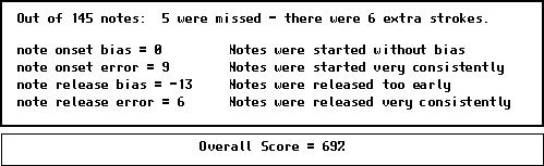
The first release of the software presented all of the feedback numerically. To indicate whether the user was starting notes early, late, or on time, RhythmTutor calculated and displayed two pairs of statistics, one pair for note-onset, and one pair for note-release. The statistics for note-onset were:
- Onset Bias: The average position of the onset of the user's notes relative to when they should have started, expressed in the program's time-units. A negative bias indicated that the user's notes tended to start early, a positive bias indicated that they tended to start late, and a zero (or very small) bias indicated that they tended to start at the correct time.
- Onset Error: A measure of the variability or consistency of the user's note starts and stops. High consistency in when notes were started or ended (relative to where they were supposed to start and end) produced a low error score, and inconsistency raised the error score. RhythmTutor provided the same two scores for note-releases (i.e., ends of notes). The display of the statistics appeared as shown below.
Before
In my review of RhythmTutor's user interface, I commented that the feedback display was too textual: the note-tallies were "buried" in prose text sentences. More importantly, the bias and error statistics were very difficult to interpret. I advised the developer to redesign the display to make the "Missed Notes" and "Extra Notes" scores more prominent. I also suggested that the numerical Bias and Error scores be replaced by a graphical display using histograms to show how the user's note-starts and note-ends were distributed around where they should have been. The developer took these suggestions and redesigned the feedback display as follows.
RhythmTutor Score Display: After
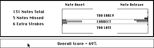
In my opinion, the developer did a good job of redesigning the feedback display based on my suggestions. I might have made the histograms vertical instead of horizontal so that time would proceed from left to right for both graphs, but that's just a minor detail, and there are some advantages in the histogram design the developer used. Overall, RhythmTutor's feedback display was greatly improved.