This is a new browser window. When finished viewing, just close this window.
|
This document shows a typical usability test report. The yellow boxes are annotations (not included in actual usability test reports) that explain the report's various sections. For your convenience, listed below are the annotated sections of this report. Annotated Sections of this Report: |
|---|
|
Our usability test reports typically begin with an executive summary briefly describing the testing method and results. Depending on your requirements, the results summary can, as below, include a table showing the number of usability problems revealed by the test, categorized by severity. After your development team reviews the problems and tells us which problems they plan to fix, we can, as below, also add those numbers to the table to provide a quantitative measure of the impact of the test. [Back to Top] |
|---|
The Alpha release of the QRL software was tested on eight users from August 3-7, 1998. The test participants were people recruited from outside of CompanyX. All of the participants were in the target user-population for QRL.
After a pre-test interview and signing of legal forms, test participants were asked to perform 22 tasks requiring them to accomplish specified goals using the Calendar functionality of QRL. Afterwards, the tester conducted an interview to gather participants' subjective impressions of the product. The test tasks covered most of the Calendar-related functionality of QRL. QRL's other planned functionality - email and document management - were not included in the test because they had not yet been implemented. The product's on-line Help facility was also not included in the test.
Overall, the performance of test participants was good, with most participants completing the tasks fairly easily, and some participants completing them with assistance. All participants completed all of the application tasks (see below), yielding a 100% completion rate. Table 1 shows the number of usability problems found and scheduled to be fixed. The main body of this report provides detailed performance information (task time, errors, assists). It also lists the specific usability problems found, our recommendations on how to fix them, and the development team's plans for addressing each problem.
Table 1. Number of usability problems found in test, and number developers plan to fix in pending release.
| Severity | Total Number Found | To Be Fixed in Pending Release |
|---|---|---|
| High | 10 | 9 |
| Medium | 20 | 15 |
| Low | 24 | 9 |
| Total | 54 | 33 |
Satisfaction with the QRL functionality, as measured by the post-test interview, was fairly high. Overall, participants feel that the QRL is useful but that some of its concepts and features are difficult to understand. An important issue that emerged is that the user interface for creating calendar appointments should be improved.
|
This section of the report describes in detail how we conducted the test. It lists the tasks participants were asked to perform. [Back to Top] |
|---|
The Alpha release of the QR software was tested on eight users from August 3-7, 1998. QR is web-based software designed to be run on a company's intranet, providing a company-wide means for employees to manage their email, schedules, and documents. The target users of QRL are: 1) CompanyX employees, 2) employees at CompanyX customer companies. The test was conducted to evaluate the user interface of the product prior to its release, and to suggest areas for improvement.
The test participants were eight people from outside of CompanyX, seven of whom were recruited through the CompanyX Usability Test Participant pool database, and one of which is an acquaintance of a QR development team member. The participants were a fairly sophisticated group with respect to amount of computer and Web experience. Seven of the eight participants had been drawn from the CompanyX test-participant pool database. The "May '98 Tech Users" database (consisting of Business Week readers who had responded to a questionnaire indicating an interest in participating in CompanyX usability tests) was queried for all people who had indicated that they had at least three years of experience using the World Wide Web. Of 392 people in this database, 53 met this criterion. People in this group living on the middle-to-northern San Francisco Peninsula (i.e., near the CompanyX test-site) were called, subjected to a brief phone-screening interview, and scheduled until all the test-sessions had been filled. The eighth test participant was an acquaintance of one of the QR development team members. Like the other participants, he had at least three years of experience using the Web, and passed the phone screening interview. See Table 13 in Appendix 2 for details.
Of the eight test participants, six were male and two were female. None were familiar with QR or with any of its CompanyX predecessor products. All participants were given a $75 gift certificate as an incentive for participating.
Upon arrival at the usability lab, participants were told the purpose of the test, asked to sign some legal forms regarding their participation in the test, interviewed briefly to ensure that they met the criteria for the test and to gather more information about their background, and given some initial instructions about performing the tasks. The instructions included a request to "think aloud" while working.
After completing the background interview/questionnaire and initial instructions, participants were asked perform the following tasks using the QRL:
The instructions for each task specified what the goal of the task was, but did not say how to achieve it. While participants performed the tasks, the usability engineers recorded the participants' actions using videotape, data-logging software, and printed data-sheets. The data recorded included, for each task, elapsed time, number of errors, and number of assists. An error was defined as an action that could not lead to the goal, e.g., choosing the wrong menu-item, or failing to save data before closing. An assist was defined as an instance where the tester provided a hint because the participant had failed repeatedly to find the correct action.
Finally, participants were asked a set of questions about their experience using QR.
|
In this section of the report, we present our detailed findings. We begin with quantitative results:
|
|---|
Participant performance on the 22 test tasks (A1 - C3) was good. Most participants completed most of the tasks quickly and without significant error. Participants varied in how long it took them to complete all the test tasks (38 minutes to 1:04; see Table 2). Participants made an average of 5.8 errors while performing the entire set of test tasks, and required an average of 2.5 verbal assists over all of the tasks. For details, see Appendix 1, Tables 10 and 11.
Table 2. Overall user performance for test tasks.
| Total Task Elapsed Time | Summed Task Time | Errors | Verbal Assists | |
|---|---|---|---|---|
| Mean | 50 min. | 44 min. | 5.8 | 2.5 |
| Minimum | 38 mins. | 35 min. | 2 | 1 |
| Maximum | 64 min. | 61 min. | 11 | 8 |
The post-test interview included several questions asking participants to assign ratings on a seven-point scale to various aspects of the software. QRL garnered good ratings on the standard subjective impressions questions: Usefulness: 6.25, Attractiveness: 5.86, Ease-of-use: 6.06, Understandability: 5.88, and Ease of accomplishing the test-tasks: 5.6.0 (see Figure 1); For details, see Appendix 1, Table 12.
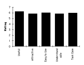
Figure 1: Post-test subjective satisfaction ratings.
Test participants were also asked several yes/no questions about their impression of QRL. The following are the questions, and a summary of participant responses:
Table 3 shows the number of usability problems and bugs found, ranked by severity, and the numbers that the development team has committed to correcting.
Table 3. Number of usability problems found in test, and number developers plan to fix in pending release.
| Usability Problems | |||
|---|---|---|---|
| Severity | Number Found | To Be Fixed | |
| High | 10 | 9 | |
| Medium | 20 | 15 | |
| Low | 24 | 9 | |
| Total | 54 | 33 | |
| Bugs | |||
| Severity | Number Found | To Be Fixed | |
| High | 3 | 1 | |
| Medium | 4 | 1 | |
| Low | 0 | -- | |
| Total | 7 | 2 | |
|
We then present a qualitative analysis of the specific problems encountered by test-participants in completing each test-task. In this section, screen images of the software serve as illustrations. [Back to Top] |
|---|
The following sections describe the results for each of the 22 test tasks. For detailed test-task results, see Table 11 in Appendix 2.
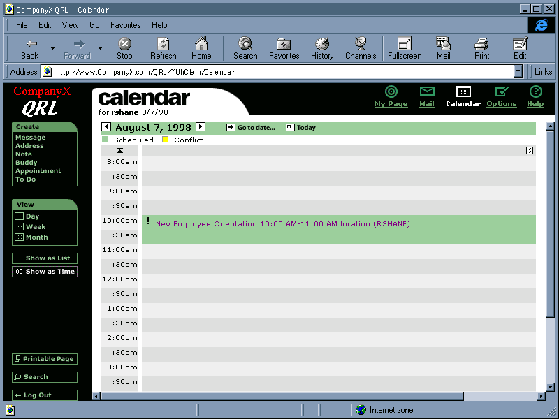
The first task consisted of simply logging into QR: typing a specified user-name (rshane) and password (welcome). Most test participants did this easily, in less than 30 seconds.
One participant apparently mistyped the password, but because the characters in the password are not fully echoed, did not realize it. The system's feedback was only the message "Login Failed." The user and the testers all assumed initially that something was wrong with the system. Only after the testers paused the test and tried logging in themselves and had no problem doing so was it decided that the test participant had mistyped the password.
After a user has successfully logged in, QR displays the Home. Participants were asked to interpret this page, describing what was on the page and what they thought it was for. Participants took between 3 and 7 minutes to do this.
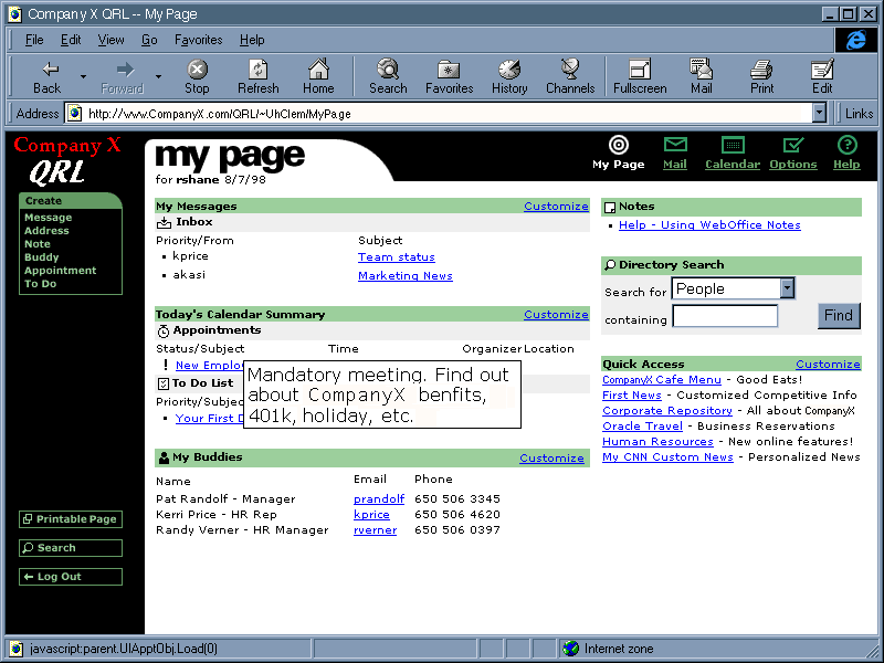
Most of the content of Home seemed pretty clear to the test participants, with some noteworthy exceptions (see Table 8 in the Design Recommendations section, below):
This task asked participants to find the time of an appointment that was displayed on Home. Performing the task required only looking at the page and finding the information. All participants found the information easily. Most in 35 seconds or less, but one took a little over a minute to spot it. It was not necessary to open the appointment to see its time, but some participants opened it anyway.
Participants were asked to indicate how they would use QR to keep track of a four different hypothetical pieces of information. Most participants said more-or-less what the designers expected, with some exceptions:
This task required spotting a ToDo item that was displayed on Home and viewing the item's content. Some participants did this by clicking on the item to open it, but most used the mouseover-popup to read the item's content. Participants took from 22 seconds to two minutes to complete the task, but there was no apparent relationship between the completion time and the method they used to display the item's content.
Participants were asked to view the invitation to a particular meeting that was listed in the "Today's Appointments" section of Home, and delete the meeting. Most of the participants completed this task in under a minute. One took slightly over two minutes to do it, because he initially missed the item when he clicked on it, but didn't realize it, and so waited several seconds for it to open. Also, when the item opened, he noticed the Cancel button before noticing the Delete button, and so spent time wondering whether Cancel would cancel the meeting (i.e., thereby deleting it from his schedule) before he noticed the Delete button and decided to use it instead of Cancel.
This task required participants to record a simple appointment. The Create Appointment function is available from any page, including Home, so participants needn't explicitly invoke the Calendar function to complete this task. Participants took from just under two minutes up to nearly four minutes to complete this task, and exhibited a variety of problems and voiced a variety of complaints:
Participants were asked to view an overview of their schedule for "next week". Despite the fact that the times to complete this task ranged from 28 seconds to over two minutes, most participants had little trouble with it. However, most misread the task as "view an overview of your schedule for the next week", and so had to be told that the task was to look at "next week", not "this week". In addition, the following problems were observed:
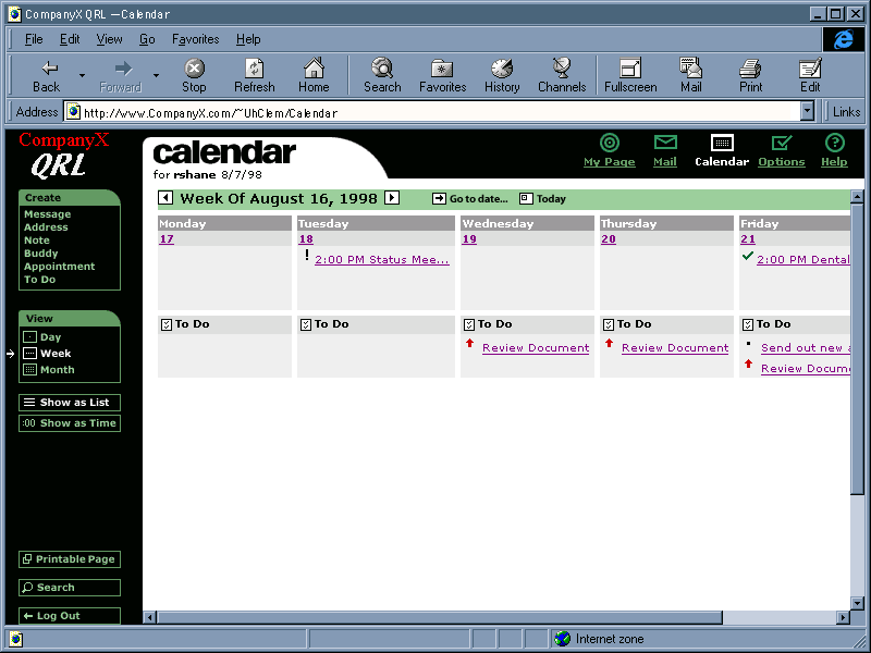
This task asked participants to return to viewing this week, and then find a different way of displaying next week. Participants completed this task in times ranging from 30 seconds to two minutes 35 seconds. Most participants backed up using the left-arrow button, but some used other methods, including: the Today button, the browser Back button, and returning to Home and then reinvoking Calendar. Most participants who had used the right-arrow button to advance the week in task B1 used the Goto Date function in this task, while most who used Goto Date in task B1 used the right-arrow button in this task. In addition, the following problems were observed:
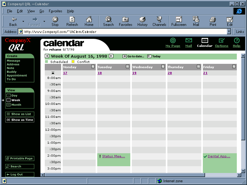
Participants were informed that there is a timeline view of a week, and asked to switch to it and check for Thursday evening appointments. Participants took from 30 seconds to over three minutes to complete this task. Several participants had difficulty finding this view because there is nothing labelled "timeline" and/or because they didn't understand the term "timeline". Two needed assistance to find it. Once they found the view, everyone first used the browser's scrollbar to try to display evening times, noticed that times past 4:30 p.m. still weren't shown, and immediately tried the down-arrow buttons.
The goal of this task was to mark a particular Todo item as done. Most participants completed this task with little difficulty (and in under 1.5 minutes), but two had great difficulty (and required more than 2.5 minutes). These are the main observed problems:
This was a prediction task: participants (who were looking at a week view from the previous task) were asked to guess what the Today button in the Calendar would do. All but one expected it to display a one-day view of the current date. When they tried it and it didn't do that, some thought that it made sense for it to retain the view-level and some didin't.
Participants were asked to create an appointment for a lunch date, with an alarm. Times to complete this task ranged from just under two minutes to almost six minutes. Five of eight participants required assistance to complete this task, mainly because entering invalid data into a field caused the software to ignore the appointment. Several problems were observed:
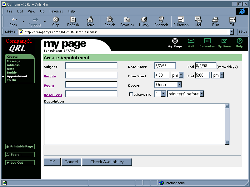
This was a task to create a more complicated appointment: a meeting with two work-colleagues that repeats weekly. This was the most difficult task of the test. Participants needed between 3.5 and 8.2 minutes to complete it. Problems seen included many of those seen in task B6 (above), but also:
Participants were asked to create a ToDo item to keep track of an assigned task. Most participants had little or no difficulty with this task. Times to complete it ranged from 1.5 to 4.5 minutes. Problems seen included many of those seen for creating appointments, but also:
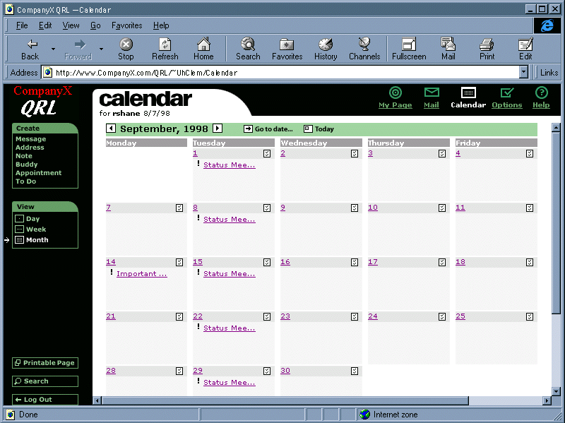
This was another interpretation task, like task A1, except that the subject was the Calendar Month view rather than Home. Most participants understood most of what was displayed, except:
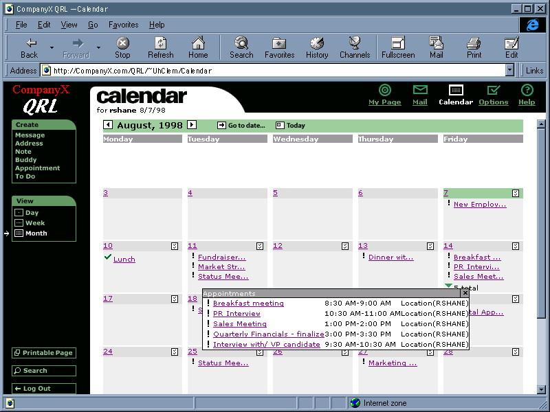
This task asked participants to determine the time and owner of a specified appointment. At the start of the task, the specified appointment was already displayed in the month view. The meeting time could be obtained via the item's popup or by opening the item, but the item's owner could only be obtained via the item's popup. Participants completed this task in a wide range of times: 25 seconds to over five minutes. The faster times were exhibited by participants who used the popup. Problems seen included:
This task was similar to the previous one (i.e., find time and owner of specified appt.), except that the specified appointment was not immediately visible in the month view because it was the fifth appt in the day (and the month view shows only three items directly). To find this item in the month view, participants had to use the "more items" button. Participants completed this task in times ranging from 21 seconds to 1 minute 40 seconds. Half of the participants completed the task by clicking on the "more items" button; the other half went to the day view for the specified date to find the item. In addition, some of the problems seen in task B10 were also seen in this task.
Participants were started in the month view, and were asked to view their ToDos for a specified date without leaving the month view. Completion times ranged from 18 seconds to two minutes. Most participants completed this task with ease. Problems seen included:
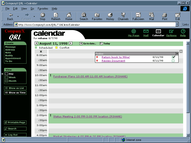
The task was to find and then interpret the day timeline, on a specified day that had conflicting appointments. Most participants understood how to invoke the timeline view by this point, but two still needed assistance to find it. Problems observed in participant interpretations:
Participants were asked to check (in the day timeline view) for evening appointments. Most participants had no trouble with this task. Times to complete it were under 45 seconds (for some considerably under) for all but one participant, who took over two minutes. That person scrolled to the bottom of the list using the browser's scrollbar, saw no evening appointments, and concluded that there were none. Only after hints from the tester did the participant notice and try the timeline's downarrow.
This task was to determine what appointments on the displayed day were conflicting, and delete one of them. Times to complete this ranged from 24 seconds to almost four minutes. Participants had a variety of degrees of difficulty with this task. Problems observed include:
QRL is useful for office workers, but it currently has some usability problems that should be fixed before releasing it. If the design recommendations listed in the next section are incorporated and the corresponding changes are made, QRL will be an easy-to-use product for its target users.
|
The largest section of the test report is often the "Design Recommendations" tables, which list every usability problem uncovered by the test, the problem severity, our recommended design change, and the development team's response (if available). [Back to Top] |
|---|
This section describes the usability problems found during testing and while the test was being designed. Tables 4 - 9 list the problems by product area: General Navigation, Create/Edit Appointment, Creat/Edit ToDo, Home, Calendar Display, and Bugs. In the problem descriptions, "P" is an abbreviation for "test participant". Each usability-problem listing includes design recommendations, severity ratings, and the development team's response.
Table 4.
| General Navigation | |||
|---|---|---|---|
| Usability Issue | Design Recommendation | Severity | Resolution/Status |
|
Many Ps expected (at least initially) Go To Date and Today to take them to a day view of the specified day. However, many later said that it is OK that it preserves the current view-scope. |
Ignore this unless further testing shows it to be a more common problem. Alternative: grey out the Today button when the current view (day, week, month) includes today. |
low |
Not planned. Might change "Go to Date" to "Go to..." so it won't suggest as strongly that it goes to a particular date. |
|
Some Ps thought that the Create "menu" was a navigation bar (with Create highlighted). |
Make it clearer that Create is the name of the list, not just a highlighted item, by making it look different from the other items. |
medium |
Under study. |
|
Some Ps wanted mouseover popups to be delayed so they could move the mouse around Home and other screens without having popups flickering on and off rapidly. |
Do this. |
high |
Planned for first external release. |
|
Some Ps tended to use the browser's Back button to return to previously visited pages. This sometimes returns to the page they expect and sometimes doesn't (see also Bugs). |
Ignore this unless further testing shows it to be a more common problem. |
low |
Not planned. |
|
Some Ps expected to exit dialog-box "pages" (e.g., Create Appt.) not by clicking OK, but rather by clicking on the top nav bar icon they wanted to return to. |
Ignore this unless further testing shows it to be a more common problem. |
low |
Planned. Will warn users that they can lose data unless they click Save/OK. |
|
Some Ps had trouble distinguishing click-links that bring up pop-ups from ones that go to a different page. |
Use a different-looking link for pop-up links. Or make them mouseover popups instead of click popups (with a delay). |
medium |
Planned for first external release. Pop-up links will look 3-D. |
|
Some Ps had trouble matching "Show as Time" with the term "timeline". |
Replace the "Show as List" and "Show as Time" buttons with a pair of radiobuttons: |
medium |
Under study. |
|
All Ps figured out that Printable Page had to do with printing the current page, but the term struck some as odd. |
Rename to be a verb, but not "Print" because that is already on the Browser and this isn't the same function. Try: "Print text" |
low |
Planned for first external release. Will try tooltips explanation. |
|
Some Ps weren't sure what Create Address was for. |
Consider ways to clarify what sorts of information QR handles, and what each type of info, including Address, is. In particular, Address needs to be distinguished from Quick Access addresses (URLs), and Buddy addresses (email). Possibility: use a two word name for this, or put a longer label on the ToolTip for this item. |
medium |
Planned for first external release. |
|
Most Ps understood generally what Search was for, but some weren't sure what the scope of its search is. |
Provide a more explanatory label, e.g., Site Search, or Web Search. |
low |
Planned for first external release. |
|
Some Ps weren't quite sure what Quick Access was for. |
Name it Favorite Bookmarks, since web users know what bookmarks are. |
low |
Under study. |
|
Some Ps weren't sure a meeting is the same as an appointment. In some calendar software, a meeting is a special case of an appointment, with extra fields. |
Consider distinguishing meetings from ordinary appointments in future releases. |
low |
Not planned. |
|
The same ToDo icon that is clickable in some Calendar views appears on Home (in the ToDo header) and in the Calendar Day List view, but is not clickable there. But some Ps tried to click it. Some did it to display their ToDo list; some did it to create a new ToDo item. |
Option 1: Clicking on the ToDo icon does the same thing in all contexts where it appears. It may not be very useful in contexts where the day's ToDo list is already displayed, but so what. Option 2: Have clicking on the ToDo in the Home and Day List contexts do something reasonable for that context, e.g., create a new ToDo item. |
medium |
Planned for first external release. Pop-up links will look 3-D, but the inactive ones will look flat. |
Table 5.
| Create/Edit Appointment | |||
|---|---|---|---|
| Usability Issue | Design Recommendation | Severity | Resolution/Status |
|
Many Ps expected the date of new appointments to default to the day they were viewing or had selected in the calendar (ditto Create ToDo). Some created appointments by going to the desired date first. Some didn't look at or bother to set the date, because they assumed it had been set to the day they started from. |
Do this if possible. |
high |
Planned for first external release. |
|
Many Ps expected the End Date to default to whatever they put into the Start Date. |
Do this if possible. Another option would be to eliminate the End Date setting altogether, since it also confuses some users when they set repeating appointments (see problem 13 below), and require multi-day appts to be set as repetitions of one-day appointments. Many calendar tools don't allow multiple-day appointments. |
high |
Planned for first external release. Redesigning New Appointment dialog to get rid of End Date. |
|
Many Ps, when told to create an appointment "next Tuesday", said they couldn't tell what next Tuesday's date was, so they wanted either a calendar to either just view, or a calendar widget as in the Go To Date function that would act as a tool for setting the date. |
Do this. |
high |
Planned for first external release. Will provide mini-calendar tool, as in Go To Date. |
|
Many Ps wanted a way to choose people by a list rather than having to remember their user names. |
This field needn't be a text field filled in by typing or a people-chooser; it could instead be a scrolling list of user names, empty initially, filled in using the people chooser. That way, it would also be clear that only user names of company people are supposed to go into it (see problem ###, below). Less radical is to leave the text field as-is and to provide a people-chooser (as I believe is planned). However, this approach will still cause some users to think they can type "Grandma" or "dentist" into the text field. |
high |
Planned for first external release. Will be search facility, not just a list. |
|
Many Ps wanted feedback that a new appointment was or was not accepted by the system, rather than having the system silently set the appointment or not set it. |
If the user is in the Calendar function, s/he can easily confirm that that the apptmt was recorded, so it isn't so important to provide feedback when the user is in Calendar and the appointment is OK. But when the appointment fails, see the next problem (#12). Also, when the user is not in the Calendar function (e.g., Home or Doc Mgmt), feedback is needed whether an appt succeeds or fails. |
medium |
Planned for first external release. |
|
If a user gives invalid info when creating an apptmt, the appointment creation fails with no warning. Furthermore, all of the valid data the user entered is lost. |
If the New Appointment form detects invalid data when OK is pressed, the form should remain displayed, with the invalid data selected (highlighted) and an error dialog should appear over the form saying "Invalid <field name>. Cannot make this appointment." Ditto New ToDo. |
high |
Planned for first external release. |
|
Some Ps expected to be able to create an appointment using a button on the date itself. Some wanted to be able to drag out times on a timeline to create an appointment, as in some desktop computer calendars. |
Consider putting buttons on dates if it wouldn't be too cluttered. |
low |
Not planned. |
|
Some Ps were unsure what End Date would mean for a repeating appointment: end repetition vs. end 1st appointment. |
Eliminate the current End date setting. Add an End Repetition date-setting that is invisible (or greyed out) until the appointment is set to repeating. |
medium |
Planned for first external release. Redesigning New Appointment dialog to get rid of End Date. |
|
Some Ps wanted to specify a start time and a duration instead of a start time and an end time. |
Ignore this unless further testing shows it to be a more common problem. |
low |
Not planned. |
|
One P wanted to be able to decrement and increment dates and times using the + and - keys. |
This would be easier to provide if the dates and times were broken up into several fields, e.g., Date: [mm]/[dd]/[yyyy] Time: [hh]:[mm]. |
low |
Not planned. But date widget is under study. |
|
Some Ps wanted to be able to set advance warnings of more than 10 minutes. |
Provide warning intervals as a combo-box, i.e., a typein field that is also a menu of frequently-used values. If that isn't possible, extend the menu with times up to 24 hrs. |
high |
Planned for first external release. |
|
Some Ps were unsure how Check Availability would work. E.g., could they check availability for themselves? Would it just say "That time/date won't work for all invitees, try another?" (which would be frustrating) Could it suggest workable times? Most Ps didn't mention this simply because most didn't notice it and the test tasks didn't require Ps to encounter it. This would have been a Common Problem had the tasks required using it. |
Rethink this. |
high |
Planned for first external release. |
|
Some Ps not sure what Delete All would do. Delete all appointments? Delete all repetitions of this appointment? |
If it means "delete all repetitions", label it "Delete All Repetitions", and don't show this unless it's a repeating appointment (or show it greyed out). If it means "delete all appointements", get rid of it, because no sane person would ever use it. |
medium |
Planned for first external release. Will replace two Delete buttons with one Delete menu with different functions. Will relabel "Delete All" to clarify that it deletes all instances of a repeating appointment. |
|
Some Ps wanted an easier way to set times. |
Provide a time-chooser that provides a list of times (as in Sun's CalendarTool). A less radical change would be to break the time-fields up into two fields instead of one, where the ":" is a label between the fields rather than something users have to type, e.g., [HH]:[MM]. An even less radical change would be to leave the time fields as-is, but be more flexible in the accepted time-formats. |
medium |
Planned for first external release. Will at least make time fields more tolerant of variations in syntax. |
|
One P wanted to be able to set times in 24-hour notation. |
Consider ways to provide this if possible. |
low |
Planned for first external release. |
|
Some Ps were unsure what the OK button would do if they had created or edited an appointment. |
Perhaps this button should be labeled more specifically than OK. One possibility is to change it back to "Save" (as it used to be). Another is to label it differently depending on whether the user is creating ("Create"), editing ("Save"). A third possibility is, when the user views/edits an appointment, keep this button greyed out until the user actually changes something in the form. |
low |
Planned for first external release. Will change OK back to Save. May also label the button Create on the Create Appointment form. |
|
Some Ps thought the Cancel button would cancel the appointment, rather than cancelling the creation/editing of the appointment. |
Ignore this unless further testing shows it to be a more common problem. |
low |
Not planned. |
|
Pressing the RETURN/ENTER key while the insertion point is in any of the form's text fields closes the form and tries to create/edit the appointment, even though the user may not have entered most of the info. |
One option is not to do anything special about this, and let the solution for item #12, above solve the problem. Another option is to change RETURN so that it closes the window only when the insertion point is in the last (i.e., bottom-most and rightmost) field on the form. |
low |
Under study. |
Table 6.
| Create/Edit ToDo | |||
|---|---|---|---|
| Usability Issue | Design Recommendation | Severity | Resolution/Status |
|
One P confused "Repeat" setting and "Show N Days in Advance" setting. |
Consider better labels for these. |
low |
Planned for first external release. |
Table 7.
| My Page | |||
|---|---|---|---|
| Usability Issue | Design Recommendation | Severity | Resolution/Status |
|
Many Ps were unsure what Customize on some Home section headings was for. They weren't sure whether it was for determining what information is on Home, adjusting the format of the information in a given section, or adding new items to that section (e.g., new Buddy, new Quick Reference URLs). |
Rethink name. |
medium |
Planned for first external release. |
|
Some Ps were unsure what Notes are, at least initially. Notes (i.e., msgs) to other colleagues? PostIt notes (aka Sticky notes). |
Consider ways to clarify what notes are. |
low |
Under study. |
|
Some Ps were unsure what Options was for. |
Ignore until further testing shows it to be more of a problem. |
low |
Planned for first external release. Will rename Options to "Customize". |
|
One user confused Home with the Calendar day-view, i.e., she thought there would be a Home for any specified day. |
Ignore until further testing shows it to be more of a problem. |
low |
Not planned. |
|
Directory Search wasn't clear. Most Ps saw "people" in the menu, didn't look at other menu items, and assumed that Directory Search was for finding only people. |
Ignore until further testing shows it to be more of a problem. |
low |
Not planned. |
|
Most Ps expected to see newly created appts in Home, but then (usually when questioned) realized that Home shows only Today. |
Make it clearer that Home shows only Today, e.g., make the word Today larger, bolder, a different color. |
medium |
Planned for first external release. |
Table 8.
| Calendar Display | |||
|---|---|---|---|
| Usability Issue | Design Recommendation | Severity | Resolution/Status |
|
Many Ps were unsure (or mistaken) about what the exclamation and check-marks on calendar and ToDo items mean. Some thought the checkmarked items were ToDos. Some thought the exclamation point meant "important", "mandatory", "business related", or "created by someone else". Few Ps found the pop-up help for these icons, but even those who did found the terms unclear. E.g., does "accepted" mean that the user accepted the appointment or the system accepted it; and what does "new appointment" mean? |
Rethink this entire approach, and at least rethink the symbols. A checkmark clearly means "completed ToDo" to most users, so use it only for that purpose. Don't use it for appts. ToDo priority could be indicated by color rather than a symbol (so priority wouldn't interfere with completeness). ? could mean an invited appointment (as in, "Will you accept this?"). A tiny OK or no symbol at all for accepted appts. |
medium |
Planned for first external release. Symbols will be revised. Exact details under study. |
|
When the meaning of the symbols was explained to Ps, some were surprised that events they'd created were marked as not yet accepted. |
Events created by a user should automatically be marked as accepted by that user. |
high |
Under study. |
|
Many Ps expected to be able to mark ToDo items as done in list views and in pop-up views. |
Allow this if possible. |
medium |
Not planned. |
|
Some Ps thought the week and month views should show Saturday and Sunday. Omitting Saturday and Sunday mean that their labels (e.g., "Week of August 9") sometimes conflict with the first date displayed. Also, some Ps wanted to be able to set and see appointments on weekends, e.g., company picnics, working weekends, etc. And advance notice for ToDos counts weekend days, even though they aren't shown. |
Show weekends if possible. Perhaps provide a toggle at the left: "Show: [ ] weekends". |
high |
Done. Option allow showing weekends or not. Considering ways to make the setting more visible/accessable. |
|
Some Ps wanted the calendar to header to indicate the current day of the week in addition to the date. |
Do this. |
medium |
Planned for first external release. |
|
One P didn't understand that ToDos are part of Calendar. Saw them in Home and assumed they were a different function. Looked for the ToDo app separate from the Calendar app. |
Ignore. |
low |
Not planned. |
|
Some Ps were not familiar with the concept of a timeline vs. a list view. However, one P correctly noted that both view are useful because the Timeline is less useful for sparse schedules because appointments would be too spread out; in that case the List view is better. But for packed schedules, the timeline would be better and the List view would be cluttered. |
Replace the "Show as List" and "Show as Time" buttons with a pair of radiobuttons: |
medium |
Under study. |
|
Some Ps had trouble (at least initially) figuring out how to scroll the timeline to show later/earlier times of day. All Ps tried the scrollbar first. |
Bigger timeline-shift buttons. Show more of the day on one view (requiring scrolling using the scrollbar), e.g., 8am - 10pm. |
medium |
Planned for first external release. |
|
Some Ps wanted the timeline scrolling arrow at the top and bottom of the timescale to disappear when there were no more unviewed times beyond that point. |
Hide or grey-out the timeline scroll button when the timeline is at the beginning or end of the day. |
low |
Planned for first external release. |
|
Some Ps noted that the date of the timeline view scrolls off, leaving the current date visible at the top of the page, which can mislead users about what day is being viewed. |
Lock date in view. |
medium |
Planned for first external release. |
|
Some Ps noted that the legend in the timeline view (appointment, conflict) scrolls out of view. |
It could be locked constantly in view, or it could be both at the top and bottom of the timeline page. |
medium |
Planned for first external release. |
|
Some Ps expected Goto Date and Today in week and month views to show the week or month starting from the specified date. |
Ignore until further testing shows it to be more of a problem. |
low |
Not planned. |
|
The conflict list links on conflicting appointments aren't totally clear. Some Ps, in deleting a conflicting appt., deleted the unintended one because they weren't sure which one they had opened. |
Ignore until further testing shows it to be more of a problem. |
low |
Not planned. |
|
Popup windows (e.g., Goto Date, ToDo list, Conflict list) can't be moved to a new position, even though they have titlebars and close buttons like other windows that are draggable. Some Ps tried to move them, e.g., the Goto Date window obscured its function button and a P wanted to see that button's label after he'd brought up the window. |
Make them draggable. |
medium |
Under study. |
|
The Calendar uses green for two different purposes: to indicate the current day, and to indicate appointments. |
Use a different color for appts than for marking today. |
medium |
Planned for first external release. |
|
The compact form of appts in popup windows is a bit confusing: some Ps thought that the owner in parentheses was the value of the location setting. |
Use a different syntax so it won't look like "location (owner)". |
low |
Planned for first external release. |
Table 9.
| Bugs | |||
|---|---|---|---|
| Bug | Design Recommendation | Severity | Resolution/Status |
|
When a P switched from the calendar month view to the day view, the indicator on the left of the screen continued to point to "month". |
fix |
medium |
Done. |
|
The calendar won't accept "1pm" instead of "1:00 pm" as a time. If users will be required to type times, the system should be very flexible in the formats it accepts. |
fix |
high |
Done. |
|
Once a ToDo has been scheduled as repeating, it is not possible to change it back to one-time. |
fix |
high |
Under study. Not in team's direct control. |
|
When users double-clicked on links and buttons, the system would sometimes get screwed up. This may already have been fixed after the first few test sessions. |
fix |
high |
Under study. Probably. |
|
When one P typed an incorrect password, the error message didn't say what exactly was wrong, it just said "Login Failed". Since the password isn't fully echoed, it was very difficult to figure out what was wrong. |
The error message should indicate the reason for the failure. Then, the text in the erroroneous field should be selected (highlighted) when the error dialog is closed. |
medium |
Under study. Probably. |
|
Sometimes the browser's Back button "returns" to a different view of the Calendar than the user was on when last in the page being "returned" to. |
fix |
medium |
Under study. Probably. |
|
When the user presses the browser's Back key, pages that had data entered into them don't have the data anymore. |
Retain the data. Most other web-browsers do show the data, so users expect it. |
medium |
Under study. Probably. |
|
If you desire, our usability test reports can include an appendix presenting the data for each participant and each task, to allow you to re-analyze it). [Back to Top] |
|---|
Table 10. Summary of performance results: task completion times.
| Participants | Summary Stats | ||||||||||
|---|---|---|---|---|---|---|---|---|---|---|---|
| Task | 1 | 2 | 3 | 4 | 5 | 6 | 7 | 8 | Mean | Min | Max |
| A1 | 1:46 | :17 | :21 | :25 | :28 | :25 | :17 | :22 | :33 | :17 | 1:46 |
| A2 | 4:50 | 5:44 | 6:23 | 5:31 | 4:08 | 3:59 | 3:10 | 4:20 | 4:45 | 3:10 | 6:23 |
| A3 | :27 | :20 | :25 | 1:15 | :35 | :13 | :18 | :15 | :29 | :13 | 1:15 |
| A4 | 2:10 | 1:37 | 5:55 | 2:58 | 1:14 | 2:35 | 2:12 | 1:47 | 2:34 | 1:14 | 5:55 |
| A5 | :28 | :22 | 2:07 | 1:19 | :43 | 1:10 | :42 | 1:09 | 1:00 | :22 | 2:07 |
| A6 | :20 | :21 | :56 | 2:10 | :35 | :30 | :15 | :20 | :41 | :15 | 2:10 |
| A7 | 1:45 | 1:50 | 3:40 | 3:58 | 2:33 | 2:59 | 2:58 | 2:44 | 2:48 | 1:45 | 3:58 |
| B1 | 1:30 | 1:30 | 2:30 | :53 | :28 | 1:10 | 1:02 | 1:10 | 1:17 | :28 | 2:30 |
| B2 | :30 | 1:23 | :55 | 1:30 | :42 | :38 | :37 | 2:35 | 1:06 | :30 | 2:35 |
| B3 | :30 | 1:30 | 1:40 | 3:17 | 1:19 | 1:00 | 2:12 | 1:55 | 1:40 | :30 | 3:17 |
| B4 | :52 | :40 | 1:17 | 4:24 | 2:38 | 1:31 | 1:30 | 1:26 | 1:55 | :40 | 4:24 |
| B5 | 1:56 | :44 | 3:28 | :55 | 1:12 | 1:55 | 1:43 | 1:27 | 1:40 | :44 | 3:28 |
| B6 | 3:10 | 5:55 | 3:17 | 3:05 | 1:48 | 1:52 | 2:33 | 4:20 | 3:15 | 1:48 | 5:55 |
| B7 | 4:10 | 7:42 | 8:12 | 3:30 | 3:26 | 4:05 | 4:25 | 3:58 | 4:56 | 3:26 | 8:12 |
| B8 | 1:58 | 1:57 | 2:40 | 1:42 | 3:39 | 2:15 | 1:30 | 4:37 | 2:32 | 1:30 | 4:37 |
| B9 | 4:01 | 2:27 | 4:55 | 4:03 | 2:30 | 6:20 | 3:40 | 4:42 | 4:05 | 2:27 | 6:20 |
| B10 | 4:00 | 1:38 | 5:05 | 1:40 | 1:13 | 1:00 | 2:45 | :25 | 2:13 | :25 | 5:05 |
| B11 | :28 | :25 | 1:41 | 1:39 | :30 | :40 | :21 | :32 | :47 | :21 | 1:41 |
| B12 | :45 | :34 | :27 | 2:00 | 1:50 | :18 | :40 | :37 | :54 | :18 | 2:00 |
| C1 | 1:32 | 1:35 | 3:01 | 2:09 | 1:18 | 1:43 | 2:54 | 4:17 | 2:19 | 1:18 | 4:17 |
| C2 | :19 | :08 | :33 | 2:10 | :16 | :20 | :25 | :41 | :37 | :08 | 2:10 |
| C3 | 1:33 | :24 | 1:35 | 3:44 | 2:07 | 1:13 | 2:31 | 1:20 | 1:48 | :24 | 3:44 |
| Total | 39:00 | 39:03 | 61:03 | 54:17 | 35:12 | 37:51 | 38:40 | 44:59 | 43:54 | 39:40 | 61:03 |
| Elapsed | 57:00 | 47:00 | 64:00 | 59:00 | 38:00 | 41:00 | 46:00 | 48:00 | 50:00 | 38:00 | 64:00 |
Table 11. Summary of performance results: errors, assists.
| Participants | Summary Stats | ||||||||||
|---|---|---|---|---|---|---|---|---|---|---|---|
| Task | 1 | 2 | 3 | 4 | 5 | 6 | 7 | 8 | Mean | Min | Max |
| A1 | 1, 1 | <1, <1 | 0, 0 | 1, 1 | |||||||
| A2 | 0, 0 | 0, 0 | 0, 0 | ||||||||
| A3 | 0, 0 | 0, 0 | 0, 0 | ||||||||
| A4 | 0, 0 | 0, 0 | 0, 0 | ||||||||
| A5 | 1, 0 | 1, 0 | <1, 0 | 0, 0 | 1, 0 | ||||||
| A6 | 0, 0 | 0, 0 | 0, 0 | ||||||||
| A7 | 2, 0 | 1, 0 | 1, 0 | <1, 0 | 0, 0 | 2, 0 | |||||
| B1 | 0, 0 | 0, 0 | 0, 0 | ||||||||
| B2 | 2, 1 | <1, <1 | 0, 0 | 2, 1 | |||||||
| B3 | 0, 1 | 1, 1 | 1, 1 | <1, <1 | 0, 0 | 1, 1 | |||||
| B4 | 1, 0 | 1, 0 | 1, 0 | 4, 3 | 2, 0 | 1, 0 | 1, 0 | 1.4, <1 | 0, 0 | 4, 3 | |
| B5 | 0, 0 | 0, 0 | 0, 0 | ||||||||
| B6 | 1, 0 | 2, 0 | 1, 1 | 0, 1 | 0, 1 | 1, 0 | 1, 1 | 2, 1 | 1, <1 | 0, 0 | 2, 1 |
| B7 | 1, 0 | 1, 0 | 1, 0 | 1, 1 | 1, 0 | 1, 0 | <1, <1 | 0, 0 | 1, 1 | ||
| B8 | 1, 0 | 1, 0 | <1, 0 | 0, 0 | 1, 0 | ||||||
| B9 | 0, 1 | 0, <1 | 0, 0 | 0, 1 | |||||||
| B10 | 1, 0 | 1, 1 | 0, 1 | <1, <1 | 0, 0 | 1, 1 | |||||
| B11 | 0, 0 | 0, 0 | 0, 0 | ||||||||
| B12 | 1, 0 | <1, 0 | 0, 0 | 1, 0 | |||||||
| C1 | 0, 1 | 1, 1 | <1, <1 | 0, 0 | 1, 1 | ||||||
| C2 | 0, 1 | 0, <1 | 0, 0 | 0, 1 | |||||||
| C3 | 4, 1 | <1, <1 | 0, 0 | 4, 1 | |||||||
| Errors | 7 | 5 | 2 | 11 | 4 | 6 | 4 | 8 | 5.8 | 2 | 11 |
| Assists | 1 | 1 | 1 | 8 | 1 | 2 | 3 | 3 | 2.5 | 1 | 8 |
Table 12. Post-test subjective ratings for participants 1-8.
| Participant | Useful | Attractive | Easy to Use | Understand | Task Ease |
|---|---|---|---|---|---|
| 1 | 6 | 6 | 7 | 7 | 7 |
| 2 | 7 | 6 | 5 | 6 | 6 |
| 3 | 6 | 5 | 5 | 5 | 5 |
| 4 | 5.5 | 6 | 7 | 6 | 6 |
| 5 | 6 | 6 | 7 | 6 | 6 |
| 6 | 7 | 7 | 6 | 6 | 6 |
| 7 | 7 | 5 | 7 | 7 | 7 |
| 8 | 5.5 | 5 | 4.5 | 4 | 5 |
| Mean | 6.25 | 5.88 | 6.06 | 5.88 | 6.00 |
| Min | 5.5 | 5 | 4.5 | 4 | 5 |
| Max | 7 | 7 | 7 | 7 | 7 |
|
If you desire, our usability test reports can include a summary of the test-participant profiles (from the pre-test questionaire). [Back to Top] |
|---|
Table 13. Summary of test-participant responses to pre-test professional background interview.
Demographics |
Experience |
|||||||||
|---|---|---|---|---|---|---|---|---|---|---|
| User# | Employer | Job Title | Time @job | Win 95 | Win 3.1 | Mac | Unix | Scheduler | WWW Browser | |
| 1 | "In between" | N/A | N/A | + | + | several | Outlook | Netscape & IE | ||
| 2 | Stanford | Grad. Stdnt Bioeng. | 7 yrs | + | + | + | Eudora | Datebook Pro | Netscape | |
| 3 | Self | Consultant | new | + | + | + | several | several | Netscape & IE | |
| 4 | Space Systems Loral | Exec. Director | 10 yrs | + | + | Mac Mail | Now Up to Date | Netscape | ||
| 5 | Easy Planet | VP Mrktng | 1 yr | + | + | + | + | several | several | Netscape |
| 6 | CNET | Mrktng Manager | 1 yr | + | + | + | Eudora | Ascend | Netscape | |
| 7 | Link Exchange | Sales Manager | 1 yr | + | + | + | several | several | Netscape & IE | |
| 8 | TRW | Systems engineer | 13 yrs | + | + | Quick-mail | none | Netscape & IE | ||