This is a new browser window. When finished viewing, just close this window.
User Interface Review:
Jupiter Calendar and Messaging
Prepared for SageBrush Corporation by UI Wizards, Inc.
Author: Jeff Johnson
UI Wizards, Inc.
creation Date: 15 April 1999
|
After our clients implemented an initial version of the Messaging application that we designed (see the corresponding Conceptual Model and UI Specification documents), they called us back in to review the implementation of the user interface. This report describes usability problems that we found and our recommendations for correcting them.
The yellow boxes are annotations (not included in actual review reports) that explain the report's various sections. For your convenience, listed below are the annotated sections of this report.
Annotated Sections of this Report:
|
|
This section briefly describes the purpose of the UI review. It also provides an Executive Summary of the results for the benefit of busy managers who don't have time to read the entire document. [Back to Top]
|
Purpose
SageBrush Internet Applications is developing a suite of web-based Personal Information Management (PIM) applications, referred to collectively as Jupiter. Jupiter includes, among other things, a Calendar (i.e., scheduling) facility and an Email (i.e., messaging) facility.
SageBrush wants Jupiter to be easy for its intended users to use. It has taken a series of steps during the design process to ensure this. The following is a summary of the relevant history:
- SageBrush previously developed an implementation of the Calendar facility. (At the time, the internal code-name for the planned application suite was QRL rather than Jupiter.) In mid-1998, with the assistance of UI Wizards, SageBrush conducted usability tests of the QRL Calendar application (see Usability Test Report: QRL Calendar, dated 8/26/98). The tests indicated a need for significant improvements in Calendar's user interface.
- In late 1998, SageBrush's Usability group developed new guidelines and standards for web-based applications. Because QRL had been designed prior to the development and distribution of the new standards, it did not comply with them in a variety of ways. For various reasons, the Calendar application was put on hold.
- Also in late 1998, design work began on the Messaging (Email) application. From September through early December of 1998, UI Wizards (with help from the Jupiter development team) developed a user-interface specification for Jupiter Messaging (see User Interface Design Specification: Jupiter Messaging, Release 1.0, dated 12/3/98). Since the design of the Messaging coincided with the release of preliminary versions of the new SageBrush standards and guidelines for web-applications, those standards and guidelines were followed in the Messaging design.
- In early 1999, the Calendar application was redesigned and re-implemented to comply with the new user-interface standards for web-applications (and to incorporate improvements suggested by the earlier usability testing). At the same time, the development team began implementing the Messaging application according to the user-interface specification.
The team's management asked UI Wizards, Inc. to review the user-interface of the current Calendar (Scheduling) and Messaging (Email) applications as input for the team as it prepares Jupiter for usability testing and then release. The goal of this review is twofold:
- Identify usability problems in both the Calendar and Messaging applications, so that some of them can be corrected prior to usability testing.
- Identify discrepancies between the Messaging User-Interface Specification and the software as implemented.
Accordingly, this review describes usability problems in the Scheduling and Messaging applications and provides recommendations on how to correct most of them. It also points out important discrepancies between the Messaging User-Interface Specification and the Messaging user interface as currently implemented.
Executive Summary of Findings
Jupiter Calendar seems pretty solid, and its user interface is, overall, pretty clear and intuitive. Messaging is also good, although it is a bit rougher because, unlike Calendar, it is not in its second iteration. On the other hand, some design-improvements and a fair amount of polishing will be required before either the Calendar or Messaging applications are "ready for prime time".
The overall design suffers from several kinds of inconsistencies (detailed in relevant sections, below). Developers of software products and online services should realize that they are in the publishing business, and therefore must, like all other publishers, establish design standards, conventions, guidelines, and above all, processes that yield consistent interaction style, layout, formatting, terminology, writing style, use of color, etc. While such inconsistencies may seem minor, they give users an overall impression of an unprofessional product.
Some of the usability problems in the current implementations of Calendar and Messaging have already been solved in previous products. It is therefore a good idea, when faced with a design problem, to look at how competitors have solved it. A good source of ideas for Jupiter Calendar and Messaging are the Calendar and Email tools in Sun's Solaris Common Desktop Environment: DTCalendar and DTMail, respectively. For example, a problem in the current Jupiter Calendar's user interface for changing repeating appointments was solved long ago in DTCalendar, and the solution is not only good but also applicable to Jupiter. In general, I recommend that the Jupiter team check DTCalendar and DTMail when faced with calendar- and email-specific UI design problems.
Count of Problems Found
Overall, this review found a total of 112 problems, of which 26 were bugs and the rest usability problems. Table 1 shows the breakdown of usability problems by severity (high, medium, low) and the plans the developers have for addressing the problems.
Table 1: Number of usability problems found in test, and developers responses.
|
Problems Found
|
|
Severity
|
Number Found
|
To Be Fixed in Pending Release
|
To Be Fixed in Later Release
|
|
High
|
17
|
|
|
|
Medium
|
40
|
|
|
|
Low
|
29
|
|
|
|
Bugs
|
26
|
|
|
|
Total
|
112
|
|
|
Usability Testing Issues
One purpose of this user-interface review was to identify design issues that should be subjected to careful usability testing, and to suggest tasks for the test.
The Calendar portion of Jupiter was tested previously. Obviously, a good source of tasks, scripts, and other ideas for the planned test would be the report of the previous test (see Usability Test Report: QRL Calendar, dated 8/26/98). Also obviously, the Messaging application of Jupiter needs to be heavily tested because it is new (although reports from tests of previous SageBrush email products can provide ideas, scripts, and test-tasks).
Apart from that, issues that should be tested in the planned usability test include:
- Whether users have trouble with the action "buttons" that do not respond unless they are clicked on their labels (as opposed to anywhere on the button).
- Whether users are confused by the fact that the function toolbar for each Jupiter application is on the function panel, below the Application/function title. In some Jupiter applications (e.g., Jupiter Options), this seems potentially more problematic than in other applications.
- Whether it is a problem that many "dialog boxes" displayed by Jupiter (i.e., the internal popups and the mini-browser windows) are not modal. When these are displayed, do users click on the expected window, or do they click somewhere else? If the latter, does this cause disorientation?
- Whether users can fill in the "Server" settings in the Login screen and other places it appears.
- Whether users understand what message drafts are: how to save them, and how to edit them.
- Whether users understand message templates, e.g., how to create them, and how to use them.
- Whether users have trouble creating their own hierarchies of message sub-folders.
- Whether users have trouble specifying message addresses, e.g., in using the Addressee search.
- Whether users have trouble specifying dates for appointments, to-dos, and messages.
- Whether users have trouble dealing with message attachments.
- Whether users have difficulty setting message Options.
|
These two sections outline the structure of this document and explain the limitations of the review. [Back to Top]
|
The critique begins with a section devoted to usability problems that are general to both applications. This is followed by sections devoted to problems in the Calendar and Messaging applications. Within each of these two sections are sub-sections for each of the core functions in the application. Within each sub-section, problems are categorized into high-, medium-, and low-severity usability problems, and bugs. All problems are numbered to facilitate referring to them.
Limitations
This critique is based on two days spent using Calendar and Messaging and talking with members of the development team, and about 1.5 days spent preparing this report. Although it proved possible to provide a lot of feedback (see below), there are limitations to what this critique can provide.
The first limitation is that although I made an effort to review all parts of the two applications and believe that I have come close to this goal, there may be some functions or windows that I missed. In such cases, it is hoped that the comments I have made on parts I did review will provide feedback that can be generalized to any parts I missed.
A second limitation is that the recommendations in this report do not constitute a coordinated redesign. Rather, this critique was a time-limited effort to locate and recommend corrections for most of the usability problems. The result is a loosely connected set of suggestions, each of which pertains to a specific aspect of the software. As a result, some recommendations made in this report interact with each other. For example, I may have pointed out how to improve the presentation of information in a specific display, and elsewhere have proposed that that display be merged with another one or eliminated altogether. Though such recommendations may seem contradictory, they are both provided to allow the developers to pick and choose which recommendations to incorporate.
Third, although recommendations are provided for correcting most of the usability problems pointed out in this report, there was not time to devise good recommendations for all of the problems. Therefore, in a few cases, I merely point out the problem and urge you to consider ways of fixing it.
|
In this section, we describe general UI problems, i.e., problems that were not specific to the Calendaring or Messaging application. The UI problems we found are categorized into high, medium, and low severity, and bugs. We also make recommendions for correcting the problems. [Back to Top]
|
General: Overall
High Severity Usability Problems
- The click-target of most of the "dialog box" control buttons (e.g., Save, Delete, Cancel) does not include the entire button. It is possible for a user to clearly click on the button and have nothing happen. Users have to click on the button's text label. The buttons in the middle of the Directory Search "dialog box" are especially problematic because they have so much blank space (e.g., Rooms). Recommendation: This just won't work. If you're going to present buttons, they must behave like buttons; otherwise they are useless. Users must be able to click anywhere on a button; it's just too built-into people's reflexes.
- When clicked, buttons don't give very good click-feedback. Buttons should change appearance (e.g., depress) on mouse-down to indicate a press, and take effect on mouse-up (unless the user moves the pointer off the button before releasing).
- There are some inconsistencies in names for functions. For example, both "Scheduling" and "Calendar" are used for that function, and both "Mail" and "Messaging" are used for that function. Also, Jupiter uses both "Logon" and "Login". Recommendation: Decide on a name for every concept, and use it consistently.
- All of the Jupiter function-panels are structured so that the function title is above the toolbar for switching between functions. This makes it possible that some users will perceive the toolbar as offering choices within the function, rather than as offering functions within the application. For some reason, this interpretation seems strongest in the Options window.
Medium Severity Usability Problems
- Confirmation dialog boxes use an error or warning dialog-box and symbol (!). Users will think that an error has occurred until they read the message. Recommendation: Use an information dialog box and symbol (i) instead.
- Many error and warning messages in Jupiter are unclear, ungrammatical, misspelled, inconsistently worded, or contain too much techno-jargon. Recommendation: Have a technical writer check and revise all messages displayed by Jupiter.
- Windows displayed by Jupiter (both internal "popup" windows and external windows) are inconsistently named. Some examples:
- Error and confirmation dialog boxes (true dialog boxes, not layered popups or mini-browser windows) have "Microsoft Internet Explorer" as their title. This seems odd, and also makes it difficult for users to tell which function displayed the window.
- The window for searching for attendees for an appointment is titled "Message Compose Addressing Search -- <browser name>". Even ignoring the strange wording of this title, we didn't get here from Compose Message, we got here from Create Appointment.
Recommendation: Internal windows (e.g., popup dialogs, date-picker) should be named to reflect their function and/or the function that displayed them. External windows (e.g., Attendee Search) should provide the name of the application (so users can see which application displayed them) and the function name, e.g., "Jupiter: Check Attendee Availability". External dialog boxes should be titled "Jupiter: Error" or "Jupiter: Confirmation", depending on which type of window they are. No external windows need to indicate the browser name.
- When the Netscape browser is used, resizing the window causes the current page to repaint several times before it settles down. This severely impacts the perceived responsiveness of the application.
- Inconsistent spelling of "To Do". It's spelled "To Do" in most places, but "Todo" in some, e.g., "Save Confirmation" dialog for the View To Do List popup, and in the tooltip on the "To Do" icon on the Create toolbar. Recommendation: Spell it "To Do" everywhere.
- On the Jupiter main navigation toolbar, the Logout button was initially hard to see as anything but a random squiggle. It was a while before I realized that it's an arrow around the Jupiter Globe. Somehow, the Logout globe isn't as tightly drawn as the one in the Jupiter Logo. Maybe it's a different background. Recommendation: Try to make it clearer that this image is based on the Jupiter logo.
- It seems too easy to Logout by mistake. Recommendation: Add a Logout confirmation dialog box.
- The various layered popup dialog boxes (not the real dialog boxes or the mini browser windows) are not modal, which can result in some weirdness, e.g., a user can click on other buttons. Recommendation: Consider whether it is important to make these popup dialog boxes modal, and if so, do it.
- The toolbars at the top of many function panels (e.g., Scheduling: Day View, Options) don't look like toolbars because there is no visible border between them and the panel's content. On some function-panels, the toolbar looks OK because the item just below it in the panel is a scrolling list that provides its own border (e.g., Scheduling: Day View). But on other function-panels, the toolbar doesn't look like a toolbar at all, and the items on it look just like more controls on the panel, e.g., the Customizing Options page. Recommendation: Add a border below the toolbar.
- When a new page is displayed, the page title is currently the last thing to be changed to indicate the new page. This is poor from a user-feedback standpoint. Recommendation: Given that pages sometimes (often) take considerable time to display, it would be helpful if the new page title was one of the first things displayed, rather than the last thing. That way, at least users could get quick feedback that they are going to the desired page.
Low Severity Usability Problems
- The Jupiter base color is purple. That's just asking for trouble from Gary Falwell. Recommendation: Leave it purple, and add a triangle symbol somewhere, and maybe a hidden "666" for good measure. ;-)
- Labels that are above datafields, scrolling areas, and panels are often too high above the labeled object. E.g., the "Description" label in the Login page. Also the function titles above the function content-panel, e.g., "Scheduling: Week View". Severity: Low. Recommendation: Move the labels closer to the labeled object. They should almost (but not quite) touch the labeled object.
- On the Jupiter main navigation toolbar, the cursor changes to a text-insertion I-beam between the icons for no apparent reason. There's no text there, especially no editable text. Recommendation: Inhibit the I-beam.
- In some settings scattered around in Jupiter, the text baselines aren't aligned (see example on left).
Recommendation: All text in a given setting "line" should be aligned on its baseline (see example on right). This includes the text inside the settings (textfields, menus, etc.).
- Some of the "Successfully saved" confirmation dialog boxes may be unnecessary. They are sort of like dialog boxes on dialog boxes (since the Create Appointment and Change Options screens are essentially dialog boxes). Users should be able to turn off confirmation if desired.
Bugs
- While using Jupiter, executing application actions (e.g., Save, Delete, Cancel) displayed the message: "Your session has expired . Sending a Login request." and then took me to the Login page. Sometimes this even happens when I click on the Logout function on the main Navigation toolbar (so I get where I wanted, but for the wrong reason). Occasionally, I don't even get the message: I just go straight to the Login screen (which of course is quite a shock when you've just clicked on a Save or Send button). There are two problems with this:
- This must be a bug, because it happens frequently, even when I've been interacting with Jupiter fairly steadily, i.e., I haven't let it sit idle for a long period.
- The message has an extra space at the end of the first sentence before the period.
- Sometimes after I resize the browser window (especially in Netscape), the content area repaints as blank, even though the browser indicates that it is done loading the page. Sometimes it displays the message "Data Missing. This document resulted from a POST operation and has expired from the cache..."
General: Logon
High Severity Usability Problems
- When an invalid password or username is specified, an error message is displayed:
Login Failed. Please re-enter your login information and try again.

				Error Message: PWD Exception occurs when invoking constructor 'Session (String name, String pword, String server, String url)'
There are several problems with this error message:
- Too non-specific: It just refers to "login information". Users won't know what information was incorrect. (We'll ignore the fact that the offending field is identified in the second part of the message, because users won't understand this part at all and will ignore it.)
- Redundant: "...re-enter info and try again..." Re-entering the information is trying again.
- Incorrect capitalization: "Login Failed." Why is "Failed" capitalized?
- Overly technical: The second part of the message will be meaningless to users and simply shouldn't be there.
Recommendation: Have a technical writer rewrite this error message. Possible revision:
The password you entered is not valid.

				Please enter a valid password and click again on Login.
Medium Severity Usability Problems
- The Server setting is somewhat unexpected. It is unclear how users will know how to set it. Hopefully, it defaults to something reasonable so users won't have to set it. Otherwise, many users won't know and will simply leave it as-is or pick something randomly. Recommendation: Change the design so this is set up in the installation or user-customization of Jupiter and remove it from Logon. For example, web browsers don't ask users to specify a proxy server each time: that's set (rarely) in user-Preferences.
- The Login button/link doesn't look like one. It looks like part of the background art. The only clue users have that it is active is that it has a tooltip and also changes the cursor to a hand. That might be enough, but it might not be. I predict that users will fill out the datafields, then look for a button, and not finding one, eventually arrive at the Login "button" by a process of elimination. A design that requires users to figure things out by a process of elimination isn't good. Recommendation: Expand the green to encircle the entire word "Login", and make the outline oval shaped (like a button). Include the arrow inside the oval.

Low Severity Usability Problems
- The labels for the datafields (Username, Password, etc.) are a bit too high over their respective fields. Recommendation: They should be visibly closer to their own field than to the field above.
- The label "Username" seems a bit computer-geeky. Users don't refer to themselves as "users". Recommendation: Call it "Login Name" or "Logon Name", depending on whether you call this page "Login" or "Logon".
Bugs
General: Options
High Severity Usability Problems
- All of the Jupiter function-panels are structured so that the function title is above the toolbar for switching between functions. This makes it possible that some users will perceive the toolbar as offering choices within the function, rather than as offering functions within the application. For some reason, this interpretation seems strongest in the Options window.
Medium Severity Usability Problems
- The Default menu uses old names for the views: "Daily", "Weekly", "Monthly", "Timeline". Recommendation: For consistency, use the new names: "Day", "Week", "Month", "Time".
- The "toolbar" buttons at the top of the panel don't seem to be on a toolbar because there is no border separating the toolbar from the settings below. Unlike other settings, the first setting here isn't a big table that provides its own border, so the absence of a border on the toolbar is more noticeable here than in other Jupiter panels.
- The current setting category is not highlighted. The only indication of which setting category we are viewing is the panel title (above the panel) and the settings themselves. I predict that some users will be confused by this.
- The main action button at the bottom of the panel is Save. That may be fine, but for an Option setting panel, "OK" would be more conventional.
Low Severity Usability Problems
- The one setting currently on the Messaging Options panel (Auto-Reply) is labeled in a different font size than all other Jupiter settings. The label also ends with a colon, unlike all others.
- I'm not sure the Save confirmation message is needed here. Recommendation: At least users should be able to disable it.
Bugs
- When the user clicks on the Messaging Options toolbar button, the panel changes, but the panel title remains whatever it was. In other words, this panel doesn't set the title to "Messaging: Options".
- If a user changes settings in one options category, switches to another category, and then switches back, the changes are lost.
|
In this section are problems found in the Calendar functions. [Back to Top]
|
Scheduling: View To Do
High Severity Usability Problems
- The Save and Delete popups on repeating To Do items are very confusing. It is unclear what choice is being presented. Recommendation: See recommendation for repeating appointments (below).
Medium Severity Usability Problems
- The Notify Me setting is a plain text field, which doesn't indicate well enough what the legal values are. Recommendation: This field requires a number, so it should at least be a number field (i.e., right justified). Even better: it should have increment and decrement buttons attached to it so users can easily adjust the number. Another alternative: Make it a combo-box menu with a selection of reasonable values and the ability to type-in a value.
Low Severity Usability Problems
- The Due Date seems too far from its data field.
Bugs
- Sometimes no vertical scrollbar is shown for the data-entry area even though the scrolling text region for Description is clipped by the containing frame.
- When the appointment is a repeating event, clicking "Save" displays a popup dialog box. The exact location of this dialog box depends on the exact location of the mouse pointer when the user clicks. If the user clicks at the bottom of the button label, the "dialog" appears close to the bottom edge of the To Do panel and its bottom edge is clipped by the containing frame. If the user clicks at the top of the button label, the "dialog" appears up higher, and the top edge is clipped by the containing frame. Recommendation: The dialog box position should not depend on where the user clicks. Just bring the dialog box up in the same (unclipped) position every time.
- Odd things happen if the user happens to be moving the mouse pointer when they click on the Save button. Sometimes the result is a blank screen saying:
Host name lookup failure. The host Delete [or Save, or Cancel] could not be found. Check the spelling and try again.
- Attempting to drag and drop the Save, Delete, or Cancel buttons produces a blank screen with a second set of buttons above the first.
- With the Netscape browser, no date pickers are displayed in the Create Appointment or Create To Do panels.
- Clicking on Save displays a popup dialog box titled "Save Appointment". But this isn't an appointment; it's a To Do, so the popup dialog box is mis-titled.
Scheduling: Create To Do
High Severity Usability Problems
Medium Severity Usability Problems
- The main action button is labeled "Save". This is vague and doesn't jibe well with the function we are in. Recommendation: Label it "Create". This situation is analogous to a Print dialog box, that instead of labeling its main action button "OK", labels it "Print".
Low Severity Usability Problems
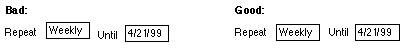
- Text baselines are mis-aligned in lines that have multiple items, e.g., Priority, Due Date; Frequency, Until; Notify me, days in advance. It looks sloppy. Recommendation: Align 'em.
Bugs
Scheduling: Day View
High Severity Usability Problems
Medium Severity Usability Problems
- In List View, the column headings "Status/Subject" and "Priority/Subject" are misleading. They initially seem to be headings for fields that can contain either status (or priority) or subject. But in fact, the status and priority are shown to the left of the subject. This is therefore just a double label. Recommendation: Separate these column headings into two, e.g., "Status" and "Subject". This will require moving the "Status" heading to the left a little bit to center it over its column, but there does appear to be space to do that.
Low Severity Usability Problems
Bugs
- In the Netscape browser only, there are problems with the display of scrollbars:
- When a user first switches to the Time view from the List view, no vertical scrollbar is shown even though the window is too short to show the entire timeline. The scrollbar only appears if the window is resized.
- Once a vertical scrollbar has been displayed for the Time view, it is retained when the user returns to List view even though it is not needed there.
Scheduling: View Appointment
High Severity Usability Problems
- The user interface for changing and deleting existing appointments and to-dos is non-intuitive, especially for repeating appointments and to-dos. There are two parts to the problem:
- Part of the problem is the word "Save", which is the same label that was on the button when we created the item. "Save" in this context makes it seem like editing an item and clicking on "Save" will leave the old item and add an additional item with the new info. But of course that isn't how it works. Recommendation: Replace "Save" with "Change" as in the Sun Solaris CDE mail application "DTCalendar".
- The extra problem with repeating appointments is due to confusing wording in the three choices:
O Save only this appointment

						O Save all appointments

						O Save all appointments from this day
This wording is very confusing. The first choice is confusing because users think of repeating appointments as one appointment. When they see this choice, they will think: "Only this appointment? What other appointments could we be talking about?" The second choice is supposed to refer to repetitions of this appointment, but can easily be interpreted to mean "all appointments I've made". The third choice is supposed to refer to repetitions of this appointment from today on, but can easily be interpreted to mean "all appointments scheduled for the currently selected day".
- The popup box has a radiobutton choice and then OK and Cancel buttons. This requires two keystrokes to make a choice. It could be operated with one keystroke if the choices were in the action buttons.
Recommendation: Revise the UI for editing appointments to be more like Sun's DTCalendar. New appointments are created using "Create", not "Save". Existing appointments are edited using "Change", not "Save". The Change button isn't active until the user has made a change in an appointment. If the appointment is a repeating appointment, clicking the Change button displays a dialog box with four buttons (each with tooltips text):
This appointment is part of a repeating series. Change:

					[Just this one] Tooltip: "Only this one appointment in series"

					[All] Tooltip: "All appointments in series"

					[From here forward] Tooltip: "All appointments from this one forward"

					[Cancel] Tooltip: "Cancel change"
Obviously, the corresponding dialog box for to-do items would substitute the word "To Do" wherever "appointment" appears above.
Medium Severity Usability Problems
- In the Save Appointment popup "dialog box", the tooltips on the OK and Cancel buttons don't make much sense. OK: "Close with selection"; Cancel: "Cancel selection and close". What selection is this talking about? "Selection" has a specific meaning in GUIs. The radiobutton setting isn't a selection. Recommendation: Have a technical writer review and revise all messages displayed by Jupiter. Also, see previous item.
Low Severity Usability Problems
Bugs
- A vertical scrollbar is often displayed even though nothing is scrolled off-screen.
Scheduling: Create Appointment
High Severity Usability Problems
- If an invalid room is specified, an error dialog appears saying:
Error while saving the appointment. Please verify the information entered.

					Error Message: Invalid User/Resource ID
Several problems with this message:
- The second sentence says that it is the error message. From the user's point of view, the error message includes both sentences.
- The message is too vague. The problem is an invalid room. Use a specific message for each type of invalid data.
- The message is implementation-centric. Users don't care that a lower-level procedure threw an exception to a higher level one. Hopefully, this is just to help you during your debugging. Before releasing the software, you need to remove all of this sort of stuff. [Note: Sometimes, the second sentence was a different system message: "XAPIA/CSA Call Failed".]
- The message contains a misspelled word "informtion". Should be "information".
- In the Attendee Search window, when the Search button is clicked, users get no indication that it is searching. No busy cursor (unless the cursor if moved over the results area, which is invisible and so why would anyone know to move their cursor there?), no progress bar, nothing. Users can't tell if it's doing anything and they don't get any way to tell how long it will take. Bad. Recommendation: Display some indication that the search is proceeding, e.g., a message "Searching..........", where more periods are displayed over time.
- In the Attendee Search window, because the Search results area is completely invisible until some results are found, the operation of this window is very confusing. Even the label "Search Results" is not shown until results are returned. Recommendation: The label "Search Results" should be displayed permanently. The scrolling list should be displayed permanently with a black border, and simply should be empty until results are found. That way, it will be clearer to users how this window works.
- In the Attendee Search window, the click-targets on the transfer buttons are far smaller than the buttons. Users currently have to click on the labels. This is very bad. You can fix it now or you can wait until a Priority 1 bug comes screaming in from your first users.
Medium Severity Usability Problems
- The Attendees, Optional Attendees, and Rooms links all display the same window. In particular, the "Search for" menu is always set to People. Recommendation: When the window is displayed by clicking on the Rooms link, the menu should be set to Room.
- In the Attendee Search window, the "Ok" should be all caps. "Ok" is not OK.
- The Check Availability window often shows a heading "Unable to obtain the following schedules:" followed immediately by the figure legend for Available and Unavailable times. In other words, the heading is shown even when there are no items to show there. Users who are new to the tool will think that the legend is the what the heading is referring to. Recommendation: Move the legend up to the top right (right of the date). Suppress the "Unable to obtain..." heading if there is nothing to display.
- The main action button is labeled "Save". This is vague. Recommendation: Label it "Create" to match the command that displayed this screen.
- The Attendee Search dialog box is titled "Message Compose Addressing Search". Huh? We're in Create Appointment.
- In the Attendee Search window, the labels of both scrolling lists scroll off. They shouldn't. Recommendation: Put the labels on the panel above the scrolling areas instead of in the scrolling areas.
Low Severity Usability Problems
- It is unclear what is supposed to go into the Until field. I assume it's a date. (Note: that no date-picker is displayed in Netscape browser.) On the other hand, it isn't so bad because it fills in automatically when the user chooses a value in the menu. Recommendation: It should have a label "mm/dd/yyyy" like the date above.
- When the Check Availability window does display items under the "Unable to obtain..." heading, it lists them separated only by comma (no spaces), and with a comma after the last item, e.g., "PEGTEST1,PEGTEST2,PEGTEST10,"
- The Check Availability window has no explicit close button. Users must close it using the Close control (X) on the window titlebar. Recommendation: All dialog boxes (including pseudo dialog boxes like this one) should have an explicit Close button.
- The Close (X) control on the Check Availability window title bar is considerably smaller than the standard size for this control. Some users may have trouble hitting it. Also, the inconsistency seems sloppy. Recommendation: Make it the same size as all other titlebar Close controls.
- In the Check Availability window, the user names are hard to distinguish from other stuff. Recommendation: Bold them.
- In the Attendee Search window, the word "in" is mis-aligned relative to the rest of the items in that line. It's too low. It looks sloppy. Recommendation: Text baselines should be aligned.
- In the Attendee Search window, the Search button is positioned next to the top line, rather than next to the main thing users are specifying (the search string). Recommendation: Move it to the right of the "Containing" setting.
- In the Attendee Search window, "containing" is not capitalized, although most setting labels in Jupiter are capitalized. Recommendation: Capitalize it.
- In the Attendee Search window, the search results area and the "sent message to" area appear with a white background. This looks unfinished. Recommendation: Change background of these areas to panel background. Only the inside of editable text fields and scrolling lists should be white.
- In the Attendee Search window, if a user searched for people, it is possible to assign them to rooms, and vice-versa. This doesn't make sense to me. Recommendation: The transfer buttons should be active or inactive (i.e., grayed out) depending on the type of search results shown. E.g., if the results are room results, the Attendees and Opt. Attendees buttons should be inactive.
Bugs
- In the Attendee Search window, once people are found, it is possible to add the same person to the "Send to" list twice. I don't think that makes sense, does it?
Scheduling: View Schedule Of...
High Severity Usability Problems
- The action button is labeled "Login". Huh? The user is not logging in; they login on the Login screen. To users, this is something else, even though your implementation may treat is as authenticating another username. Recommendation: Call it "View".
Medium Severity Usability Problems
- It may be difficult for some users to specify the name of a server. Is it really necessary here? Aren't all user ID's unique across servers? Recommendation: Get rid of it if you can.
- The overall label on this information is "Proxy User Information". This is implementation-centric. Users won't know what it is. Recommendation: Find a less techno-centric way of describing it. Or even better, just leave it out. The page is already labeled and the datafields are probably self-explanatory.
Low Severity Usability Problems
Bugs
- Clicking the "login" button displays something below the action buttons, but it's almost completely clipped by the bottom of the frame and is not visible, and there is no scrollbar to scroll it on the screen.
Scheduling: Week and Month Views
High Severity Usability Problems
Medium Severity Usability Problems
Low Severity Usability Problems
Bugs
|
In this section are problems found in the Messaging functions. [Back to Top]
|
Messaging: Folder List
High Severity Usability Problems
- According to the UI Specification, folders can be added only to the user's private mail folder. But the Create Folder button works in all folder views. Thus, it is possible to add a folder in places where the UI Spec says it shouldn't be possible. Recommendation: The Create Folder button should be inactive (i.e., grayed out) everywhere except where it is possible to add folders. If deactivating the button isn't possible, clicking it when viewing a folder that doesn't allow sub-folders should display an error dialog box:
Sorry, the <folder name> folder cannot have sub-folders.
Medium Severity Usability Problems
- In Messaging: Folder List, if the current selection is invalid for a function the user has invoked, there are four possible messages:
- "Only one message should be selected, before performing this action."
- "Please select a message, before performing this action."
- "You can only select a message, before performing this action."
- "At least one item has to be selected before a Copy." (or Move, or Delete)
Messages a-c are ungrammatical: the comma should not be there. In addition, message c is very awkwardly worded and ambiguous: the writer knows it's supposed to be "You can only select a message, before..." but users may read it "You can only select a message, before...". Messages b and d are for the same situation and so should be the same message.
Recommendation: Wordings were suggested for cases a and c in the UI Spec (page 12). Messages b and d should be basically the same message (perhaps with the specific operation filled in as in message d). All messages should be reviewed by a technical writer. Suggested wording for message b/d:
No message is selected.

				Please select a message and click <button name> again.
- The scrolling area's gray border is inside the scrolling area, so when the area is scrolled, one edge of the border disappears. Recommendation: The visible border of the scrolling area should be outside of the scrolling area so it is always visible. A border inside the scrolling area isn't very useful.
- The UI Specification called for clicking on the icon for each listed item to display a menu of item-type-specific functions, but it isn't implemented. Recommendation: Decide whether to implement this.
- The Create Folder popup "dialog box" has no Close control (X) on its titlebar, unlike other popups. Recommendation: Add one.
Low Severity Usability Problems
- Inconsistent naming: The tooltip on the Mail icon in the Jupiter navigation toolbar is "Go to Mail", but the mail page is labeled "Messaging". Is it "Mail" or "Messaging"? Recommendation: Either change the tooltip to "Go to Messaging", or change the title of the email facility to "Mail" throughout Jupiter.
- The column headings don't stand out enough. Recommendation: They should be underlined or bold (or both).
- It would be helpful to be able to get an idea of (some of) the content of messages without having to open them. Many mail readers provide this by simply including the first few words of content in the message listing. Recommendation: Provide rollover popups, as you have in Calendar.
- In the Create Folder popup "dialog box", the label for the settings is in a different font from other setting labels in Jupiter. It looks sloppy. Recommendation: Use a consistent font.
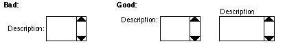
- In the Create Folder popup "dialog box", the Description label is center-aligned with its text area. Recommendation: It should either be aligned with the top of the text area, or placed above it. In the latter case, the text area would have to be made wider.
Bugs
- The Next Page and Back Page (to show the next/previous 25 messages) don't seem to work. I get a blank page when I click on them.
Messaging: View Message
High Severity Usability Problems
Medium Severity Usability Problems
- No indication is provided of which part of the message (Body, Attachments, Option) is being displayed. Users may see the Body button and wonder: "Huh? What's this do. Am I not already looking at the message body?" Recommendation: Be on the lookout for this in usability testing.
- The Copy/Move popup appears in an odd position: right over the Subject and Date of the message. Why right there? Why not in the vast middle of the screen? Recommendation: Don't put this right over the message header.
- The Copy/Move popup has no Close (X) control on the right of the titlebar. Recommendation: Add one.
Low Severity Usability Problems
- In this screen, you do have a separator below the panel toolbar. Good, but you don't have one on any of the other panels. Recommendation: Be consistent.
- In the Copy/Move popup "dialog box", the label "Select Folder" is in a different font than most other Jupiter setting labels. It looks sloppy. Recommendation: Use fonts consistently.
Bugs
- Some valid URLs in messages bodies are not marked as links (e.g., see the message in pegtest10's inbox from Hnarvaez titled "[Fwd: More specs from UI group]", dated 4/13/99.
- The Message Options panel seems not to be implemented yet. It displays "Loading Options..." but nothing is loaded.
- A message that is shown in the Inbox as having an attachment ("test of attachments", from Ray10Chang, 2/10/99( does not show the attachment on the Attachments sub-panel.
- The Next and Previous Message buttons change appearance when clicked, but don't change back to their "normal" appearance when the new message is displayed. After being clicked, they are still functional, but they don't look functional. One additional strange fact: If one of these two buttons has been clicked and is erroneously still displayed as "pressed", clicking on the other button changes the appearance of the first button back to "normal".
- There is some sort of pixel crud to the left of the Subject: line.
- Delete Message gives no feedback other than "Done" in the browser message are. It continues showing the supposedly deleted message, except that some white stuff appears at the bottom of the window under the action buttons. Returning to the Inbox, one sees that the message has been deleted.
Messaging: Compose Message
High Severity Usability Problems
Medium Severity Usability Problems
- The setting labels (To, CC, Subject) are right justified (as in the UI Specification), but setting labels everywhere else in Jupiter are left-justified. Recommendation: Be consistent.
- Clicking on the "From" address displays a "dialog box" for adding the address to the address book. This is probably OK, although users normally expect an address link to be a mailto link. It would help users predict what would happen if the browser message area displayed something like "Add address to Address Book" instead of "http://ayukawa.../0asjbc?template=mail_view_cin#".
- This is one of only two functions that splits the action buttons so that some (Send and Cancel) are on the extreme right. I find myself expecting the important buttons to be on the left (based on my experience with all the other Jupiter panels), so in this window I move the mouse first to the left and then over to the right. (The other panel that splits the buttons is Address book, but it has more of a reason to: the panel consists of two halves. See below.) Recommendation: Consider whether splitting the buttons is really necessary on this panel.
Low Severity Usability Problems
- In the "Add to Address Book" dialog box, the label for the Description field is vertically centered along the left edge of the scrolling text area. Recommendation: It should be either aligned with the top of the text area, or the text area should be wider and the label should be above it. For illustration, see recommendation on UI Problem 86 (above).
Bugs
- The title shown for this panel is whatever it was before, i.e., this panel does not appear to set a panel title. It should say "Messaging: Compose Message".
- The Cancel button on the "Add to Address Book" dialog box doesn't work.
- Forward message does not put the forwarded body text into the new message. It doesn't show the forwarded message as "included" either. But when the message is sent, the forwarded message has been included. So it appears to be a display problem, not a functional problem.
Messaging: Address Book
High Severity Usability Problems
- Except for the action buttons at the bottom of the screen, the panel is completely blank until I click on "Create Individual" or "Create List". This makes it very difficult to understand how to operate this panel. Hopefully, the blankness is just a bug. Recommendation: The panel should start out display a scrolling list on the left. If the user has not selected any item in that list, the first item should be automatically selected and its details shown on the right.
- In the Directory lookup window, the To, CC, and Remove buttons have even more blank space where clicking doesn't work. Very bad. Recommendation: Treat this as a bug, and fix it!
Medium Severity Usability Problems
- Directory lookup has the same problems as are mentioned in Calendar:
- blank screen before any results returned
- widget color doesn't match panel background
- "Ok" isn't all caps; should be "OK" instead
Low Severity Usability Problems
Bugs
- The action buttons at the bottom of the window use the incorrect button borders for their positions. The wrong buttons have rounded edges. The button shapes should be consistent with those in other windows, e.g., the Compose Message page.
- The Cancel button does not work.
Messaging: Message Templates
High Severity Usability Problems
- Clicking on a message template currently invokes View Message on that template. According to the UI Specification, it's supposed to invoke Compose Message using the template. Recommendation: Follow the spec.
Medium Severity Usability Problems
- The icon for message templates is currently the same as that for real messages. According to the UI Specification, templates should have a different icon than messages. Recommendation: Create an icon for message templates that looks like the template toolbar button icon you already have. Alternative: a message icon with a dotted outline instead of a solid outline, i.e., a message that doesn't look real yet.
Low Severity Usability Problems
Bugs