This is a new browser window. When finished viewing, just close this window.
Jeff Johnson
UI Wizards, Inc.
jjohnson@uiwizards.com
Eight months before an interactive movie game was due to be shipped, its developers and funders decided that its user interface had to be radically simplified. The author was given the task of designing a new, simpler control scheme. This paper describes the redesign process, the design issues that arose and how they were resolved, the tests that were conducted to evaluate new design ideas, and concludes with an evaluation of the resulting design, lessons learned, and thoughts on user-interface design vs. game design.
User interface, design, games, usability testing, interactive movies
In July 1996, Advance Reality, a game software developer, hired me as a consultant to solve a user-interface design problem in a game they were developing. I was referred to them by AnyRiver Entertainment, the game's "producer"1. AnyRiver was responsible for testing the game on computer-game enthusiasts (referred to as play-testing), and their tests indicated that players were having difficulty operating the game's controls.
The game is called A Fork in the Tale, abbreviated Fork. The developers had shot a full-length feature film viewed through the eyes of the protagonist. In contrast to a normal movie, each scene was filmed with many outcomes. The developers were editing the footage together to create an interactive game. Such games are known in the game software industry as "full motion video" (FMV) games.
Every few seconds while the movie is playing on an individual's computer screen, mouse-sensitive control symbols appear over the movie action providing opportunities for the player to affect what the protagonist does or says, e.g., leave, enter door, ask question, make comment, don magic cloak, dodge punch. The software selects the sequence of clips to show based on the player's choices and various state-variables.
The high frequency of choices provided in Fork represents an advance over previous interactive movies, which offer players a choice only every several minutes. The frequency of choices also makes the game much more complex (i.e., branchy) than most FMV games: five CD-ROMs are required to hold all of the footage a player might encounter. To keep the game's complexity manageable, at most three control symbols are presented at a time.
Another difference between Fork and most other FMV games is that it is real-time: the movie does not stop while a player considers which action to choose. If a player fails to make a choice within a few seconds, the opportunity passes and a choice is made by default.
The game's premise is that you, the player and movie protagonist, innocently walk into the midst of a shoot-out, get wounded, black out, and wake up washed ashore on an island. The goal is to figure out where you are, who the other people on the island are, and how to get back home. Your character (the protagonist) is an average guy who has an active sense of humor (his voice is that of comedian Rob Schneider). He is basically non-violent, but will defend himself if attacked. Others on the island range from friendly and helpful to hostile and dangerous.
The problem facing the developers was that the symbols for controlling the movie-action were much too complicated for players to master: they were non-intuitive, unsystematic, and too numerous. Players could not make meaningful choices between control symbols quickly enough.
Simplifying the controls was regarded as critical to the success of the game. The game developers of course wanted the game's mysteries and puzzles to be challenging, but they didn't want operating the game to be difficult.
The developers had tried three times to design action controls for the game, but none of the resulting control schemes had proved satisfactory. They were therefore open to the game producer's suggestion to hire a consultant.
My task was to devise a new control scheme: a way of organizing and representing protagonist actions that was easier to understand than the previous schemes had been.The game developers first wanted to be sure that they could work with me and that I would design a control scheme that they liked, so they structured my assignment such that they could decide quickly if they wanted me to continue. In three days, I was to produce a document describing a new control scheme. It didn't have to have the final action categories or control art, but it did have to explain, abstractly, how actions would be categorized and approximately how many categories would be needed.
I started by playing Fork and asking questions about it. I played it not as a normal player would, but rather using special production software that allowed me to jump around, replay clips, etc. I focused on a few game scenes that the designers said contained intensive action or conversation. My goal was to understand the expressive requirements of the game.
Too many symbols. Action-symbols were organized in a three-dimensional set, with color, shape, and bitmap image as independent axes of meaning. With five colors, about 10 shapes, and dozens of images, the old scheme used hundreds of symbols. Furthermore, the meanings assigned to shapes and colors were arbitrary, e.g., color: yellow = helpful, green = curious; shape: spiked = aggressive, rounded = passive. It was nearly impossible for players to learn all of the symbols.
More semantic resolution than necessary. The old control scheme distinguished each action-situation in the game from every other. This would make sense if players were in control of the time, subject, object, and mood of their actions, but in this case the game is in full control of the timing and effect of actions, only a few of which are available at a time. Therefore, the action-resolution required is much lower.
Similar representation of very different actions. In the old control scheme, most symbols were stationary opaque plates that appeared at the bottom of the screen. Whether a displayed symbol depicted, e.g., a physical movement or a speech act, was indicated only by the shape of the plate. This hindered recognition of even what general type of action a symbol represented.
Flawed implementation. The game editors (who, along with their other editing duties, added action-symbols to movie clips) didn't understand the old scheme, so they implemented it haphazardly. Each editor tended to use a subset of symbols s/he understood or liked the appearance of. Furthermore, editors made up new symbols occasionally, not all of which fit the scheme. The result was an ad hoc implementation of a principled (albeit flawed as described in points 1-3) design.
Although the old control scheme was to be replaced, it was clear that an important feature of it should be retained: clickable action-symbols that appear at choice-points in the movie. The real-time (i.e., non-stop) nature of the game required that all available protagonist actions at choice-points be simultaneously visible, ruling out a control scheme such as that used in slower-paced games, where the cursor changes shape as it is moved around the screen to indicate what action is available there.
The main re-design task was therefore to design a simpler but sufficient categorization of actions, and symbols to represent the categories. Initial analysis of the game suggested that protagonist-actions fell into six categories: navigate in a direction, look in a direction, interact physically with objects or people, speak, think silently, and memorize events or faces.
Experience with iconic user interfaces [2] suggested to me that choosing among available actions would be easier if these six classes were grouped into two superordinate action-classes -- physical movements (navigate, look, and interact) vs. speech acts and thoughts -- with gross differences in how the two classes would be presented.
Opportunities for physical actions would be represented by black and white, semi-transparent, animated "hotspots". They would usually float over the action and pan with it (e.g., enter door, block punch), but might appear at the edges of the screen if they had no clear direct object (e.g., turn right, jump). A few such "hotspots" had already been introduced into the game by editors dissatisfied with the existing controls, and seemed successful.
In contrast, opportunities for speech and thought would be represented by cartoon speech balloons containing a symbol representing the specific speech or thought sub-category. They would appear at the bottom edge of the screen (to appear to come from the protagonist's own mouth) in one of three fixed positions.
Memorizing events and faces posed a dilemma: which main symbol class should it be in? Memorizing is a mental act, but has a definite target in the movie-action, like looking closely at something. The game editors had already used hotspots to represent opportunities to memorize things, and play-testing indicated that it worked well. Following the principle "if it isn't broken, don't fix it," I left this aspect of the game as it was.
An important goal was to reduce the number of action sub-categories (and symbols). The recognizability and discriminability of graphical symbols in a set does not depend exclusively on set size: people can discriminate fairly large sets if the symbols in the set are different enough from each other and if the mappings from symbols to meaning are intuitive [3]. Nevertheless, other things being equal, smaller symbol sets are preferable. Whatever the optimal number might be, hundreds of action sub-categories was clearly too many. It was also clear, however, that the game's expressive requirements ruled out having ten or fewer sub-categories per main action-class. Somewhat arbitrarily, I set myself the goal of having at most 30 symbols in each of the two main classes.
After playing critical game-scenes, I devised preliminary categorizations of movement and speech actions that seemed to cover the expressive requirements while not exceeding this limit (details below). Although the final control symbols would be drawn by graphic artists (one artist per set to assure consistent appearance within each set and clear differences between the two sets), I made rough sketches for each of the speech and movement sub-categories.
Having satisfied myself that a simplified control scheme that met the game's expressive needs was feasible, I presented it to the developers. They liked the simplified control scheme and asked me to continue refining it and to work with the graphic artists, game editors, and programmers to get it implemented.
Over time, I learned that, in addition to the game's expressive requirements, there were requirements and constraints arising from Advance Reality's schedule and resources, and from the wishes of the game designer.
An important constraint on the re-design effort was that the only funded usability testing was the play-testing being conducted by AnyRiver. Their support for Fork was based, in part, on positive results from testing early prototypes of the game on computer-game enthusiasts. They continued play-testing throughout the development period, reporting player enjoyment, usability problems, and bugs to Advance Reality. Any other usability testing had to be done very quickly and at essentially no cost. However, we sometimes needed to test specific design ideas before adding them to the game. In such cases, we had to devise quick, cheap tests.
A final set of requirements were based on the game designer's wishes and goals. Before describing them, it is important to clarify my role in the project.
In the computer game industry, the game designer is usually also the user-interface designer (supported by art directors and graphic artists). Because the roles were separate in this case, it was possible to observe how our concerns overlapped and interacted. The game designer was concerned mainly with how entertaining and aesthetically pleasing the game was and how well it embodied his overall vision. I was concerned mainly with usability. Our different concerns often led us to differences of opinion. As a consultant, I had to accept the game designer's judgment if he insisted. He respected my judgment and yielded to it more often than he overruled it, but, naturally, he was difficult to convince if a proposal ran counter to his vision of the game. His ideas about the game that affected the re-design included the following:
Although he realized that the new control-scheme had to have far fewer action sub-categories than the old scheme, the game designer tended to favor having more categories than I did. To him, each protagonist-action had a meaning, and he preferred to represent actions in terms of the intended meaning, rather than in terms of just what was necessary to distinguish them at choice points. This issue arose repeatedly during the re-design effort.
The game designer had strong feelings about the appearance of the control symbols. He wanted them to have three-dimensional depth, i.e., not appear flat in the plane of the screen. They had to "lead players' eyes into the movie action". The controls also had to fit with the game's woodsy, old-world fantasy theme: they had to look "antique and classy". While these graphic style requirements did enhance the aesthetic appeal of the game, they also biased the symbol art towards more-detailed styles, rather than toward the abstract, minimalist styles that graphic designers agree are easier to recognize [3].
The game designer wanted to minimize the use of text throughout the game. The game software can display a text label under any action symbol, but the game designer felt that labeling every control symbol would slow players down and divert their attention from the movie-action, as well as hinder translating the game into other languages. I agreed, so my initial design used text labels: 1) only on speech symbols, not on physical action symbols, 2) mainly in early game scenes to help players learn the symbols, and 3) thereafter, only where necessary to distinguish choices (e.g., when multiple speech acts of the same type were offered). However, as is described later, the game producer disagreed with us on this issue.
As described above, my initial analysis of the requirements for controlling the protagonist's physical actions yielded four action categories that were to be represented by hotspots: navigating in a direction, looking in a direction, interacting physically with objects or people, and memorizing events or faces. From playing the game, it seemed that the following sub-categories of each of these categories were needed:
Navigate: forward, 45 degrees right, 45 degrees left, right, left, backward, turn around right, turn around left, turn right, turn left, turn 45 degrees right, turn 45 degrees left, stop/stand-still.
Look: up, down, left, right, here.
Interact: hit/knock, kick, push, block, grab/catch, duck, dodge left, dodge right, spin left, spin right, break free.
Memorize: this.
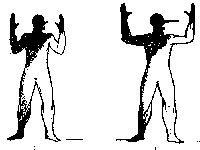
Each action sub-category would be represented by its own symbol. Figure 1 shows early sketches of some of these symbols.
Figure 1: Sketches of physical-action symbols.
The total number of sub-categories (and therefore symbols) in this initial version of the physical-action controls was 30. This was worrisome, because it seemed likely that additional experience with the game would expose the need for physical actions not covered by these sub-categories. For example, I soon realized that we needed a sub-category and symbol for Jump.
Fortunately, further analysis also indicated that some of the initial sub-categories were not needed. For example, it became clear that many Look opportunities in the game could be represented by navigate symbols such as Turn Left, and the rest could be represented by a single Look Here symbol placed in the relevant screen-location. It also became clear that because users were choosing between available actions, not generating actions, it was not necessary to distinguish Hit from Kick: both could be represented by a single Strike symbol. Similarly, it was not necessary to distinguish Push from Block, or Dodge Right and Left from Navigate Right and Left. Finally, the need for some sub-categories disappeared as the game evolved: Break Free and Turn 45 degrees right and left.
The final set of action sub-categories to be represented by hotspots numbered 21. It contained:
Navigate: forward, right, left, 45 degrees right, 45 degrees left, backward, turn around right, turn around left, turn right, turn left, stop/stand-still.
Look: here.
Interact: strike, push/block left, push/block right, grab/catch, duck, jump, spin left, spin right.
Memorize: this.
Once these sub-categories had been finalized, we instructed the game editors to use them throughout the game. It didn't matter that the symbols for the sub-categories did not yet exist, because each use of an action symbol in the game is just an index into a table of symbol bitmaps. We filled the table with placeholder images initially, and replaced them one by one as the symbols were finalized.
Even as the physical-action sub-categories were being refined, symbols to represent them were designed. My sketches served as input for a graphic artist, who produced successive iterations of the symbol set with feedback from me and the game designer.
Some of the sub-categories were easy to represent graphically. It was obvious that symbols for navigation actions should be arrows such as those painted on roads and road-signs. The only difficulty in designing the symbols for these was in achieving the animated three-dimensional perspective appearance that the game designer wanted. Other physical actions that proved easy to design symbols for were: strike (a jagged starburst borrowed from comic books), grab/catch (a target), spin (an animated arrow chasing its tail), and memorize (a small pulsating cloud). Once these symbols were in the game, AnyRiver's play-testing indicated that game players easily understood them.
In contrast, some physical action sub-categories were hard to represent graphically. I initially sketched Stop/Stand-Still as a stop sign, but it proved impossible to create a recognizable black and white stop-sign bitmap within the size and perspective constraints. We eventually settled on a perspective X. To represent Look Here, I initially sketched a pair of eyes, but the game designer was rightly concerned that symbolic eyes would not be recognizable, and that realistic eyes would look like something peering out of the movie rather than a symbol. We chose a zooming rectangle. Other action sub-categories that were difficult to find suitable symbols for were: Jump, Duck, and Block.
With each of the hard-to-depict sub-categories, the game designer and I worked with the graphic artist until we had a hotspot we considered worth trying in the game, then put it into the image table, and judged its effectiveness for ourselves as well as awaiting feedback from AnyRiver's play-testing. If it didn't work, we sent the artist back to the drawing board (or more precisely, the paint program).
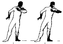
Figure 2: Final images for some physical-action symbols.
Play-testing yielded many complaints about early versions of the hotspots, but with revisions, the complaints ceased. In fact, it eventually seemed that players were using the physical action symbols without being fully conscious of them. When AnyRiver was preparing the game's instruction manual, they asked for a list of the hotspots. When we sent them the list, they were surprised that there were so many distinct images. We pointed out that, with the exception of the Stop/Stand-Still symbol, people don't perceive the navigation symbols as distinct symbols, but rather as the same arrow pointing in different directions. AnyRiver made use of this in the manual to simplify the explanation of the hotspots.
The speech/thought controls were designed in parallel with the physical-action controls. Opportunities to speak were to be depicted by a cartoon speech balloon enclosing a symbol representing the type of speech-act. Opportunities to think internal thoughts would be represented by a thought balloon enclosing a subset of the speech-act symbols. As with the physical-action controls, we had to develop both the sub-categories and symbols.
My initial analysis of conversation-intensive game scenes suggested a need for 12 sub-categories of speech: statement, question, accept, refuse, offer help, aggressive/ /insult, sarcastic, humorous, need help/frustrated, flatter/praise/thank, grovel/beg/plead, and recall memory. An additional "speech" type was to represent keeping silent (although see discussion below). The sub-categories for thought were to be a subset of those for speech.
After defining the initial speech sub-categories, I began sketching symbols for them. I suggested using letters for some speech types (e.g., "?" for Question), faces for some (e.g., a comedy mask for Humorous), and hand gestures for others (e.g., a shaking fist for Aggressive). The game-designer preferred a scheme having a common visual theme for all speech symbols (in addition to their being inside the speech balloon), and decided that we would use human figures making mime-gestures.
Figure 3: Initial sketches of speech figures.
Based on my initial sketches (see Fig. 3) and input from the game designer, an artist (not the one who created the hotspots) drew human figures miming the current set of speech sub-categories. Each mime-figure consisted of two frames, which would alternate rapidly on the display to produce a simple animation (see Fig. 4). Initially, the game designer and I met with the artist almost weekly over a two-month period to critique the latest mime-figures and inform the artist of changes in the speech sub-categories.
By this time, based on further experience with the game and pressure from the game designer (who tended to favor more specific speech sub-categories), the number of speech sub-categories had expanded to 27. They were: statement, question, accept/yes, decline/no (polite), refuse/no (adamant), request (polite), demand (adamant), greet, offer/helpful, exclaim, lie/exaggerate, whine/seek-sympathy, accuse, gratitude/thank, flatter, humorous/witty, sarcastic/snide, aggressive/insult/defiant, grovel/beg/plead, flirt, manipulate, reason/persuade/explain, care/empathy, deal/negotiate, get-real/get-a-grip, and recall memory.
Figure 4: Artist drawings of animating mime-figures.
Unlike the hotspots, which had been drawn using painting software, the new speech symbols and the speech balloon were drawn on paper. Digitizing them and combining the mime-figures with the speech balloon would be very expensive and time-consuming, so we wanted to wait until we were more confident that the speech sub-categories were stabile and the symbols were adequate. But this meant that the speech controls weren't being play-tested.
|
Speech Symbol |
Participant Responses |
|---|---|
 Lie/Exaggerate |
|
 Sarcastic/Snide |
|
Table 1: Example responses to paper speech symbol test. The upper symbol conveyed its intended meaning; the lower didn't.
To get empirical data on how well the mime-gestures conveyed their intended meanings, I conducted informal paper tests: I recruited ten volunteers who were not associated with Advance Reality or AnyRiver and knew nothing about the game, showed them the figure-pairs, told them that each pair was an animation of a man trying to express something silently, and asked them to write on an answer sheet, in a few words, what the man was trying to say. I then assigned each response a subjective score between 1 (missed intended meaning) and 10 (got it).
The results of the first such test were discouraging: a few symbols were conveying their intended meaning to most subjects, but most were not (see Table 1). I reported the poor test results to the artist and game designer, and we changed the basic miming figure, revised some of the symbols (see Fig. 5), and repeated the test with different participants. Some symbols did better in the second round of testing; others didn't. Based on the results of the second test, we revised some of the figures again.
Figure 5: Examples of revised mime-figures.
We briefly considered adding color to the mime-figures as a redundant indicator of mood (in contrast to the old scheme's use of color as an independent dimension). To be helpful, the color scheme had to be obvious to players, rather than something additional to learn. Further analysis revealed that such a plan required finding not only a universal mapping of emotion-level to color, but also a universal mapping of our speech sub-categories to emotion-level. To check the latter, I conducted a quick informal test: I asked eight employees of Advance Reality who weren't involved in developing the speech symbols to rate each speech sub-category for "amount of emotion" on a 0-5 scale (0=low; 5=high). Some sub-categories received uniformly high emotion-ratings (e.g., accuse, exclaim, refuse), while others received uniformly low ones (e.g., statement, keep silent), but most received a wide range of ratings (e.g., accept, fear, manipulate, humorous). Comments from test participants suggested that variability for certain items was due to some people separating amount of emotion from type of emotion while others did not. Since finding the required two universal mappings seemed unachievable, we abandoned the idea of augmenting speech symbols with color.
The speech symbols still weren't satisfactory, and time was getting short. We decided to put some of them into selected game-scenes and use our own reactions and play-testing to guide further design. This exposed two new issues:
On-screen, the mime-figures were too small to be easily recognized. Enlarging both the figures and the enclosing speech balloon would obscure too much movie action. Our solution was twofold. First, we enlarged the figures but repositioned them in the speech balloons so that their legs were clipped off. All the information was in the upper bodies anyway. Second, we exaggerated whichever features carried the meaning (e.g., hands, mouth). This is a common practice of cartoonists and graphic artists [3].
Although the two-frame animation of the mime-figures worked well, it proved distracting and disorienting to have several speech symbols displayed at once, all animating in synchrony over the movie action. Simply assigning different animation rates to different mime-figures broke up this effect, reducing the visual impact of multiple speech symbols to acceptable levels.
Once these graphic-design issues were resolved, the main issues returned to the fore: determining the final speech sub-categories and symbols to convey them. The deadline was looming and we had to allow time for the editors to add the new speech sub-categories throughout the game. We were worried that we had too many speech sub-categories for players to remember: 27, not including the thought sub-categories. We were also concerned that many of the mime-figures didn't convey their intended speech-category well.
To finalize the speech sub-categories and symbols, we had to resolve several issues about which the game designer and I had different opinions:
Did we need speech sub-categories that were proving very difficult to depict? These were: sarcastic/snide, reason/persuade/explain, care/empathy, deal/negotiate, whine/seek sympathy, and flatter. I had concluded that the problem was not simply that we hadn't yet found the right mime-figure to depict these concepts, but rather that they were too abstract to represent graphically. I convinced the game designer that we should drop them and "bend" other sub-categories to cover those situations.
Did we really need multiple symbols for thoughts? The game designer preferred having a variety of thought-symbols to depict the different types of "silent" remarks the protagonist could make. I argued that thoughts can't be heard by other characters and don't affect the outcome of the game (most are just opportunities to hear one of Rob Schneider's funny wisecracks), so there was no need to distinguish one from another. We ended up with only one Thought symbol (an empty thought balloon).
Did we really need a symbol for not speaking? I favored eliminating the symbol and having players keep silent by not selecting any speech symbol. The game designer wanted keeping silent to be an explicit choice because there are situations in the game where remaining silent is a strategic move. We compromised: eliminate Keep Silent, use no symbol wherever keeping silent isn't strategic, and use the Thought symbol wherever keeping silent is strategic (although this meant finding and adding a suitable recorded protagonist "thought" line).
Did we really need symbols that were hardly used? Two speech symbols were needed only once or twice in the entire game: manipulate, get-real/get-a-grip. They seemed to me to be good candidates for elimination, but the game designer wanted to keep them because he felt that the attitudes they represented were critical for the scenes in which they appeared. We kept them. We also added a symbol for "Shhh!" (i.e., telling someone else to be quiet), even though it was only used once.
With these decisions behind us, the set of speech/thought sub-categories numbered 22. We felt comfortable with this number and with how the remaining mime-symbols were working, so we began instructing the game-editors on how to install the new speech sub-categories throughout the game. Assigning speech sub-categories required much more care and judgment than did adding physical-action sub-categories. I developed guidelines for editors to follow.
Unfortunately, installing the new speech controls was as difficult for editors to do correctly as the old ones had been. After the editors had made one pass through the game assigning speech symbols, I did some checking and estimated that about half of the thousands of assignments were incorrect. I revised my guidelines to be more explicit, and explained them verbally to most of the editors, to no avail. The game designer asked the editors to be more careful, to no avail.
The editors had a complex job, which included editing together video sequences, voice-tracks, and sound effects as well as placing the control symbols in space and time. Furthermore, they were working under intense time-pressure. One finally told me that she didn't have time to determine the correct speech sub-categories; she simply made everything a Statement, and assumed that someone else would fix it later. In response to this, I learned to use the editing software well enough to allow me to go through the entire game, listen to all the protagonist's lines, and assign speech sub-categories.
Once the speech controls were in the game, feedback from AnyRiver (based in part on their play-testing) was swift in coming. They wanted two further changes:
They wanted all speech symbols to include text labels. Although the game designer and I had decided to use text very sparingly, AnyRiver convinced us that the advantages of text labels outweighed the disadvantages. I went back through the game, composing and adding terse labels for each speech opportunity.
They wanted the set of speech symbols reduced further. They were preparing the user manual and were worried that the list of speech symbols would seem daunting. The game designer and I felt that the set was as small as it could be. A compromise was reached, based on the recognition that in most of the game, only a few speech sub-categories were needed (seven), but some scenes were "conversation games" requiring more expressiveness and hence more speech sub-categories. AnyRiver wrote the manual so as to list the seven frequently-used speech symbols separately from the rest.
Figure 6: Examples of final speech-figures.
One goal of the re-design effort was to reduce drastically the number of control symbols game players had to distinguish and choose between without compromising the expressive choice that was needed to make the game entertaining and rewarding. We ended with 21 physical-action symbols and 22 speech/thought symbols: a total of 43. Obviously, this was a drastic reduction from the several hundred symbols of the old control scheme. The game designer also felt that we had done so without compromising expressive choice.
In critiquing the old control-scheme, I treated the lack of compliance by game editors with it as an indictment of it. However, the editors also had trouble assigning the new speech sub-categories. It is tempting to conclude that this has more to do with their heavy work-load than with the control scheme, but that conclusion won't withstand the observation that editors did not have much trouble installing the new physical-action controls. Perhaps work-load contributes to the problem, perhaps deciding the appropriate sub-category for a speech act is as hard as is devising a good categorization of speech acts, and perhaps our speech categorization was still not intuitive enough.
We can also ask how well the final control symbols depicted their intended meanings. My feeling is that the symbols for physical actions and memorizing were highly successful: so good that players hardly notice them even while using them heavily.
Whether the speech/thought controls were successful is debatable. In the end, we had to augment them with text labels. Play-testing indicated that, thus augmented, they were usable. With more time, I might have suggested revising the mime-figures yet again or trying other ways to represent speech acts.
Although I had been hired to redesign the action-controls, the game developers expanded my charter to include other aspects of the game's user interface that needed refinement or redesign. These included: the cursor's various shapes, which indicate whether or not the movie is at a choice point and how much time remains to choose; the visual feedback when control symbols are hit or missed; the score counters that appear in certain scenes; the user interface for making use of saved magical objects; and the control panel for starting, saving, and loading games and setting game options. Play testing indicated that these aspects of the user interface were successful, but the processes by which they were designed are beyond the scope of this paper.
Working on Fork taught me the following lessons:
A picture may be worth a thousand words, but finding the right picture to convey a verbal concept can be very hard. The best way to convey some verbal concepts is verbally.
If symbols in a set depict their meanings well, people can discriminate and recognize them even if the set is large. Users may not even realize that the set is large.
Universally recognized mappings between color and emotion depend on a universal emotion scale, which may not exist. Designs that map color to emotion are risky.
Game developers understand the need to test on real users (better than do most software developers), but they could use help from user-interface specialists in understanding the distinction between play-testing and more focused usability testing, and the importance of the latter.
User-interface designers have different concerns and skills than game designers and graphic designers. User-interface skills are as important for designing games as for productivity software, but the reverse is also true: the skills of game designers could be useful in making productivity software more engaging and fun.
Earlier, I stated that the game designer often yielded to my judgment on user interface issues. But what is a user-interface issue, especially in contrast to a game-design issue? The game's plot and dialogue and the challenge of solving its mysteries and puzzles clearly fall under game design. Users' ability to navigate successfully in the game-world and keep track of how they are doing clearly falls under user-interface design.
But consider the issue of deciding who the intended users are and designing a suitable product for them. That is often cited as an important, though neglected, concern of user-interface designers [4]. After I had played Fork, I had concerns about who it was for and whether it would appeal to them.
As someone who rarely plays computer games, I felt that the interactive-movie aspects of Fork were great, i.e., it was easy to become engrossed in the mystery and wanting to solve it. However, I was put off by some embedded puzzles that were not integral to the story: points at which the movie disappears and the player (not the protagonist) negotiates a maze or manipulates objects to find a combination. These were included to make Fork appealing to "hard-core gamers". I worried that they might make it unappealing to light-gamers and non-gamers, and that we ought to think more about the question of who Fork was for rather than glibly answering "everyone!" but even I didn't consider this a user-interface issue at the time.
Similarly, AnyRiver, Fork's producer, prepared cover art for the package and manual that included sophomoric drawings of near-naked women, even though there is nothing so racy in the game. Again, this was done to appeal to gamers, but I felt that it would turn off non-gamers, light-gamers, parents (who often control purchases), and female gamers.As it turns out, the game is selling rather poorly. I frankly don't think that this is due to poor controls: play-testing indicated that they were adequate. I think it is due to insufficient consideration of the target market. Maybe that should be treated as part of user interface after all.
The author is grateful for the opportunity to work with the creative designers and developers at Advance Reality, especially film director and game designer Rob Lay and lead programmer Ken Carson. Thanks also to the graphic artists at 415 Productions and McMacken Graphics, to staff members at AnyRiver who contributed ideas to the user interface, especially Chuck Clanton and Stewart Bonn, and to several anonymous CHI'98 reviewers.
It is common for three companies to be involved in the preparation and marketing of a computer game: the designer/developer, the producer/funder, and the distributor. The distributor of Fork is Electronic Arts.
Johnson, J., Roberts, T., Verplank, W., Smith, D.C., Irby, C., Beard, M., and Mackey, K. (1989) "The Xerox Star: A Retrospective," IEEE Computer, September, 22(9), pages 11-29.
Mullet, K. and Sano, (1995) D. Designing Visual Interfaces, Mountain View, CA: SunSoft Press.
Landauer, T.K. (1995) The Trouble with Computers, Cambridge, MA: MIT Press.